We may earn money or products from the companies mentioned in this post.


Last Updated on May 8, 2026 by Cate
When it comes to choosing the perfect neutral, it feels like a daunting task—too warm, too cool, too dark, too light. But let me introduce you to Sherwin Williams Repose Gray, the Goldilocks of grays. It’s the one that lands perfectly in the middle, creating a calm and inviting atmosphere that works in any room of your home.
This fantastically versatile gray paint color is a true staple—and I should know. I’ve used it in every single room of my old home (except the bedrooms!). It’s that good.
So, what makes Repose Gray so amazing? Let’s dive into its undertones, lighting behavior, LRV, popular comparisons, and more.

A Go-To Neutral That Works Almost Anywhere
Repose Gray is a neutral gray/greige with a slightly cool vibe. While it can lean warm in bright lighting, it generally reads as a cooler tone.
It has subtle violet undertones—yes, violet! But don’t worry, you won’t end up with purple walls. That touch of purple gives the color depth and prevents it from looking flat or lifeless. Think soft elephant gray. It’s elegant and timeless.

Still a Fan Favorite in 2024?
Absolutely! While earthy tones are trending right now, Repose Gray still holds its own. It’s a classic Sherwin-Williams gray that pairs beautifully with white trim and warm wood finishes.
Not everyone wants stark white walls. Repose Gray offers just enough contrast while staying neutral and easy to decorate with. Just be sure to match it with your floors, countertops, and decor to avoid any clashing undertones.
Light Reflectance Value (LRV)
LRV: 58
The LRV scale goes from 0 (pure black) to 100 (pure white), and Repose Gray lands at 58. That means it reflects a moderate amount of light—not too bright, not too dark. It’s an ideal mid-range tone for walls.
Want to learn more about LRV? Check out my guide to Light Reflectance Value.

Undertones You Need to Know
Let’s break it down: Repose Gray is a mix of gray, brown, greige, and a kiss of purple.
That little hint of purple is what gives Repose Gray its character. It adds just enough pizzazz to keep it from falling into the “boring” category.
It’s important to remember that undertones are highly subjective. You can look at the same wall and see completely different tones depending on the time of day, direction of light, and even the furniture around it. Lighting—both natural and artificial—has a massive impact on how Repose Gray will read in a space. That’s why it’s always smart to sample it in your room before making a final decision.
Warm or Cool? Here’s the Truth


Technically, it’s a warm gray, but it leans cooler than many others due to its undertones. When compared to Sherwin Williams Worldly Gray, Repose is clearly the cooler of the two.
If you are a fan of cool colors, Check out these Sherwin Williams Cool Grays.
Where to Use It in Your Home
This color really shines in:
- Living rooms with lots of natural light
- Kitchens with quartz or granite countertops that have matching undertones
- Hallways and entryways for a consistent neutral flow
- Home offices where a clean, non-distracting color is key
It’s incredibly versatile. Just make sure to test it in your space, especially with your existing flooring, countertops, and lighting conditions.
How does lighting affect Repose Gray?
The way a color is perceived is highly dependent on lighting. For example, a room with tons of natural light pouring in will look different from a room with little to no natural light.

Northern Exposure
As the graphic above shows, if you have a North-facing room, the coolness of colors is brought out.

You may also see hints of the color’s purple/blue undertone. As I mentioned before, I have this fantastic gray in most of my home, and some days, when I’m looking at the color on the bathroom walls, I notice the tiniest hint of purple.
This is something to consider, especially if you are looking for a paint color with a warmer feel.
Don’t start painting until you have the right tools!
Southern Exposure
Southern exposure natural light warms up the color. It feels soft and airy.
My old living room had south-facing light. In addition to Repose Gray on the walls, I also painted the fireplace using Dovetail and the white I used for the trim and shiplap was SW Extra Whit.


The beauty of this color is that it can be used just about anywhere. It’s so versatile, and it makes a beautiful backdrop for any decor style. As you can see in the photos, an eclectic decor style is going on: cotton stems, vintage pieces, a farmhouse-style chair, simple picture frames, and more.
eastern exposure
Eastern exposure typically means that the room receives sunlight in the morning, which tends to be cooler and softer compared to the warm, direct sunlight of the afternoon. It is likely to maintain its serene and versatile character while subtly adapting to the nuances of the morning light, creating a welcoming and timeless atmosphere.

Western Exposure
Western exposure rooms typically receive warm, golden sunlight in the afternoon and evening. This warm light can enhance the warmth of the color, giving the room a cozy and inviting feel. Compared to rooms with cooler exposure, the gray may appear slightly warmer and more inviting, with softened undertones and rich depth that enhance its timeless elegance.
Cabinet-Worthy? You Bet.

Yes, yes, yes! Repose Gray looks amazing on cabinets, especially when paired with quartz or granite countertops that have similar undertones. Be sure to sample it against your countertops and backsplash first.

Exterior-Friendly? Surprisingly, Yes.
Repose Gray works beautifully as exterior trim or even as a whole-house exterior color. In sunlight, it looks much lighter—almost like a soft, warm white.
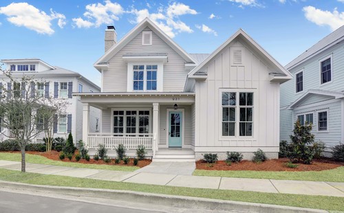
Remember that colors appear much lighter outside in the sunshine, and this color will look like a soft white without any harshness.
Best White Paints to Pair With It

I love it with clean or bright off-whites like SW Extra White, SW White Snow, or SW Pure White. SW Westhighland White is a warmer and darker shade compared to those colors, but it also looks lovely. Whites with yellow undertones, such as SW Alabaster or SW Greek Villa, will work, but I advise swatching these colors together with Repose Gray to make sure you like them together.
These white paint colors are great options for trim as well.
How to lighten Sherwin Williams Repose Gray
A different way to use Repose is by lighting it by 50%, 25%, or whatever % you want. Basically, this means that when mixing a color, you start with your base, which is white. Then, you add colorant to make the color of your choice.
So, let’s say we were adding 12 drops of blue and 12 drops of black colorant to the white base. To lighten that color, you’d equally reduce the number of drops, so 12 drops now become six drops.
I decided to use this paint lightening method in our business office. Even though it is a relatively light color, I was afraid it would look a bit dark in the space since there was a low-light space.
It lightened the color just enough to do the trick.

What is the easiest way to Sample?
Keep Sheen in Mind
Did you know that paint sheen changes the way color looks?
- Higher sheens (like satin or semi-gloss) reflect more light and look lighter.
- Lower sheens (like flat or matte) absorb light and appear darker
Try using Repose Gray in a flat finish on walls and satin on cabinetry or trim for variation with continuity.
Looking For More Paint Color Ideas?
- The Best Pewter Paint Colors
- Neutral Paint Colors
- BEST Benjamin Moore Gray Paint Colors
- The Best Sherwin Williams Gray Paint Colors
- The Best Paint Colors for a Home Office
- Accessible Beige- A Warm Neutral
- 16 Amazing Cool Gray Paint Colors
- Benjamin Moore Beach Glass Review
- 10 Fabulous Mushroom Paint Colors
Sherwin Williams Repose Gray vs. Agreeable Gray

What is the difference between Repose Gray and Agreeable Gray?
- LRV: 60 (lighter)
- More warm with green undertones
- Leans more greige than gray
- Repose Gray is cooler with purple/blue undertones
Repose Gray vs. Agreeable Gray: who’s the winner? That’s a tricky question to answer. It’s all about preference and lighting. Both of these gray paint colors are no-fail colors. It all comes down to whether or not you want more of a cool or warm-toned gray wall color.
Check out my full Agreeable Gray review for more information.
Sherwin Williams Repose Gray vs. Benjamin Moore Revere Pewter

- Revere Pewter has an LRV: 55.51 (darker)
- Definitely warmer and greener
- It can look muddy in certain lighting
Repose Gray vs Revere Pewter- The Ultimate Showdown
Light French Gray vs. Repose Gray


- Sherwin Williams Light French Gray has an LRV of 53 (darker)
- Very cool-toned and more neutral
- Fewer undertone surprises
Which Benjamin Moore Colors are like Sherwin-Williams Repose Gray?
As stated earlier, the closest paint color to Repose Gray is Benjamin Moore Collingwood, though it is slightly lighter. It is not advisable to match paint colors, especially for light neutrals or white paints, which can appear greenish when applied to walls. Collingwood will provide a similar appearance and ambiance, though not an exact match.
Coordinating Colors
It’s not difficult to find other colors to coordinate with Repose since it works well with just about everything. Blue-gray paint colors in particular.
However, I love pairing it with SW 7014 Eider White, SW 7017 Dorian Gray, SW 7642 Pavestone, Tricorn Black, and my favorite teal, SW 6222 Riverway.
You can also pair it with rich, muted, saturated jewel tones or fresh colors. Don’t pair muted and fresh colors together. Repose can go either way, either muted or fresh. Yellow paint colors or creamy yellowish whites can look dingy.
- Pinky Beige
- Granite Peak
- City Loft
- Wool Skein
- Riverway
- Artichoke
- Iron Ore
- Dovetail

Color Recap
- has an LRV of 58.
- It is a warm gray that does pull cool in certain lighting.
- The undertones are gray, brown, greige, and an itty bitty hint of purple/blue. And this is why Repose Gray can look blue at times.
- In a north-facing room, it will look cooler, and in a south-facing room, it will feel warmer.
- It looks great with a clean white trim like SW Snowbound or SW Extra White.
- You can use this fabulous gray anywhere your heart desires: in a bedroom, bathroom, kitchen, exterior—you name it, you paint it.
To sum it up, Sherwin Williams’ Repose Gray is a stunning greige with violet undertones that pairs perfectly with bright whites or wood tones. This color is generally considered cool and is commonly used as an interior wall color and also on the exterior.
Final Thoughts
I love this color because it is a good balance between warm and cool. Some grays are just too cool and usually look blue, or they are too warm and look somewhat yellow. In my mind, it is the perfect mix of both.
Sherwin Williams Repose Gray is a reliable, go-to gray with just enough warmth to keep it cozy and just enough cool to keep it crisp. Whether you’re refreshing a kitchen, overhauling a living room, or giving your whole house a facelift, this color won’t let you down. It’s the gray I always and will continually recommend
Want help picking the perfect paint colors for your home? Book a color consultation with me and let’s get started!

Want a shade darker? Check out Mindful Gray by Sherwin Williams or Dorian Gray. Or do you prefer a gray with a bit more of a cool tone? If so, check out SW Passive.
Don’t forget that it’s always a good idea to paint large swatches where you intend to use the color when it comes to paint colors. Lighting will change in the room, so pay attention and be observant. You want to ensure you love the color in every lighting situation.
Use Samplize Peel & Stick Paint Samples for a mess-free way to test paint colors!
RECENT ARTICLES:
- Silverpointe a SW Favorite
- A Benjamin Moore Cool-Toned Gray You Need to See
- Paint Colors for Honey Oak Wood
- Sherwin Williams Kilim Beige Paint Color Review
- SW City Loft Review
- Shoji White Color Review
- Another Fabulous White Paint Color
- SW Sea Salt Paint Color Review
- Review- BM Ballet White
- Countertops for Honey Oak
- Review – Eider White
