We may earn money or products from the companies mentioned in this post.


Last Updated on May 8, 2026 by Cate
Sherwin Williams Mindful Gray is a light, mid-tone gray paint color that is highly popular, and for good reason. It is an extraordinary neutral gray paint color with no strong undertones.
Let me just start by saying I love this paint color. You’ll become more aware of this as we move along in this post. But it’s an all-around awesome gray. I like it because it is not as light as some other grays I work with. It’s a great option for a light to medium gray paint color.
Ok, now we can move on.
Gray paint colors work in almost any design situation. Why? Because they are easy to decorate around. You don’t have to worry about a gray wall color clashing with your decor.
That being said, not all gray paint colors are created equal. We have warm grays, cool grays, blue-grays, beige grays, and neutral grays. There is a gray for everyone, and today, I want to zero in on a particularly fantastic gray paint color, Sherwin WIlliams Mindful Gray SW 7016.
Mindful Gray Is a Gray Paint COlor

It is, in fact, gray. With an LRV of 48, it is not one of the lightest gray paint colors from Sherwin Williams. However, it’s not the darkest either. If you have to give Mindful a label, I’d say it is a light to mid-tone gray.
Mindful Gray is pretty fabulous. First of all, it is on my absolute favorite color strip from the paint deck. It sits among some of the greats, including Dovetail, Repose Gray, and Dorian Gray. Any one of the colors on that strip can do no wrong in my eyes.
Secondly, it is pretty dang neutral in terms of gray paint colors. It never shows any crazy undertones, which is what we all want in a gray paint color.
Let’s talk about SW Mindful Gray’s color stats.

- LRV: 48.
- R: 188 G: 183 B: 173
- Hex Value: #bcb7ad
- Colorsnap, color ID – Nurturer
*For those of you wondering what in the world is LRV and why it matters. LRV is light reflective value. To sum it up, it’s a measurement that shows the percentage of light reflected from a surface. LRVs scale is from 0-100, with 0 being absolute black and, 100 being pure white.
What are SW Mindful Grays undertones?
Mindful Gray doesn’t have any strong undertones. It has gray and greige undertones and some very subtle bluish/green undertones, but don’t let those blue/green tones scare you. They help keep this Sherwin Williams gray from getting too warm. And the greige undertones keep this gray beauty from feeling icy or chilly.
Is Mindful Gray a warm or cool color?
Technically speaking, Mindful is a warm neutral paint color. However, it has the perfect balance of cool tones that prevent it from getting too warm. That is the bluish undertone hard at work for ya. If you were to compare it to a cool-toned gray, you would see how warm it is in comparison.
Then you have the greige undertone working hard to keep the color from looking too cool. Everyone here is working hard to create the perfect neutral gray stunner.
Honestly, sometimes it’s hard to tell if it is a warm or a cool paint color.
Are you thinking about using Mindful Gray by Sherwin Williams in your home? Make sure you have the right tools to complete the project properly!
Mindful Gray and lighting
Light plays an important role in how a color looks and can change the appearance of virtually any color. For this reason, it’s a good idea to be familiar with the lighting situation of the room you are choosing the right paint color for.
- North-facing rooms – Light in North-facing rooms comes off cooler and somewhat bluish. Lighter colors appear more muted, while bolder colors will show up or appear better.
Mindful Gray in a North facing room will tend to look cooler. Here is where you can see those subtle blueish undertones it has.
- South-facing rooms– In South facing rooms, there tends to be a consistently bright light throughout the day. Warm and cool tones work with south-facing light, This light intensifies colors, so darker colors will seem brighter while, softer colors will almost look like they are glowing.
It’s safe to say Mindful Gary loves a south-facing room. It is here you will see how neutral of a gray it can really look.
- East-facing rooms– East facing rooms have the brightest light in the mornings, with a yellow-orange tone. If a east facing room will be used mostly in the evenings, going with a warm palette will help balance the lack of natural light.
In an East facing room, Mindful Gray will hold its own. The warmth it has in it will help give the room balance in the evenings.
- West-facing rooms- Early evening is when West-facing rooms have the best light. Warmer tones might seem overwhelming because of the red-orange the light gives off. However, if the main use for the room is in the mornings, the colors won’t appear as intense.
West facing rooms really bring out the warmth Mindful Gray does have in it. Since the light is red-orange, it will show more warm tones in the color.
Want to paint like a true professional?
Check out this must-have painting tool used by our painting crew
BUY THIS PAINTING TOOL
Where can you use SW 7016 Mindful Gray?
So, where can you use this fabulous Sherwin Williams Gray? Short answer: anywhere.
Kitchen
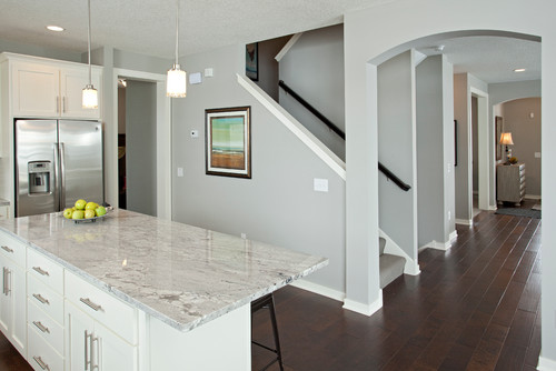 Photo by Robert Thomas Homes – Browse kitchen photos
A Mindful Gray kitchen is gorgeous. Picture this: kitchen cabinets painted in SW Snowbound, Mindful on the walls, beautiful white countertops with gray marbling, and dark hardwood floors. Dream kitchen or what?
The light mid-tone gray on the walls will contrast the light, bright white cabinets and complement the gray marbling in the counters and the dark hardwood floors.
It’s also a fantastic gray paint color to pair with light wood floors.
Mindful Gray on kitchen cabinets.
Cabinets are a great place to show off this fantastic gray paint color. It’s the perfect color to use when you want your cabinets to stand out without being overbearing.

Whether it’s on custom built-in bookshelves in your living room or the lower kitchen cabinets, Mindful Gray SW 7016 will look fabulous just about anywhere you use it.
READ MORE: PAINT COLORS FOR KITCHEN CABINETS
Use Mindful Gray on the exterior.
 Photo by Starr Homes – Browse exterior home photos
Painting your home exterior with Sherwin Williams Mindful Gray is another great place to use this light mid-tone gray paint color.
Since paint colors always look lighter on the exterior of a home, using a mid-tone gray is a great option. It will give the effect of a lighter gray paint color without appearing too light.
In the picture above, The body of the home is SW 7016 Mindful Gray, the shutters are SW 7048 Urbane Bronze, and the trim is SW 7042 Shoji White.
Want More Exterior Paint Color Inspiration?
- Paint Colors for Brick Exteriors
- Fantastic Sherwin Williams Exterior Paint Colors
- Inviting Exterior Colors
- Exterior Color Combinations
- Sherwin Williams Light French Gray- The Perfect Gray?
- Exterior Paint Colors from Benjamin Moore
- Peppercorn Color Review
- Amazing Blue Exterior Paint Colors
- Green Exterior Paint Colors
Sherwin Williams Mindful on furniture
If you are not aware, I love to restore and refinish furniture, and that includes painting it as well. I have used Mindful Gray a handful of times on some of the furniture I have painted. The most recent project I used the color on was a dresser.
I chose it because it looked absolutely stunning against the stained wood drawers.

Don’t start painting until you have the right tools!
SHOP MUST HAVE PAINTING TOOLS
Trim Colors THAT COORDINATE WELL
Mindful Gray is an amazingly awesome gray, so we want to make sure we pair it with an equally awesome trim color. The most popular color for trim and baseboards is white. However, not all white paint colors are created equal.
My favorite white trim colors to use with it are:
- Pearly White
- Pure White
- Extra White
READ MORE: THE 8 BEST WHITE PAINT COLORS FOR TRIM
NEED AN EASY WAY TO REMEMBER WHAT PAINT COLORS YOU USED IN YOUR HOME?
CHECK OUT THIS PRINTABLE PAINT COLOR TRACKER!
Mindful Gray Coordinating Colors
We already know this is a neutral gray, so that means it will coordinate with a number of other paint colors beautifully, including white and black paint colors. I particularly love it paired with darker blue gray colors and rich green colors.
A few of my favorite coordinating colors are:
- Eider Gray SW
- Riverway SW 6222
- Naval SW
- Pearly White SW
- Hamburg Gray SW
- Gale Force SW

I want to note that even though I am singing high praises about this color strip, not all the colors should be used together.
Let me explain.
Repose Gray and Mindful are only a shade apart and the same as Dorian Gray. Being that the colors are so close in shades if they are used together, they will compete with one another.
It’s best to choose colors that are at least two shades darker or lighter. This way, there will be enough of a contrast between them.
Don’t start painting until you have the right tools!
SHOP MUST HAVE PAINTING TOOLS
Sherwin Williams Mindful Gray Color Palette

As I mentioned earlier, Mindful Gray is part of the Sherwin Williams Nurturer Color Collection, which is shown in the picture above. This color palette consists of muted, earthy colors that feel warm and inviting.
This isn’t the only color palette to choose from. You can create your own color palette using some of the coordinating colors I shared.
As we now know, this gray is pretty neutral, making it easy to find colors to work with it. It looks great with darker paint colors as well as lighter ones. Remember to sample the colors to ensure you are happy with the combo.
WHAT’S THE BEST WAY TO SAMPLE THIS PAINT COLOR?
Mindful Gray vs. Repose Gray

Let’s compare these two power colors, Mindful Gray and Repose Gray.
- Repose Gray is a lighter gray that has an LRV of 58, which is slightly higher than Mindful’s LRV of 48.
- Both are neutral grays.
- Neither has strong, overwhelming undertones that steal the show.
- Repose Gray can have very slight purple undertones that come through in certain lighting. I have personally only seen it happen once.
- Mindful Gray can have bluish/green undertones come out in certain lighting.
- Both Mindful and Repose Gray have a great balance between warm and cool undertones, not too warm and not too cool.
To sum up Mindful Gray vs Repose Gray, I think the only glaring difference between the two colors is that Repose is lighter. They are both amazing gray paint colors that are suitable for almost any home.
Don’t forget to pick up these amazing painting tools! They will only make your life easier!
Color Recap – Sherwin Williams Mindful Gray Review
Here’s what we have learned:
- It’s a warm gray paint color, though it doesn’t appear to be too warm.
- Has the perfect balance of warm and cool undertones in it.
- In certain lighting, it can show a bluish undertone it has.
- It has an LRV or 48, not the lightest of grays, yet not the darkest either. It is sitting pretty in the middle of the scale.
- It is found on the same color strip as Repose Gray and Dorian Gray.
- Works well in the kitchen, on the exterior, on cabinets, on walls, and even on furniture.
- Wood tones look amazing with it.
Final thoughts on Sherwin William Mindful Gray SW 7016
It’s safe to say I’m a fan of this gray. Not only because it is on the ultimate paint strip but also because it’s so neutral. Grays are tough to choose. Some may pull too blue, and others will pull too beige. I feel like with Mindful Gray, there is the perfect balance of tones in it.
This neutral gray is a winner in my book. Can you tell I am a super fan?
Interested in More Paint Colors?
- SW Agreeable Gray
- BM Thunder
- Revere Pewter, Still a Favorite?
- The Best Neutrals
- A Great Greige, BM Edgcomb Gray
- Accessible Beige -Is it a Greige?
- BM Gray Owl Review
- Benjamin Moore Balboa Mist
- Benjamin Moore Moonshine – Full Review
- BM Silver Satin Paint Color Review
Don’t Forget!
Finally, as I say in all my paint color posts, make sure you swatch the paint colors you are thinking about using. The colors you see on the computer look different than a swatch on your home. So choose a few colors you want to try and swatch those babies. LARGE swatches, too!
Check out my review on Samplize, it’s an easier, mess-free way to swatch!
Trust me, choosing the wrong paint color is an expensive mistake you do not want to make.
RECENT ARTICLES:
- Sherwin Williams Divine White Review
- The Best Blue Exterior Paint Colors
- BM Chantilly Lace
- BM Pale Oak
- SW Tricorn Black
- Shoji White- Sherwin Williams
- SW City Loft Review
- The Best Mushroom Paint Colors
- SW Sea Salt
- Paint Color Review – Benjamin Moore Boothbay Gray
- Paint Interior Doors – Learn How

