Painting a room seems like an easy enough task. How hard can it be to grab a few brushes and rollers and slap paint on the walls? Honestly, it’s not hard. However, if you want your walls to look like a professional painted them, then you need to be certain you do it the right way. Most importantly, you need to make sure you avoid some of the most common painting mistakes do-it-yourselfers make.
Painting is one very common DIY project that many homeowners tackle themselves. It’s not a super complicated task but it does require some effort in order to achieve the best possible outcome.
Through the years, I’ve seen it all—the good, the bad, and the ugly. Some DIY painting jobs are spectacular, professional-grade jobs. Others, well, let’s just say they were memorable and not in a good way.
My point is that DIYers can get a professional-looking painting job. The key is to know what to do and what not to do.

I want to share the most common painting mistakes do-it-yourselfers make because I feel sometimes it’s much more beneficial to know what NOT to do in this situation.
14 COMMON PAINTING MISTAKES DO-IT-YOURSELFERS MAKE

1. Not sampling paint colors.
Neglecting to sample paint colors is a huge painting mistake do-it-yourselfers make. I’m an avid supporter of testing paint colors. It is the only way for you to truly see how a paint color will look in your home.

READ MORE: HOW TO TEST PAINT SAMPLES
Ok, but why is it a painting mistake?
If you paint your entire room with a paint color and then discover that the color is not what you were expecting, what now? You have to either live with it or repaint the room. That’s time, energy, and money wasted when it could have easily been avoided by sampling a paint color.
Since we are on the topic of testing paint colors, I want to tell you the best possible way you should be doing it.
2. Not doing the prep work.
This mistake is a biggie. You must do the prep work before you put any paint on the walls. Let’s discuss what “prep work” entails.
To start, gather all the painting supplies you will need for the project. If you have ever had a painting company paint for you, you will notice that they always set up all their supplies before doing anything else. They bring it all to where there will be painting or at least within arms reach.
I see DIYers do this all the time. They don’t take the time to gather all the supplies together.
Then, they begin the project only to realize they have forgotten something. Now, they have to stop what they are doing to retrieve what is needed. The back-and-forth is not only wasting time but also creating extra work.
Another problem with not collecting all your supplies prior to getting started is that it sometimes leads to laziness or “trying to figure it out.”
For example, you forgot your ladder, but you don’t want to go get it. In this situation, you may be tempted to try to find something to stand on, which is dangerous. Or you try to reach without it. Either way, it’s a mistake that can easily be avoided by doing the prep work beforehand.
Another part of the paint prep mistake is not inspecting the walls for imperfections like holes, cracks, etc. filling in holes. If you want smooth, beautiful walls, you have to fix imperfections on the walls first. Which usually means spackling, caulking, sanding, etc.
After taking care of the wall imperfections, now is the time to thoroughly clean the walls.
For paint to go on smoothly and to get the best adhesion to the walls, you need to have a clean canvas. Walls should be prepped of all dirt and dust, and debris should be removed. If you prep your walls correctly, you are setting yourself up for the most successful painting experience.
3. Not using drop cloths.
In relation to the prep stage, another super common painting mistake do-it-yourselfers make is not using drop cloths. For some very odd reason, DIYers always skip this step.
Drop cloths are essential for a clean painting job site. Let’s face it: Accidents happen, and when they do, you need to be prepared.

Do you want to know how we can tell when a room is painted by a do-it-yourselfer? Paint splatter. When you see paint splatter on the floors, you can tell it was a DIY paint job. Painting pros ALWAYS use drop cloths, no matter the size of the job.
It may seem like a pain, but the few minutes it takes to put down drop cloths will save you hours of scrubbing stubborn paint splatter off the floors later on.
4. Using low-quality painting tools.
The quality of the tools you use plays a big part in execution, as well as how your paint job will turn out.
Think about it, if you were to use a crappy dull knife while cooking, you are going to struggle to cut and chop, which creates more work and results in not the best-looking presentation.
The same theory applies to painting. You can use the best of the best paint, but if you neglect to use high-quality applicators, that top-notch paint you bought will look no better than the inexpensive kind.
Investing in a high-quality paintbrush will go a long way, just remember to take care of it with proper cleaning.
READ MORE: PAINTING TOOLS THE PROS USE

5. Choosing a lower quality paint.
The paint you use 100% makes a difference in how your walls will look. It’s like the old saying: you get what you pay for. And that doesn’t mean run out a buy Fine Paints of Europe paint though that stuff is top, top, top-notch, it’s not necessary.
I like Sherwin Williams and Benjamin Moore’s paints. They are reliable, and I know what to expect from them: good quality. Like many brands, they have different paint lines to choose from.
Sherwin Williams offers several options: Super Paint, Duration, and Emerald. Benjamin Moore offers Aura, Regal® Select, ben®, and ADVANCE®.
6. Not using a primer.
Not all painting projects require a stand-alone primer, but there are certain cases that do. The easiest way to avoid this painting mistake is to know when to use a primer.
Primer is needed when painting bare drywall. New, clean drywall is porous and soaks up the first coat of paint, so it is necessary to give it a nice base coat of primer.
Use a primer when you are covering dark and vibrant colors. For example, painting a light gray over a dark red. The light gray will not cover the red.
You should also always use a stand-alone primer when you are painting over glossy finishes, wood, plaster, and concrete.
One of the go-to primers we use is KILZ, Which is very reliable and top-notch.

If you are painting over a previously painted surface, you can forgo the stand-alone primer and opt to use an all-in-paint and primer like Sherwin William Super Paint.
7. Only using one coat of paint.
You splurged on great quality paint, so now you think you ought to conserve it and make it last by not using enough or only using one coat. Do not do this!
You need to use enough paint to get an even application. If you don’t, the paint will look uneven and messy. The second coat of paint will completely cover the walls and give you a beautiful finish.

Often, if one coat of paint is used, you are not getting full coverage. This results in the base color bleeding through and altering the new paint color.
Two coats of paint are also favored to ensure a balanced distribution of the paint. The conventional technique is to use two thinner layers of paint to obtain the best, even, and complete coverage.
Durability is also better with two coats of paint.
Don’t skimp on the amount of paint you use. You will end up having to use more paint to fix the uneven coats.
This is one of the most common painting mistakes do-it-yourselfers make.
8. Loading the paintbrush and roller with too much paint.
Dunking your paintbrush into the paint haphazardly will create two problems.
- You get way too much paint on the brush. Too much paint leads to dreaded paint drips.
- Submerging the bristles in the paint will only lead to paint drying and causing a huge pain to clean.

Dip the brush about one-third of the way in the paint, and you should be set. *Bonus Tip* Don’t wipe excess paint off on the side of the can instead, tap the brush,
The same applies to paint rollers. Yes, you want to have a roller fully saturated with paint, but you don’t want it dripping off the roller.
By avoiding this mistake, you will save yourself from a paint drip mess, ruining the quality paintbrush, and the best part is you will be saving paint.
9. Neglecting to use real painter’s tape.
If you want a top-notch, professional-looking painting job, do not skip using real painter’s tape. Taping allows you to get those crisp, clean, straight lines we desire.
Don’t just use any tape, make sure you spend the money on really good quality painter’s tape.
Remember, to prevent paint bleed, fully secure the tape with a putty knife, not your finger.

Painter’s tape is your friend! It’s not just used to edge baseboards and ceilings for a crisp, straight line. It is very handy when you have an element like a wall sconce that cannot be removed from the wall. You can use tape to protect the edges.
10. Not painting in the right order.
Believe it or not, painting walls, ceilings, and trim in the wrong order can cause unnecessary issues such as paint drips and uneven coverage.
Always start by painting the ceiling, then the walls, and finally the trim. When painting the walls, follow this order: top to bottom, left to right.
Want a cheat sheet for painting an interior room? This checklist will ensure you paint your room the right way. Grab a copy now for free!
11. Not allowing the paint to dry.
You have to be patient and give the paint some time to dry before applying another coat. If you don’t, the new coat of paint will pick up the wet spots of the first coat, leaving you with an uneven layer of paint.
What happens when you apply a second coat of paint too soon? You get uneven color, streaks, spots, and peeling paint. This will definitely ruin the work you already performed and the entire project. It will end up costing you more money and paint to fix the mess it made.
Do yourself a favor and make sure the first coat of paint is dry before starting the second coat.
You also want the last coat of paint to be dried before peeling off any painter’s tape that was used. If in, you run the risk of paint bleeds.
Always refer to your paint can for instructions on drying time; this will take all the guesswork out of it.
12. Not cleaning grease, oil, or residue off the walls.
This is a common mistake in kitchens and bathrooms. Obviously, you cook in the kitchen, so there is potential for grease and oil splatter to make its way to the walls. If you were to paint over this without cleaning it first, the paint would not adhere properly.
The bathroom is another place to be mindful of. You may not realize it, but hair spray and other hair products can get on the walls, leaving a residue.
Avoid all headaches by properly cleaning the walls prior to painting.
13. Choosing the wrong paint finish.
Yup, choosing the wrong paint finish can mess up the paint job. Paint finishes aren’t just for looks, they also have a function.
Paint finishes range from flat to glossy, with flat being the least washable and glossy the most washable. Flat is best suited for low-traffic areas, and many painting DIYers make the mistake of using a flat finish everywhere.
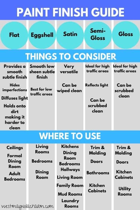
Let’s take a kid’s playroom, for example. A flat paint finish is not ideal for this space. Playrooms tend to be high-traffic areas that require frequent cleaning. You want to choose a durable paint finish so you can easily clean the walls.
Keep in mind that you want to choose the best finish for the space’s function.
14. Failing to keep track of your paint colors
Paint touch-ups are inevitable. They are going to happen. But what makes them worse than they should be is not remembering what paint brand, color, and finish was used.
Make your life simple and use a paint color tracker to keep all your paint colors in one place. This way, you are prepared for when you need to make a touch. Everything you need is at your fingertips.
FINAL THOUGHTS – COMMON PAINTING MISTAKES DO-IT-YOURSELFERS MAKE and SHOULD AVOID
Unfortunately, some painting mistakes are bound to happen. However, some can be prevented if you know how to avoid them. These 14 painting mistakes do-it-yourselfers make are common yet avoidable.
If you are planning on doing a DIY paint job, you need to know what not to do, and the rest will come easily.
Trust me, taking the time to prep, using drop cloths, prime when necessary, investing in quality materials, etc., will benefit you in the long run. You’ll be proud of your DIY paint job, which looks like it was painted by a true professional.
RECENT ARTICLES: