We may earn money or products from the companies mentioned in this post.


Last Updated on May 8, 2026 by Cate
Sherwin Williams Gale Force is a stunning dark blue paint color. This gorgeous color is elegant yet moody and works well in all types of decor styles.
Welcome to another incredible paint color review.
Today’s color is one that I have always loved and admired. It is fantastic for so many reasons, and you’ll learn why as I go through this post.
The absolutely fabulous paint color I am reviewing today is Sherwin Williams Gale Force SW 7605.

WHAT COLOR IS GALE FORCE
SW Gale Force is a blue paint color. Sherwin Williams describes it beautifully.
This moody, dark blue will wrap you in its cool, saturated embrace.
Sherwin Williams
And that is precisely what Gale Force is: a dark, moody blue paint color. Some may consider it to be in the navy blue family. I will agree with that, but I don’t think it’s entirely there. This dark blue has a little more to it.
STATS & LRV
To start, let me get the technical information out of the way.
- LRV: 6
- HUE FAMILY: blue
- COLLECTIONS: Timeless Colors
LRV, what is it?
LRV, or Light Reflectance Value, is a scale used by design professionals to measure the amount of light that is reflected from and or absorbed by a surface. The scale range is 0 to 100, with 0 being absolute black and 100 being pure white.
A great article to read to learn more about LRV is Light Reflectance Value: What Do Those Numbers Mean?

Gale Force has an LRV of 6, which is pretty low. You bet your bottom dollar it won’t be reflecting all too much light.
Hue Family. This is something that can be pretty handy in understanding colors a bit more. It allows you to understand the paint color a bit better, such as what color it may shift to or show in certain qualities of light.
Gale Force comes from the blue hue family.
Finally, Color Collections. To be honest I enjoy seeing what colors in the collections are paired together and how they are grouped. Nothing more to me than selfishly forcing my enjoyment on you.
CONSTANTLY FORGETTING WHAT PAINT COLORS YOU USED IN YOUR HOME? KEEP TRACK OF THEM ALL WITH THIS HANDY PAINT COLOR KEEPER
WHAT ARE THE UNDERTONES OF GALE FORCE?
Gale Force has some blue and sometimes green undertones. Or colors that can possibly be seen
I want to remind you that undertones are subjective and not the same for everyone. Light, fixed elements, and decor colors will affect how the paint color performs.
This information isn’t shared enough, and that’s why I promote sampling paint colors so much, probably to the point of annoyance.
If you are curious about Gale Force’s appearance, you must grab a paint sample and test it in your home. It’s the best way to represent how the paint color will look precisely.
IS GALE FORCE WARM OR COOL?
Sherwin WIlliams Gale Force is a cool-toned paint color.
Determining whether a paint color is warm or cool can sometimes be challenging. You can tell some colors immediately and are left guessing for some.
When you wonder what the paint color’s tone is, I have a tip that can sometimes help you figure it out.
All you need to do is compare the paint color to another.
What this does is allows you to see the warmth or coolness better. Visuals are always helpful, so here’s an example.
Explore More Warm-Toned Paint Colors:
GALE FORCE, LIGHTING & CARDINAL DIRECTIONS
Lighting is one, if not the most, important factor regarding what a paint color will look like.
It broadly affects how you will perceive a paint color. For this reason, it’s a great idea to be knowledgeable about the lighting condition and the cardinal direction of the room you are choosing the right paint color for.

As you can see in the chart, here are the four cardinal directions: north, south, east, and west, with a brief description of how the light looks from each direction.
NORTH-FACING ROOMS – Light in North-facing rooms comes off cooler and somewhat bluish. Lighter colors may appear more muted, while bolder colors will show up or appear sounder.
SOUTH-FACING ROOMS – In South-facing rooms, there tends to be a consistently bright light throughout the day. Warm and cool tones work with south-facing light. This light intensifies colors, so darker colors will seem a bit brighter while softer colors will appear to look like they are gleaming.
EAST-FACING ROOMS – East-facing rooms have the brightest light in the mornings, with a yellow-orange tone. If an east-facing room will be used mainly in the evenings, going with a warm palette will help balance the lack of natural light.
WEST-FACING ROOMS – Early evening is when West-facing rooms have the most favorable light. Warmer tones might seem overwhelming because of the red-orange the light gives off. However, if the primary use for the room is in the mornings, the colors won’t appear as strong as they would in the evening.
SW Gale Force will look a bit more grayed down or muted in a north-facing room. And in a south-facing room, it will look a bit brighter.
It’s important to remember always to take lighting into consideration while choosing a paint color. But you cannot forget the other elements that influence a paint color’s appearance. This includes fixed elements like cabinetry, flooring, tiles, etc., and the decor colors you choose for your home.
WHAT ARE THE BEST LIGHT BULBS TO USE?
Don’t forget about your light bulbs! The color of the light bulbs in your home is commonly overlooked and can affect how a paint color looks.
All lighting affects your paint color regardless of whether it is natural or artificial. But artificial lighting can somewhat be doctored, and that’s with the color of the light bulb you use.
The color of the light bulbs you use will influence how a room’s paint color looks. Unfortunately, this is an important detail that is often overlooked.
With the variety of light bulbs available, it can become overwhelmingly confusing. I mean, what is really soft white and bright white?
Thankfully, it becomes easier once you know a little bit about light bulbs.
For reference, light color or light appearance is measured on the Kelvin (K)temperature scale. Lower Kelvin numbers mean more yellow light; the higher the Kelvin number, the whiter or bluer light.
Remember, lower Kelvin (K) numbers = yellow light, Higher Kelvin (K) numbers = white/blueish light
I always recommend using this type of light bulb.
Be cautious of the light bulb names such as “daylight” or warm light.” I’d advise against picking a light bulb by its name.
Instead, always check the package for actual facts. This allows you to choose the best bulb for you.
[show_shopthepost_widget id=”5029209″]
Don’t forget, as much as lighting plays a significant part in how a paint color will look at times. There are other determinants to be aware of. For instance, decor, furniture, fixtures, cabinetry, and floors. These elements can affect and/or influence how a paint color will look in your room.
HOW CAN I SAMPLE GALE FORCE?
I’m an advocate for testing and sampling paint colors. I wholeheartedly believe it’s a legit way to see how a paint color will react in a room.
There are a few different ways you can sample paint colors. If you want to see how to get the most out of your samples. Grab the sampling paint colors worksheet to help guide you.
LEARN HOW TO TEST YOUR PAINT SAMPLE THE RIGHT WAY.
GRAB A SAMPLING PAINT COLORS WORKSHEET TO LEARN HOW TO GET THE MOST OUT OF YOUR SAMPLES

WHAT IS THE BEST TRIM COLOR TO USE WITH SW GALE FORCE?
SW Gale Force looks terrific with a clean white paint color. That is my favorite trim color to pair it with.
Two fantastic white paint colors would be Extra White and Pure White.
However, It also looks good with off-white paint, such as Greek Villa and Alabaster.
Let me not lead you to believe that Gale Force only looks good with white as a trim color.
You can go the monochromatic route and find a lighter shade of blue to use as a trim color.
There is no set rule regarding what color should be used on the trim. If you sample a color and you love how it pairs with Gale Force, that says it all right there.
WHERE SHOULD YOU USE GALE FORCE?
Dark paint colors like Sherwin Gale Force can sometimes intimidate people. But I’m here to tell you not to be scared of darker paint colors because you can use them anywhere!
When used correctly, they won’t always make a space look smaller. The key is to balance out the dark color. Using lighter decor and furniture can help with this.
And, of course, sample the color first in your home. This will give you an accurate representation of how the color will perform.
Need some inspiration on where to use Gale Force? I got you!
GALE FORCE KITCHEN CABINETS
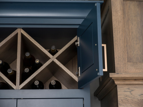
Use it on your kitchen cabinets.
It will make your cabinets the statement of the kitchen without being too bold.
Dura Supreme Cabinetry used Sherwin Williams Gale Force on the kitchen cabinets of one of their projects. And it looks like the color was made for those gorgeous cabinets!
Sara Mir also painted her kitchen cabinets using SW Gale Force.
It looks stunning with the lighter walls. And I think it’s the ideal paint color for light wood floors.

SHERWIN WILLIAMS GALE FORCE ACCENT WALL

Another fantastic way to incorporate this gorgeous blue is by using it as an accent paint color.
Emmylouwho.reads painted the wall behind her bookshelves in Gale Force.
I love this because it adds a pop of color without going overboard.
WALLS
Use Gale Force as an all-over wall paint color.
Nishatailordesign used Gale Force on the walls in her office. The room looks stunning and not dark or heavy. I love the balance this room has.

IS GALE FORCE A GOOD EXTERIOR PAINT COLOR?
Absolutely! Sherwin WIlliams Gale Force is an outstanding exterior paint color!
Deep, rich blues have been such a popular exterior paint color choice lately. I see the color everywhere!
Gale Force is a fantastic exterior color because it has the depth to stand up to the sunlight.

Another fantastic thing about this color as an exterior paint color is that it looks great with brick as well as wood tones.
home_by.holly painted the exterior of her home using SW Gale Force. It beautifully complements the wood features of the home.
Such a stunning color combination. Holly killed it!
READ MORE: PAINT COLORS TO GO WITH BRICK

CHECK OUT SOME OF THESE EXTERIOR PAINT COLOR OPTIONS
SHERWIN WILLIAMS GALE FORCE COORDINATING COLORS
I find darker blues like this are a bit easier to find coordinating paint colors.
A simple method to discover colors that match well together is to consult the color wheel. Complimentary colors are those found directly opposite from one another on the wheel.
For instance, orange is a complementary color to blue.
The color wheel is an incredibly useful tool for creating color schemes.
Here are a few examples of paint colors that work..
- Natural Choice
- Iron Ore
- Natural Tan
- Greek Villa
- Alabaster
- Shitake
WHAT IS THE BENJAMIN MOORE COLOR EQUIVALENT?
I often encounter the question of whether a paint color is equivalent to another brand of paint.
Short answer: no.
There are colors that are very similar to one another, but I haven’t come across an exact dupe.
There are times when some colors are so similar that they are nearly indistinguishable once they are painted on the walls.
But I understand why people ask about equivalents. Sometimes, we don’t have access to specific brands, and if you fall in love with a paint color from that brand, you want to find it elsewhere.
For those who are curious, I have found that Benjamin Moore Blue Note 2129-30 is the closet, spec-wise.

2129-30 BLUE NOTE
WHAT ABOUT COLOR MATCHING?
I wouldn’t say you should, but you certainly can if you want.
If you are considering color matching between brands, do it with a bit of caution.
Brands formulate paint colors differently. This means that if they mix a paint color that isn’t theirs, it has the potential of being slightly off.
If you still want to take a chance, I strongly recommend starting with a sample of the color to start. This way, you can see if the color is what you expected and if you like it.
COLOR COMPARISONS
Reminder* The colors you view on a computer screen do not represent the paint colors themselves. To see the actual color, always swatch your paint samples.
GALE FORCE VS NAVAL

- Naval has an LRV of 4, a tiny bit lower than GF’s LRV of 6
- Naval is a bit darker and has a bit more saturation.
- Gale Force can show a bit of a green/blue
- SW Naval is closer to a true navy blue.
GALE FORCE VS HALE NAVY

- Benjamin Moore Hale Navy has an LRV of 8.36. That’s a smidge higher than GF’s 6
- Hale Navy is from the purple-blue hue family.
- BM Hale Navy is the lighter paint color of the two.
- GF has a bit more saturation.
READ MORE: BENJAMIN MOORE HALE NAVY PAINT COLOR REVIEW
GALE FORCE VS SEA SERPENT

- SW Sea Serpent has an LRV of 7, only one number higher than GF
- Sea Serpent is only a tiny bit lighter.
- Both are very similar in saturation, GF has a pinch more.
WHAT DOES GALE FORCE MEAN?
I find some paint color names to be pretty straightforward and to the point. Others may make you think a bit more about why they were named that way. As for Sherwin Williams Gale Force, I admittedly had to look it up.
For those inquiring minds, here’s what it means.
GALE-FORCE
Meteorologists predicted gale-force winds.
Cambridge Dictionary
GALE FORCE COLOR STRIP
Once again, this is not the most essential information. However, being a paint color nerd, I like seeing the color strip pairings.
- Cascades SW 7623
- Mount Etna SW 7625
- Gale Force SW 7605
- Seaworthy SW 7620
- Deep Sea Dive SW 7618
- Santorini Blu SW 7607
- Marea Baja SW 9185
This is probably one of my favorite paint color strips!
RECAP
Did I give you too much information to handle? I feel the same way, so let me simplify it for you.
Here’s a quick overview of all the information I shared.
- LRV: 6
- HUE FAMILY: blue
- 34.858 7.291 252.039°
- COLLECTIONS: Timeless Colors
- It is a dark, moody blue paint color.
- cool-toned
- The best way to sample is with SAMPLIZE Peel & Stick Paint Samples.
- looks fantastic with a clean white or an off-white trim
- pairs well with many different colors
- can be used just about anywhere, especially on kitchen cabinets
- Makes a fantastic exterior paint color.
- Benjamin Moore Blue Note is a comparable color.
FINAL THOUGHTS
As you may already know, I am a super fan of all blue paint colors, so of course, I love this one.
But aside from my love of blue, I do honestly think Sherwin Willaim Gale Force is a striking dark blue paint color.
It’s not quite a navy blue, which makes it a bit more unique.
Gale Force is a worthy contender if you are hunting for a dark blue. I say grab yourself a paint sample and see it in your home for yourself. I’ll bet you fall in love.
RECENT ARTICLES:
- BM Manchester Tan Paint Color Review
- SW Accessible Beige
- Snowbound Sherwin Williams Review
- Benjamin Moore Boothbay Gray – Color Review
- Paint Interior Doors the Proper Way