We may earn money or products from the companies mentioned in this post.
Discover the timeless elegance of Benjamin Moore’s Classic Gray OC-23, a paint color crafted to transform any space into a sophisticated haven.
I’m so glad you are joining me today for another fantastic paint color review.
I know what you are wondering. What’s the reason behind choosing today’s paint color?
Well, to be honest, there is no reason. I was rummaging through my Samplize samples and thought, ‘Hey, that’s a great color”.
Not a compelling reason, but a truthful one.
Anyway, the absolutely fabulous paint color I’m blabbing about is Benjamin Moore Classic Gray OC-23.
WHAT COLOR IS CLASSIC GRAY?
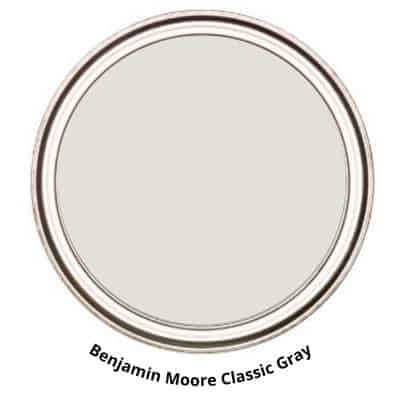
Benjamin Moore’s Classic Gray OC-23 is a soft, light, near-neutral paint color that exudes timeless sophistication and understated beauty.
This versatile shade is a perfect blend of gray and beige, offering a neutral yet warm tone that complements a wide range of design styles.
Classic Gray is relatively light and, in certain lighting conditions, tends to look almost white.
Benjamin Moore describes it as,
An ultra-light shade of gray that can also function as an off-white.
Benjamin Moore
Depending on the lighting source, Classic Gray can look gray or beige. For example, in a south-facing room, the warm tones will be accentuated, and it will appear more on the beige side.
Classic Gray OC-23 is Also Known As 1548.
Another thing to note about how it looks is it could feel a little flat in a dark room. In a super bright sunlit room, Classic Gray can possibly wash out a tad, but in a room with balanced light, it is exquisite!
CLASSIC GRAY LRV 73.67
Shall we talk about LRV? Let me explain what it is and why it is significant.
LRV, or Light Reflectance Value, is a measurement commonly used by design professionals that measures the amount of light reflected from and absorbed by a surface. LRVs range from 0 -100, with 100 being pure white and 0 being absolute black.
A great article with more in-depth information about LRV is Light Reflectance Value: What Do Those Numbers Mean?
Classic Gray has a relatively high Light Reflectance Value (LRV) of 73.67, indicating that it reflects a substantial amount of light.
CLASSIC GRAY HUE FAMILY – YELLOW
Understanding the hue family of a paint color is valuable as it provides insight into its origin and potential color shifts in different lighting. Being aware of these details can enhance your overall painting experience.
BM Classic Gray is from the yellow hue family.
KEEP TRACK OF YOUR PAINT COLORS

IS BM CLASSIC GRAY A WARM OR COOL TONED PAINT COLOR?
Classic Gray is a warm-toned paint color. Some may even describe it as a greige paint color, a mix of gray and beige.
I wouldn’t exactly say it’s overly warm-toned. I’d say it’s pretty balanced.
However, you need to keep in mind that lighting has a significant role in how Classic Gray will appear. For example, some lighting conditions will cause this light paint color to appear almost beige. This is why you have to be familiar with the lighting!
A tip you can use when you are struggling with whether a paint color is warm or cool is to compare paint colors.
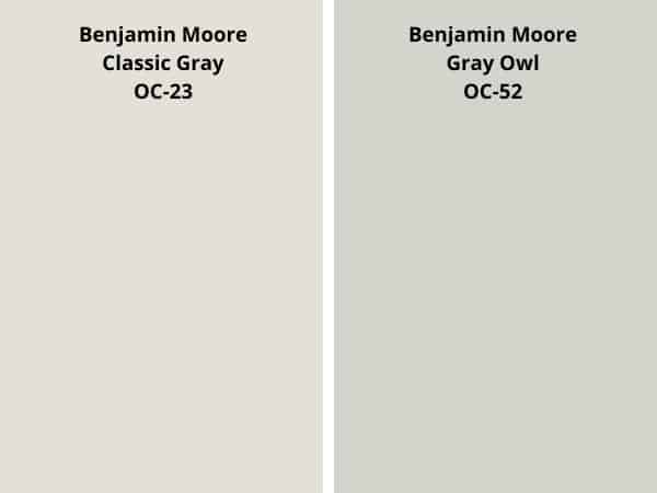
For example, let’s take Classic Gray and compare it to Gray Owl.
When they are next to one another, you can point out the Gray Owl is more cool-toned.
Like Cool-Toned Paint Colors? Check These Out!
- Sherwin Williams Lazy Gray
- Benjamin Moore Moonshine
- The Best SW Cool-Toned Paint Colors
- SW Silverpointe
- BM Coventry Gray
- Stonington Gray BM
- Sherwin Williams Reflection
- Boothbay Gray BM
Another way to determine a paint color’s tone is to sample it in your home. This will give you the most accurate representation of how the paint color will look.
WHAT ARE THE UNDERTONES OF CLASSIC GRAY?
Benjamin Moore Classic Gray has green undertones or colors that are visible in specific lighting and exposure.
Like all gray paint colors, Classic Gray is influenced by all the elements around it, such as lighting, decor, and even what is outside your window.
Certain shades of gray may appear unassuming at first, but their undertones can create disturbances when exposed to uneven lighting. In the case of Reflection, these undertones may manifest as a shade of purple.
Checking how paint colors look in your home can prevent any unwanted surprises. Swatching the colors before painting can help you make an informed decision on whether or not you like it.
CLASSIC GRAY, CARDINAL DIRECTIONS, AND LIGHTING
Lighting is one of the most important factors when it comes to how a paint color will look in your home.
It primarily impacts how you will perceive a paint color. Because of this, it’s a fantastic idea to know the lighting circumstances and the cardinal direction of the room you are choosing the right paint color for.
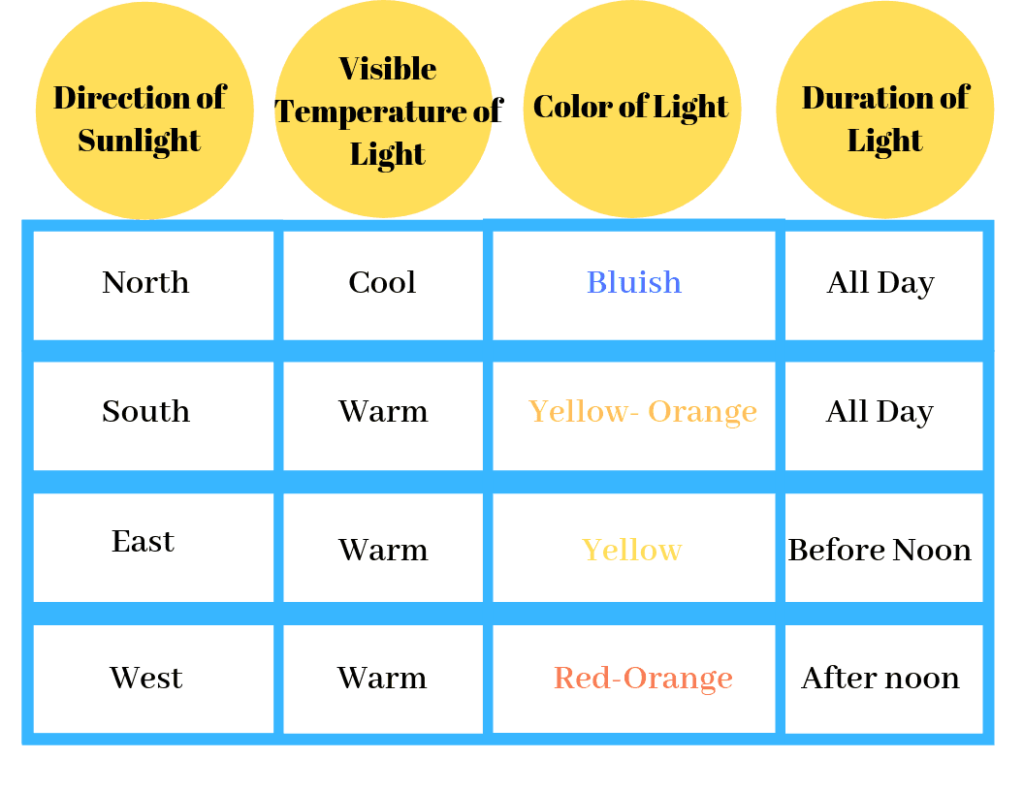
The table shows the four cardinal directions: north, south, east, and west, with a brief description of how the light looks from each direction.
Classic gray in North-Facing Rooms:
In north-facing rooms, the natural light is typically cooler and less intense throughout the day. Benjamin Moore Classic Gray can take on a slightly cooler and softer appearance in these spaces. The gray undertones may become more prominent, giving the room a tranquil and serene ambiance. This color is a good choice for north-facing rooms as it maintains a sense of lightness without becoming overly cold.
Classic Gray in South-Facing Rooms:
South-facing rooms receive abundant natural light throughout the day. Benjamin Moore Classic Gray in a south-facing room can appear warm and inviting. The natural light will enhance the warm undertones in the paint, creating a cozy and comforting atmosphere. This color is versatile in south-facing spaces, as it can adapt to the changing light conditions and offer a welcoming environment.
Classic Gray in East-Facing Rooms:
Rooms facing east receive morning sunlight, and Benjamin Moore Classic Gray can look fresh and airy in these spaces. The paint color may appear slightly brighter and cooler in the morning, making the room feel crisp and revitalizing. As the day progresses, the color might warm up as it receives more direct sunlight.
Classic Gray in West-Facing Rooms:
West-facing rooms get warmer afternoon light. Benjamin Moore Classic Gray can appear rich and comforting in the afternoon sun. The warm undertones may become more pronounced, adding a sense of coziness to the space. This color choice works well in west-facing rooms, creating a relaxed and inviting ambiance.
When selecting a paint color, it’s important to consider lighting. Nonetheless, it’s also crucial to consider other factors that can impact how the color appears.
This includes fixed features like cabinetry, flooring, tiles, etc., and the decor colors you choose for your home.
WHAT ARE THE BEST LIGHT BULBS TO USE?
Just as natural light affects paint colors, so does artificial lighting.
The color of the light bulbs you use will influence how a room’s paint color looks. Unfortunately, this is an important detail that is often overlooked.
With the variety of light bulbs available, it can become overwhelmingly confusing. I mean, what is the difference between soft white and bright white?
Thankfully, it becomes easier once you know a little bit about light bulbs.
For reference, light color or light appearance is measured on the Kelvin (K)temperature scale. Lower Kelvin numbers mean more yellow light; the higher the Kelvin number, the whiter or bluer light.
Remember, lower Kelvin (K) numbers = yellow light, Higher Kelvin (K) numbers = white/blueish light
I always recommend using this type of light bulb.
Be cautious of the light bulb names such as “daylight” or warm light.” I’d advise against picking a light bulb by its name.
Instead, always check the package for actual facts. This allows you to choose the best bulb for you.
Don’t forget, as much as lighting plays a significant part in how a paint color will look at times, there are other determinants to be aware of. For instance, decor, furniture, fixtures, cabinetry, and floors. These are all elements that can affect and/or influence the way a paint color will look in your room.
WHAT IS THE BEST WAY TO SAMPLE?
As someone who respects the importance of choosing the right paint color for a room, I highly recommend testing and sampling various options.
This step in the painting process is often overlooked, but it can provide a tangible idea of how the color will appear in the space. Neglecting this step seems impractical to me.
LEARN HOW TO TEST YOUR PAINT SAMPLE THE RIGHT WAY.
GRAB A SAMPLING PAINT COLORS WORKSHEET TO LEARN HOW TO GET THE MOST OUT OF YOUR SAMPLES

WHAT IS THE BEST TRIM COLOR FOR BENJAMIN MOORE CLASSIC GRAY?
Choosing a trim paint color to go with Benjamin Moore Classic Gray does not have to be complicated.
Look for colors that have the same tone or hue family. This ensures that colors will coordinate well.
Generally, trim paint colors are white. So, I have a few white paint colors to share that work well with Classic Gray.
- OC- 117 Simply White
- OC-17 White Dove
- OC-151 White
Don’t think white is the only trim color you can use.
Consider using a darker color to create a sense of drama and contrast in the room. If you prefer a monochromatic look, consider using the same paint color for both the walls and trim, but opt for different finishes.
READ MORE: BEST WHITE TRIM PAINT COLORS
WHERE TO USE CLASSIC GRAY?
Classic Gray OC-23 is a gentle and soothing color that can bring a welcoming and peaceful atmosphere to any room. Its subtle shade blends effortlessly with different color schemes and accent pieces, making it perfect for modern and classic interiors.
I like to say if you went through the steps of swatching and testing the paint color in your room and you like how it looks, then that’s the perfect place for that paint color.
There aren’t rules and laws you must abide by when it comes to paint colors. Have fun and create a space you love and enjoy.
LIVING ROOM
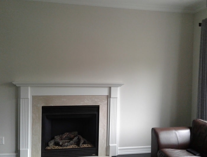
The living room is a fantastic place to use the lovely Classic Gray.
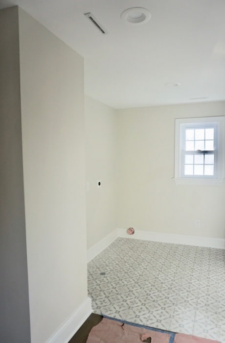
Taylorbritain painted their walls with Classic Gray. Here, the color looks soft and neutral.
BEDROOM
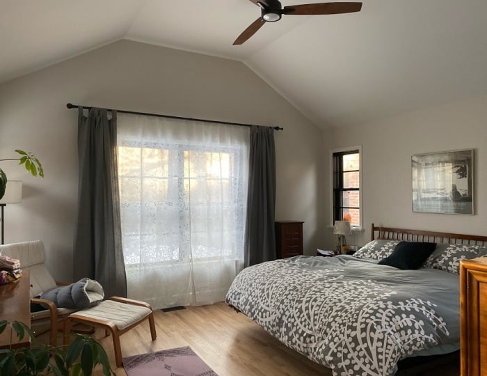
If you are looking for a light, sophisticated, neutral paint color for your bedroom, Classic Gray will fit the bill.
Stacy Lynn used Classic Gray in her bedroom, and it creates such a beautiful backdrop for the decor in the room.
READ MORE: SOOTHING BEDROOM PAINT COLORS
BATHROOM
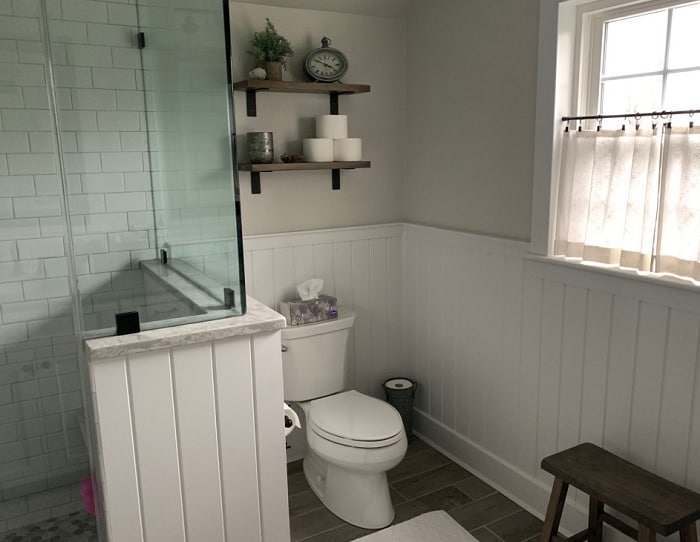
The bathroom is another fantastic place to use CG.
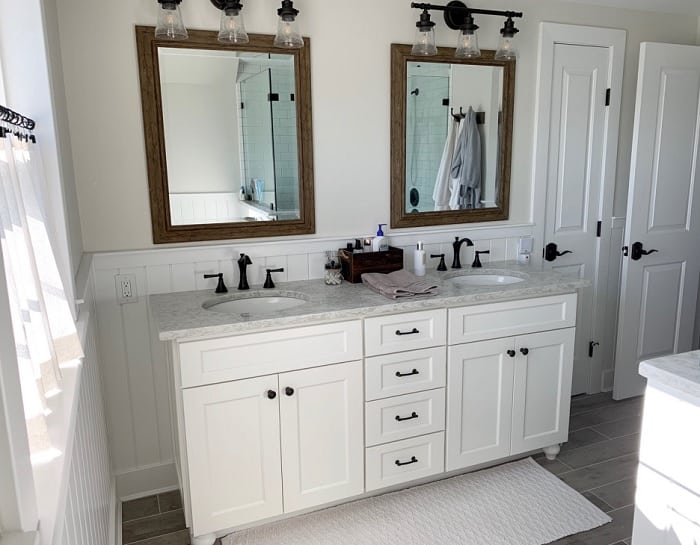
Cdisimone painted the upper half of the walls in her bathroom using BM Classic Gray. Adding this soft, neutral tone can bring an elegant and peaceful vibe to the surroundings.
KITCHEN
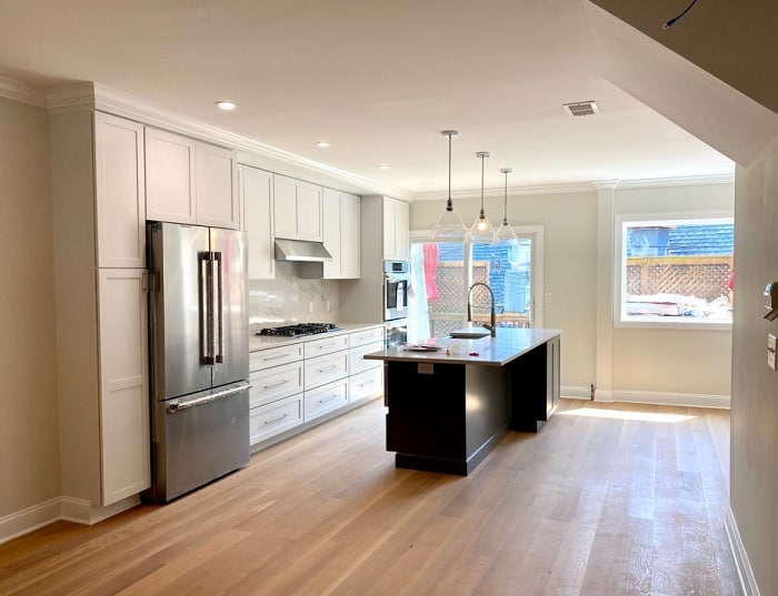
Karen Rose did it. She went with Classic Gray in her south-facing kitchen. The southern light gives the paint color a beige cast.
It’s also a beautiful paint color to complement her light wood floors.
READ MORE: THE BEST KITCHEN CABINET PAINT COLORS
IS CLASSIC GRAY A GOOD EXTERIOR PAINT COLOR?
It’s not whether Classic Gray is a good exterior paint color; the question is, is it a good exterior paint color for your home, and what are you looking for?
The case with paint colors on the exterior of a home is that the paint color will always look lighter in the sunlight.
A very light paint color like this will appear to look white and wash out a bit. This is because the color doesn’t hold enough depth to withstand the sun.
That being said, that doesn’t mean it’s a good or bad exterior paint color.
If you know how colors behave, have tested them on the exterior of your home, and are satisfied with the results, then the paint color is suitable for your home.
CHECK OUT SOME OF THESE EXTERIOR PAINT COLORS:
- Sherwin Williams Exterior Paint Colors
- Amazing Benjamin Moore Exterior Paint Colors
- Inviting Exterior Paint Colors
- The Best Blue Exterior Paint Colors
- Paint Colors that go with Brick
WHAT IS THE SHERWIN WILLIAMS EQUIVALENT TO BM CLASSIC GRAY?
I frequently come across this question: Is there a matching paint color available in another brand?
Unfortunately, there isn’t.
Sometimes, specific colors can look very similar once they are painted on walls, making it difficult to tell them apart. However, I haven’t come across an exact duplicate yet.
I understand why people want to find equivalents when certain brands are not available. It can be frustrating when you find a paint color you love from a brand that’s not accessible in your area, and you want to find a similar color elsewhere.
Not to mention the frustration of finally finding a paint color you love only to learn you can’t use it.
So, for everyone interested, I have found one Sherwin Williams paint color that is comparable to BM Classic Gray.
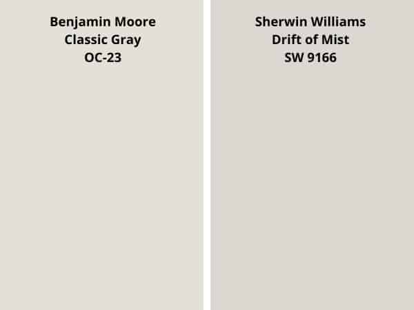
As I said close but not exact. And remember, the colors shown on the screen are not an exact representation of the paint colors.
To see the true colors, you need to sample the paint colors with real paint in your home.
SHOULD YOU COLOR MATCH?
If you decide to try your hand at color matching, that’s entirely up to you.
There is nothing wrong with it, and there is a chance the color you get is exactly what you hoped for.
I am a bit uncertain about color matching because different brands have unique formulations for paint colors. Consequently, mixing a paint color that doesn’t belong to a particular brand may result in a slightly different shade.
If you are willing to give it a shot, I highly recommend starting with a small sample of the color. This approach allows you to verify whether the color matches your expectations.
CLASSIC GRAY COORDINATING COLORS
Benjamin Moore’s Classic Gray is a versatile and neutral paint color that can beautifully coordinate with a range of other shades. Here are some Benjamin Moore paint colors that work harmoniously with Classic Gray:
- White Dove OC-17
- Revere Pewter HC-172
- Hale Navy HC-154
- Edgecomb Gray HC-173
- Simply White OC-117
- Kendall Charcoal HC-166
- Nightfall 1569
- Stone Harbor 2111-50
These coordinating Benjamin Moore paint colors can be used for accent walls, trim, or as part of a complementary color scheme to enhance the beauty of Classic Gray and create a cohesive and visually appealing atmosphere in your home.
COLOR COMPARISONS
Who doesn’t love a good comparison? Paint color, that is.
I like to do this when reviewing colors. It’s interesting to see how some popular paint colors stack up to one another; like are they similar? Are they completely opposite? Things like that.
Who knows, it can possibly help you decide on a paint color.
Let’s get into comparing!
CLASSIC GRAY vs PALE OAK
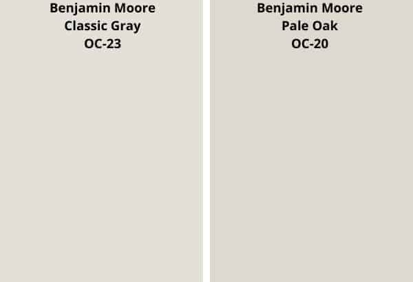
- Pale Oak OC-20 has an LRV of 68.64, a bit lower than CG’s 73.67.
- BM Pale Oak is the darker paint color of the two.
- Both are from the yellow hue family.
- Pale Oak is the more saturated of the two.
- Both colors can show a pinch of purple in unbalanced lighting.
READ MORE: BM PALE OAK FULL PAINT COLOR REVIEW
CLASSIC GRAY vs AGREEABLE GRAY
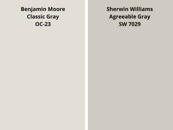
- Agreeable Gray has an LRV of 60, that’s lower than CG’s 73.67.
- Agreeable Gray is the darker paint color of the two.
- Both paint colors are from the yellow hue family.
- SW Agreeable Gray is a bit more saturated.
- Both colors can be considered greige.
READ MORE: AGREEABLE GRAY- FULL PAINT COLOR REVIEW
CLASSIC GRAY vs BALBOA MIST
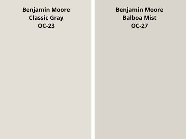
- Balboa Mist is a bit cooler in tone.
- The LRV of Balboa Mist is 65.53, lower than Classic Gray’s 73.67.
- Both have that slight chance of shifting or flashing lavender in specific lighting.
- CG is the lighter paint color
- Both paint colors are similar in saturation.
READ MORE: BENJAMIN MOORE BALBOA MIST PAINT COLOR REVIEW
CLASSIC GRAY vs EDGECOMB GRAY
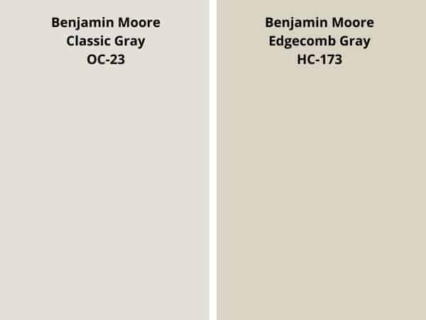
- Edgecomb Gray HC-173 is the warmer paint color of the two.
- Edgecomb had an LRV of 63.09, which is a bit lower than Classic’s 73.67.
- BM Edgecomb Gray is the darker paint color of the two.
- Edgecomb Gray is a more saturated of a paint color.
READ MORE: EDGECOMB GRAY COLOR REVIEW
CLASSIC GRAY vs GRAY OWL

- Gray Owl has an LRV of 64.51, lower than CG’s 73.67
- Between the two paint colors, Gray Owl is darker.
- Gray Owl is cooler in tone.
- Classic Gray is more saturated.
- Gray Owl has blue/green tones to it.
READ MORE: GRAY OWL PAINT COLOR REVIEW
RECAP
You have successfully made it to the recap point of the color review. Or did you just jump to this point? Either way, you are here. So, let me just give a brief recap of all the ins and outs of Classic Gray OC-23.
- LRV – 73.67
- Hue Family – yellow
- Color Collections – Off-White Collection
- Also Known As 1548
- has green undertones
- In specific lighting, it may flash a shade of purple.
- it is warm-toned
- can be considered a very light greige
- Using SAMPLIZE Peel & Stick Paint Samples is the best way to test the color.
- Simply White and White Dove are good trim colors
- It can be used anywhere, especially in living rooms.
- It looks great with wood tones.
- Drift of Mist is the Sherwin-Williams equivalent.
FINAL THOUGHTS
Experience the unchanging sophistication of Benjamin Moore’s Classic Gray OC-23. This paint color is skillfully designed to elevate any room into a refined sanctuary.
With its subtle tones and versatile nature, this shade strikes the perfect balance between warmth and neutrality. Whether you want to create a serene sanctuary or a refined backdrop for bold accents, Classic Gray harmonizes effortlessly with any design style.
Let this enduring hue envelop your walls, bringing a sense of calm and refinement to your home. Elevate your space with this amazing paint color and unlock a world of understated beauty.
EXPLORE MORE PAINT COLORS:
- Sherwin Williams Granite Peak
- Benjamin Moore Boothbay Gray Review
- Paint Colors that go with Light Wood
- How to Paint Interior Doors
- The Best Cream Paint Color
- 2024 Benjamin Moore Trending Paint Colors
- The Best Green Gray Paint Colors
- Eider White – Not Another White Paint Color
