We may earn money or products from the companies mentioned in this post.
Dorian Gray SW 7017 is one of Sherwin Williams’s top 50 best-selling paint colors. The reason is, that it is a versatile neutral gray. It’s more of a mid-tone gray so it’s not too dark, nor is it too light. This beautiful soft yet strong gray is a favorite among designers.
Hello all and welcome to another super in-depth paint color review. If you have read any of my other color reviews I dig deep into the colors and share everything you need to know about the color.
Today’s paint color was inspired by my need to always change things. Allow me to quickly explain a little further.
I had a new bathroom installed on the main level of my home last year. It turned out beautifully and I couldn’t be happier. However, there was something off. I changed the mirror and switched up the art but that wasn’t it. I finally realized it was the paint color that was off.
What did I do? I searched for a new paint color, grabbed my favorite paintbrush, and got to painting,
And the color that transformed my bathroom is,
SHERWIN WILLIAMS DORIAN GRAY SW 7017

Dorian Gray was the absolute perfect fit for my bathroom, it brought it to life.
Let’s just get right into it already, starting with the stats.
STATS
- LRV: 39
- HUE FAMILY: CIE-L*Ch(ab) = 69.499 4.758 96.016°
- HUE FAMILY – YELLOW
- Color Collections: Senior Living Cool Foundations, Acute Care Cool Foundations, Living Well – Renew, Top 50 Colors
So LRV, what is it?
LRV, or Light Reflectance Value, is a measurement commonly used by design professionals that measures the amount of light reflected from or absorbed into a surface. LRVs range from 0-100, with 100 being pure white and 0 being pure black.
LEARN MORE ABOUT LRV: Light Reflectance Value: What Do Those Numbers Mean?
Dorian Gray has an LRV of 39. This indicates that it will not reflect much light.
Knowing the LRV of a color is helpful however it is 100 percent not the end all be all. You have to remember to take into account the other elements of the space you are painting. For example, the amount of light, type of lighting, and the fixed and decor elements. These, as well as LRV all, play a critical part in how a paint color will look in your room.
The hue family that Dorian Gray comes from is yellow.
The hue family is valuable to know because it allows you to know where the color comes from. Unlike undertones which are merely perspective, the paint color’s hue family stems from scientific data.
Finally, I love sharing the color collections because for me it gives me a bit of inspiration.
WHAT COLOR IS SHERWIN WILLIAMS DORIAN GRAY?
You may have guessed this but SW Dorian Gray is a gray paint color. Let me elaborate.
Sherwin Williams Dorian Gray is a mid-toned gray paint color. Not too dark nor too light.
It is elegant and has a good amount of depth to it. It’s also quite soft and sophisticated.

There are also no particularly strong undertones pulling it one way or another as you see in some other gray paint colors. Though, Dorian Gray may flash or show some undertones in certain lighting situations. Overall, It’s a terrific versatile gray paint color that stays relatively neutral for the most part.
WHAT UNDERTONES DOES DORIAN GRAY HAVE?
Dorian Gray has slight purple undertones. But, Let me stop you right there before you dismiss Dorian Gray as a paint color option.
Near neutrals in this hue color family have the tendency to shift in imbalanced light.
Undertones are merely perspective, so if you have an imbalanced lighting situation, you may see Dorian Gray showing a bit of purple. Whereas, if you have daylight/lighting which is rather evenly balanced in all lightwaves, it will appear just as a neutral medium gray.
I always suggest sampling a paint color in the room you plan on using it. That is the only way to see how the light (balance or not) will affect the color. And it will permit you to see how the color will truly look in your space.
IS IT A WARM OR COOL PAINT COLOR?
Dorian Gray is considered a warm gray paint color. It comes from the yellow hue family which is where that bit of warmth comes from. But let me say, it’s a tiny bit of warmth that can come through. It’s definitely not the warmest gray you will find.
If you are ever struggling to figure out whether or not a paint color is warm or cool, grab a paint color with a tone that you are familiar with.
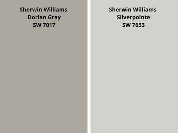
For Example, let’s take Dorian Gray and compare it to SW Silverpointe. In a side-by-side comparison, you can see that Dorian Gray is warmer in tone.


Now if we take DG and compare it to Accessible Beige, you see that DG is cooler in tone.
Comparisons are super helpful when it comes to figuring out if it is warm or cool.
SHERWIN WILLIAMS DORIAN GRAY AND LIGHTING
We know that lighting is one of the main factors contributing to how a paint color will look. It can virtually change the appearance of any color. That’s a big deal when you are trying to choose the right paint color. So, it’s best you are familiar with the lighting situation of the room you are finding a paint color for.
North-facing rooms – North-facing rooms tend to have light that shows cooler and even somewhat blueish in tone. Paint colors that are on the lighter side will appear a bit muted whereas bolder dark colors will pop and embrace that cooler light.
South-facing rooms– In South-facing rooms, there tends to be a consistent warm light throughout the day. Warm and cool tones work nicely with south-facing light. This light intensifies colors, so darker colors will seem brighter while, softer colors will look like they are gleaming.
West-facing rooms– Light is cooler in the morning and warmer or brighter in the afternoon/ early evening. Early evening is when West-facing rooms have the best light. Warmer tones might seem overwhelming because of the red-orange the light gives off. However, if the main use for the room is in the mornings, the colors won’t appear as intense because of that cooler light.
East-facing rooms– Light is warmer or brighter in the mornings and cooler in the afternoon/evenings. An East facing room’s bright morning light is more yellow-orange toned. Going with a warm palette will help balance the lack of natural light in the evening.
Let’s not forget about our light bulbs! They also have an influence on how your paint color will look.
WHAT ARE THE BEST LIGHT BULBS TO USE?
Natural light affects paint colors and guess what? So does artificial lighting.
The color of the light bulbs you use will affect how a paint color will look in a room. And unfortunately, it’s an essential detail that is frequently overlooked.
With the variety of light bulbs available and it can become overwhelmingly confusing. I mean what really is the difference between a soft white and bright white?
Thankfully finding the right light bulbs becomes easier once you know a little bit about them.
For reference, light color or light appearance is measured on the Kelvin (K)temperature scale. Lower Kelvin numbers mean more yellow light; the higher the Kelvin number the whiter or bluer light.
Remember, lower Kelvin (K) numbers = yellow light, Higher Kelvin (K) numbers = white/blueish light
I always recommend using this type of light bulb.
[show_shopthepost_widget id=”4743870″]
Be cautious of the light bulb names such as “daylight” or warm light”. I’d advise against picking a light bulb by its name.
Instead, always check the package for actual facts. This allows you to choose the best bulb for you.
Don’t forget, as much as lighting plays a major part in how a paint color will look at times, there are other determinants to be aware of. For instance, decor, furniture, fixtures, cabinetry, and floors. These are all elements that can affect and/or influence the way a paint color will look in your room.
WHAT’S THE BEST WAY TO SAMPLE DORIAN GRAY SW 7017?
The one thing I ALWAYS say and advise is to sample your paint colors. Sampling your paint colors is honestly the only way you will see how that particular color will look in your space.
Yes I know, saw your favorite Influencer post a picture of their beautiful gray walls and it’s the color you want. But their home is not the same as yours. You may have more light than they do, they may have shades of green throughout their room whereas, you have shades of yellow. These are all details that matter when choosing a paint color.
So what’s the best way to sample Dorian Gray?
Samplize Peel & stick paint samples!
WHAT IS THE BEST TRIM COLOR TO USE WITH SW DORIAN GRAY?
I am a sucker for a white trim color. It’s classic yet simple and clean. Plus it really pops. Dorian Gray is a great color to pair with a white trim. Since it is on the darker side, there is a beautiful contrast between the colors and as I said before, it pops.
You can opt for a bright white like SW Extra White for a fresh, clean, and crisp look. Or you can use a white with a touch of warmth like Alabaster. Both are beautiful options.

In my bathroom, I have SW Pure White as the trim and ceiling color.
READ MORE: THE BEST WHITE PAINT COLORS FOR TRIM
That being said, painting your trim white isn’t the only option you have.
You can also go with a monochromatic look and use Dorian Gray as both the wall and trim color. A way to slightly change the look of the trim is by choosing a different sheen or finish. This will give a small differentiation between the wall and trim.
You can also go a bit bolder with a black paint color like Caviar or Tricorn Black. This will give you a bold contrast.
Finally, Repose Gray is a great option if you want more of a distinction between the wall and trim.
WHERE TO USE SW 7017 DORIAN GRAY?
You can use Dorian Gray wherever you like. The beauty of decorating and painting is that there are no set-in-stone rules. I feel as though we worry way too much about the right and wrong with decorating. But in reality, if you are happy with your color choice, that is all that matters.
That being said there are a few places I love to see Dorian Gray painted.
- KITCHEN CABINETS
- BATHROOM
- BOARD AND BATTEN
- LIVING ROOM
- BEDROOM
- HOME OFFICE
KITCHEN CABINETS
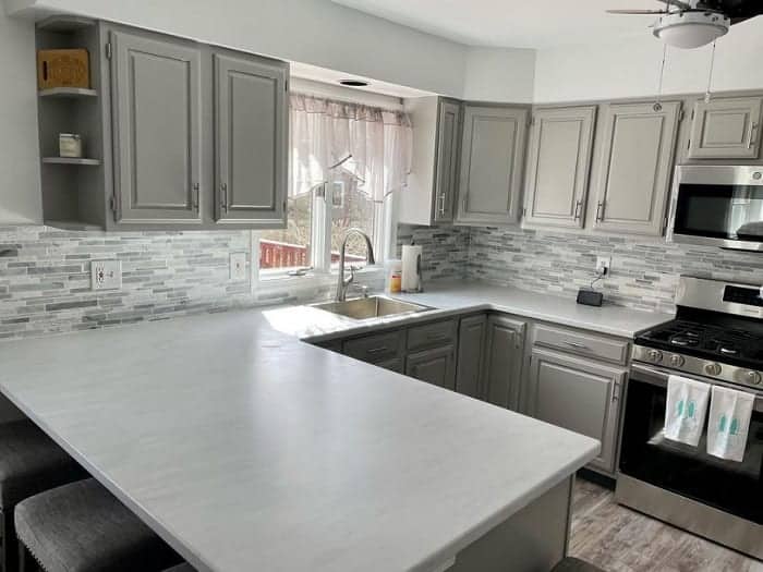
Of course, the kitchen cabinets are the perfect place to use SW Dorian. It’s the perfect neutral gray option that is more or a medium shade of gray.
Erin Hart @hartwares is an extremely talented painter. Seriously, go check out her work. She painted the kitchen cabinets in the photo with Dorian Gray. The overall look and feel of the kitchen is quite clean and classic. It is gorgeous.
DOORS & TRIM
Yes! Paint your trim with Dorian Gray. It is such a fabulous way to use the color.
Ben & Elenie @annacreekcottage paint the trim in their gorgeous home using SW Dorian Gray. It gives the space a modern yet classic feel. It also looks amazing with dark wood floors. It’s safe to say I’m kind of obsessed with this look.
READ MORE: PAINTING INTERIOR DOORS
IS SHERWIN WILLIAMS DORIAN GRAY A GOOD EXTERIOR PAINT COLOR?
Yes, Yes, Yes. I absolutely love Dorian Gray as an exterior paint color option.
With the depth it has, it can certainly hold up in the sunshine. It will not look as dark on the exterior as it would in say a bathroom. But it won’t look too light.
Angie @the.painted.piano painted the exterior of her home with DG. First and foremost, her home is stunning, and secondly, the color looks absolutely perfect.
You can see in the photos how Dorian Gray looks in both sunlight and on a cloudy day. The sunlight adds a bit of warmth to the color, whereas on a cloudy day, the color looks more like a cool-toned gray.
Isn’t it wild how lighting affects the color?
Find More Exterior Paint Color Inspiration:
- The Best Benjamin Moore Exterior Paint Colors
- Great Sherwin Williams Paint Colors for the Exterior
- Exterior Colors Combinations
- Inviting Exterior Paint Colors
- Paint Colors that go with Brick Exteriors
- SW Dovetail – A Great Exterior Paint Color
- SW Lazy Gray
- Boothbay Gray
WHAT IS THE BENJAMIN MOORE EQUIVALENT TO SHERWIN WILLIAMS DORIAN GRAY?
Sometimes, you can’t get your hands on a certain paint brand. Whether it’s due to brand loyalty, your painter only using one particular brand, or you just don’t live near one or the other. Whatever the reason, it’s’ helpful to know a paint color’s equivalent.
When it comes to Dorian Gray, I found one Benjamin Moore color that is quite similar.
1474 CAPE MAY COBBLESTONE – Benjamin Moore Classic colors
LRV: 40.14
I do this for a ton of paint colors and this one is a pretty dang close match.
But are they the same? No. But they have similar specs and if you like the one you may like the other.
If you were considering color matching Dorian Gray in Benjamin Moore paint, I firmly recommend purchasing a sample of the mixed Benjamin Moore formula before moving forward on a full gallon.

My advice here is to find a color that you like within the brand itself.
Often when you attempt to color match between paint manufacturers, the colors don’t come out the same. This is because each brand uses different formulas to create its paint colors.
It’s much easier to find a color from the brand itself than to go through the hassle and possible disappointment that can come from color matching.
DORIAN GRAY PAINT DECK COLOR STRIP
- REPOSE GRAY
- MINDFUL GRAY
- DORIAN GRAY
- ACIER
- DOVETAIL
- GAUNTLET GRAY
- BLACK FOX

WHAT COLORS GO WITH DORIAN GRAY?
Neutrals tend to be the easiest to coordinate colors with. So, of course, SW Dorian Gray looks good with all sorts of colors.
I love pairing DG with a rich blue like SW Gale Force or a softer color like SW Sea Salt. It also looks lovely with green paint colors.
A few others that pair well with DG are:
- EIDER WHITE
- REPOSE GRAY
- SERIOUS GRAY
- SKYLINE STEEL
- INKY BLUE
- JASPER STONE
It’s also a lovely paint color to pair with light wood.
DORIAN GRAY VS REPOSE GRAY

- Repose Gray has an LRV of 58 which is a bit higher than DG at 39
- Both paint colors are from the yellow hue family
- These two colors are on the same color strip in the Sherwin Williams paint deck
- Repose Gray, as well as Dorian Gray both, can flash purple in certain lighting.
READ MORE: FULL REVIEW SHERWIN WILLIAMS REPOSE GRAY
DORIAN GRAY VS DOVETAIL

- Dovetail has an LRV of 26, A few points lower than Dorian
- Both colors are in the yellow hue family
- Dovetail is less saturated and darker
- These two colors are on the same color strip in the Sherwin Williams paint deck
- The colors also complement one another nicely.
READ MORE: FULL REVIEW SHERWIN WILLIAMS DOVETAIL
DORIAN GRAY VS MINDFUL GRAY

- 75.063 5.333 94.509°
- Mindful Gray has an LRV of 48, which is not too much higher than DG
- Both are in the yellow hue family
- These two colors are on the same color strip in the Sherwin Williams paint deck
- Mindful Gray is the lighter of the two colors.
- I wouldn’t use these two together since they are so close.
READ MORE: FULL REVIEW OF SHERWIN WILLIAMS MINDFUL GRAY
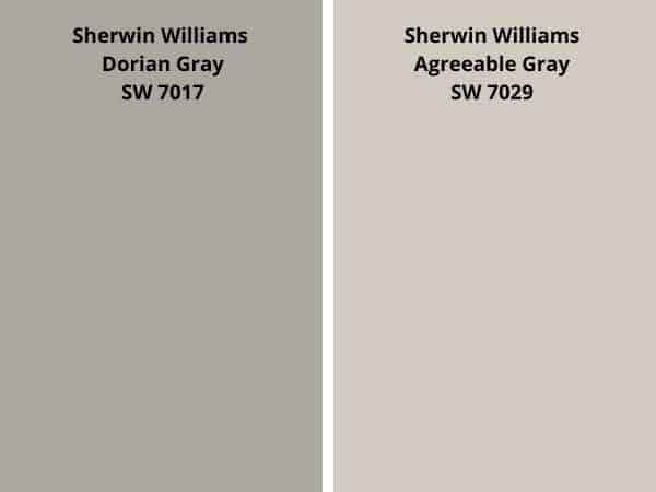
DORIAN GRAY VS AGREEABLE GRAY

- Agreeable Gray has an LRV of 60, higher than Dorian Gray’s 39
- Agreeable Gray is lighter
- Dorian Gray can flash purple in certain light whereas Agreeable can flash blue or green
- Agreeable Gray is more of a greige color and is a bit warmer
READ MORE: FULL REVIEW OF SHERWIN WILLIAMS AGREEABLE GRAY
DORIAN GRAY VS REVERE PEWTER

- Revere Pewter has an LRV of 55.1
- Dorian Gray is darker than Revere Pewter
- Revere Pewter can show green undertones in certain lighting
- Revere Pewter is the more saturated color of the two colors.
READ MORE: FULL REVIEW BENJAMIN MOORE REVERE PEWTER
DORIAN GRAY VS ANEW GRAY

- Anew Gray has an LRV of 47, higher than DG
- Anew Gray is the lighter paint color.
- Dorian Gray has less warmth than Anew Gray.
- Both are from the yellow hue family, Anew Gray leans a bit closer to yellow-red
- Anew Gray has more of a greige feel to it.
DORIAN GRAY VS ELLIE GRAY

- Ellie Gray has an LRV of 40, 1 point higher than DG’s 39
- Ellie Gray is closer to the green-yellow hue family
- Dorian Gray is the warmer color of the 2
- Ellie Gray has less saturation or color to it.
- Dorian is lighter by a hair.
RECAP
here’s a quick review of what we learned about Sherwin Williams Dorian Gray SW 7016:
- has an LRV of 39
- is located on the same color strip as Repose Gray
- comes from the yellow hue family
- can sometimes flash purple in certain unbalanced lighting
- has a bit of warmth to it, but not too much
- it’s a soft and elegant neutral gray
- the best way to sample it is with SAMPLIZE Peel & Stick Paint Samples
- Benjamin Moore Cape May Cobblestone is a very similar color.
FINAL THOUGHTS
I can wholeheartedly say I think Sherwin Williams Dorian Gray is an amazing paint color. It checks all the boxes. It’s a neutral gray, and it looks gorgeous with so many other paint colors. It’s bold yet still soft and elegant, a truly beautiful addition to any room.
It is a bit darker of a gray, but honestly, it is not too dark to use in a bathroom or bedroom. Remember, If you have a room with little to no natural light and no views, a light paint color will never bring the room to life.
Don’t fear mid-toned or darker colors.
Using a paint color like SW Dorian Gray will give the room depth and character. Add texture and lighter colors to the space with your decor, for example, throw pillows, rugs, and blankets. Doing this will create a warm, inviting space.
Is Dorian Gray going to be the best color for everyone? Certainly not. However, if you think it may be a color that will work in your home and want to see it it will perform, I say go for it and purchase a sample.
You must sample this (and every) paint color to see if it will work in your home. I know you are probably 100% over me saying this, but it’s the honest truth.
Never take someone’s word as to how a color will perform on your walls. They don’t live in your home with your lighting and decor. You need to see it with your own eyes, and sampling is the only way to do so.
Overall, I think Dorian Gray is a fabulous gray. There is a reason it made it to the Best Sherwin Williams Gray Paint Colors List.
It’s a great mid-toned gray paint color, and I think it’s worth checking out.
RECENT ARTICLES:
- FreeForm Paintbrush Review
- Awesome Pro Approved Painting Tools
- The Best Paint Colors to go with Honey Oak Wood
- Benjamin Moore Beach Glass Paint Color Review
- Pale Oak Color Review
- Shoji White Full Paint Color Review
- SW Snowbound Review
- Manchester Tan- A Benjamin Moore Favorite
- Amazing Green-Gray Paint Colors


