We may earn money or products from the companies mentioned in this post.






Last Updated on September 9, 2026 by Cate
Benjamin Moore Moonshine OC-56 is a light gray paint color with subtle blue-green undertones that create a crisp, airy feel. Softer than a true cool gray, it brings brightness and sophistication to living rooms, bedrooms, kitchens, and whole-house color palettes without feeling stark. Moonshine pairs beautifully with crisp white trim, cool-toned flooring, natural wood, and brushed nickel or black finishes, making it a versatile choice for modern, coastal, and transitional homes.
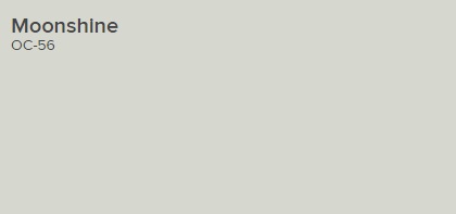
This soft shade of gray packs a surprisingly powerful punch of subtle, intoxicating color.
Benjamin Moore
STATS
- LRV – 68.28
- Yellow / Green-Yellow Hue Family
Moonshine OC-56 is also known as MOONSHINE 2140-60. What do those numbers even mean? They are there to tell you the color collection. So, OC is the Off-White Collection, and the numbers (without letters) are the Color Preview Collection.
If you’re curious why Benjamin Moore does this with some of their colors, here is some info to explain it further.
Benjamin Moore’s Off-White Colors is a collection of off white colors pulled from existing collections. Almost every color in this collection can be found in another collection. All the colors were re-numbered for this collection. You will find most of these colors have two numbers; one from the original collection and one from the Off-Whites collection. Some of the names are the same, and some of the names are different. There is not any reasoning behind why the names were changed, other than marketing
benmooreguru
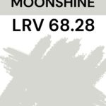
Moonshine has an LRV of 68.28.
LRV, or Light Reflectance Value, is a measurement commonly used by design professionals that measures how much light a surface reflects or absorbs. LRVs range from 0-100, with 100 being pure white and 0 being pure black.
LRV is for sure important. However, it is 100 percent not the be-all and end-all. Remember to consider the other elements of the space you are painting. For example, the amount of light, the type of lighting, and the fixed and decor elements. These, along with LRV, play a critical role in how a paint color will look in your room.
WHAT COLOR IS MOONSHINE?
Benjamin Moore paint color Moonshine is a light, near-neutral gray. At first glance, it resembles a soft, slightly cool-toned gray, and for the most part, that is exactly what it is. But near neutrals like BM Moonshine tend to be influenced by what’s going on around them.
Say you have a blue rug, blue throw pillows, and a north-facing room. You will most likely see Moonshine come off more on the cool side.
If you have enough light, it may also look like a neutral gray, depending on the conditions. This is why I always suggest testing paint samples in your home.
Use this worksheet to get the most out of sampling paint colors

WHAT UNDERTONES DOES BENJAMIN MOORE MOONSHINE HAVE?
Moonshine has subtle blue/green undertones. Like all gray paint colors, Moonshine can be influenced by everything around it. For example, lighting, decor, and even what is outside of your window. Some grays can have “sneaky undertones” that show up and cause a bit of a stir. However, I like to think Moonshine is a color that doesn’t have anything sneaky coming your way.
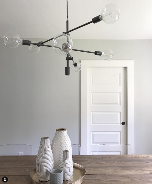
We know Moonshine has some blue/green to it, so we can expect those colors to show up in certain lighting.
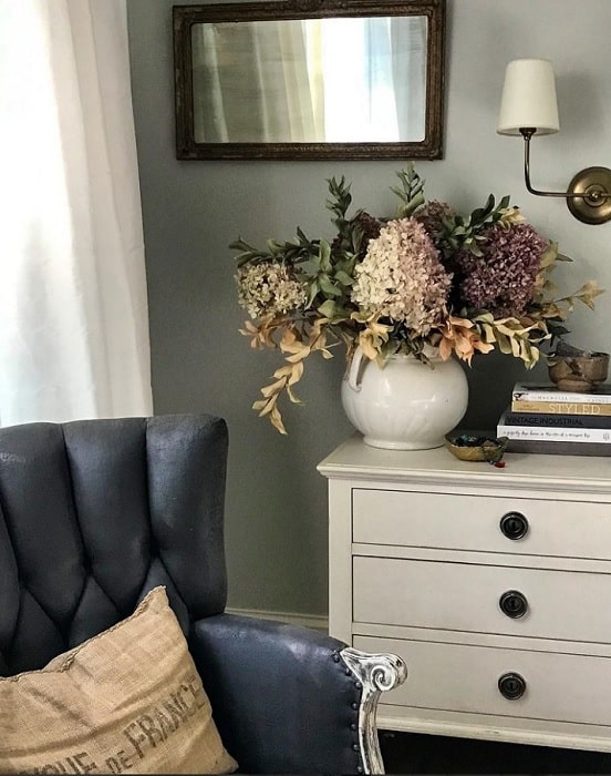
As you can see in the picture by @pleasantbaydesigns on Instagram, Moony is showing a bit of green. I think it looks beautiful. This color exudes a calm tranquillity while staying elegantly serene, as this photo shows.
READ MORE: MUST SEE GREEN PAINT COLORS
IS MOONSHINE A WARM OR COOL COLOR?
Benjamin Moore Moonshine is a cool-toned paint color. But don’t let the word “cool” scare you. It’s not at all, and it’s nowhere near an icy cool gray. It’s coolness is part of its appeal.
One of my favorite ways to tell whether a color is warm or cool is to compare it to another color you already know the tone of.
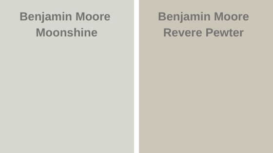
A good example is comparing BM Moonshine to BM Revere Pewter. You can clearly see that Moonshine is the cooler paint color of the two. Revere Pewter is cooler in comparison.
Now, if you were to compare Moony and BM Winter Snow, you will see that Winter Snow is cooler.
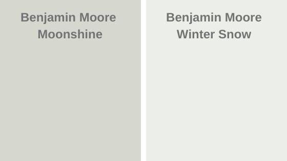
I find comparing paint colors is a fantastic way to help you in your paint color search.
LIKE WARM PAINT COLORS? CHECK THESE OUT:
- Agreeable Gray SW
- BM Swiss Coffee
- White Dove BM
- SW Divine White
- SW Shoji White
- 10 Best Mushroom Paint Colors
- BM Soft Chamois
- BM Manchester Tan
- SW Creamy
Want a More Professional Paint Finish?
Want your paint project to look less DIY and more designer-finished? The secret is often in the prep work and the tools you use. Here are my go-to painting supplies that make the process easier and the results so much better.
Check out the must-have painting tools our painting crew uses.
LIGHTING
Lighting plays a large role in how you will perceive a color. For this reason, it’s a good idea to understand the lighting situation in the room you are choosing the right paint color for.
For reference, here is how light appears in different directions.
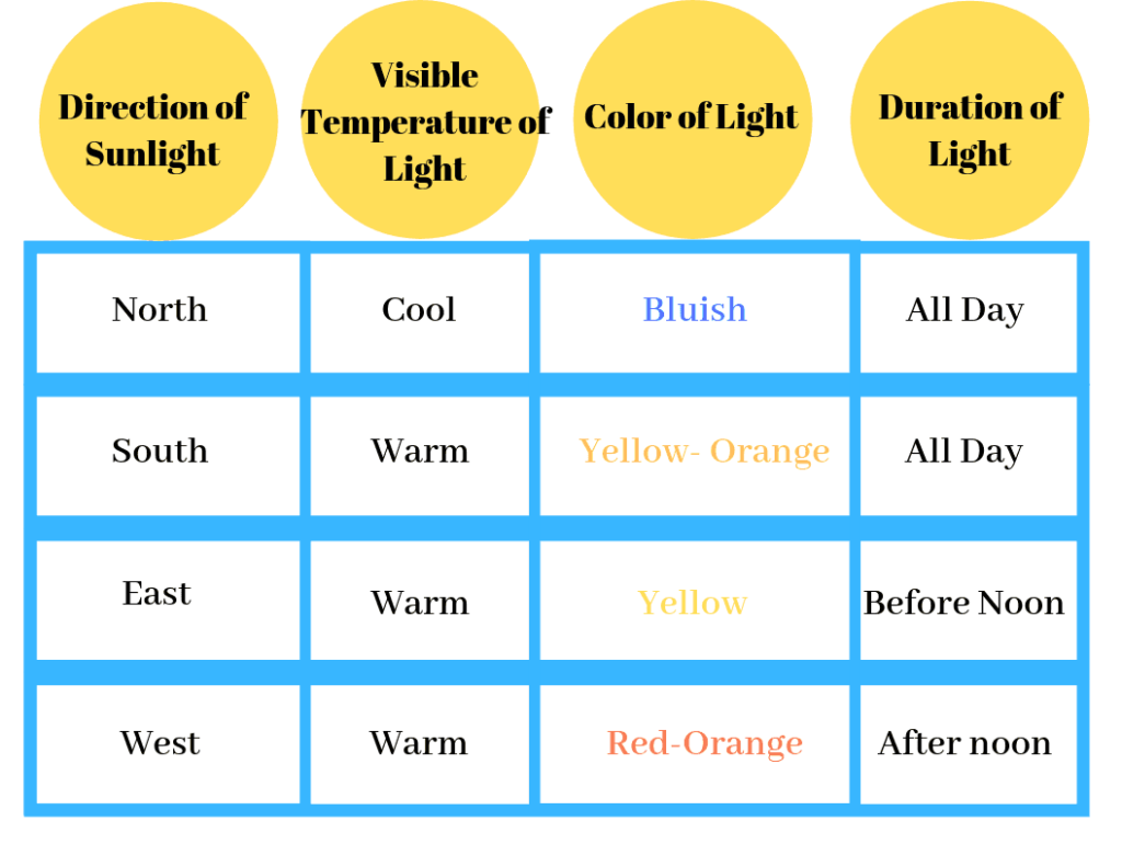
NORTH-FACING ROOMS – Light in North-facing rooms comes off cooler and somewhat bluish. Lighter colors will appear more muted, while bolder colors will show up more clearly.
SOUTH-FACING ROOMS – South-facing rooms tend to have consistently bright light throughout the day. Warm and cool tones work with south-facing light. This light intensifies colors, so darker colors will seem a bit brighter, while softer colors will appear to gleam.
EAST-FACING ROOMS – East-facing rooms have the brightest light in the mornings, with a yellow-orange tone. If you’ll use an east-facing room mostly in the evenings, a warm palette can help balance the lack of natural light.
WEST-FACING ROOMS – West-facing rooms have the most favorable light in the early evening. Warmer tones might feel overwhelming because of the red-orange light they cast. However, if the room is used mainly in the mornings, the colors won’t appear as strong as they would in the evening.
Moonshine would be a perfect color for a West-facing room. It has just enough coolness to balance out those warm light tones.
Don’t forget: while lighting plays a major part in how a paint color will look at times, other factors matter too. For instance, decor, furniture, fixtures, cabinetry, and floors. These elements can affect and/or influence how a paint color looks in your room.
WHAT IS THE BEST TRIM COLOR FOR BM MOONSHINE?
Moonshine looks fabulous with bright white trim like BM Chantilly Lace. It provides beautiful contrast and really lets it shine as the star of the “show.” But of course, you’re not limited to using only a white color for the trim.
It’s also a beautiful paint color to go with honey oak trim and dark wood elements.
The beauty of decorating is that there are no set-in-stone rules you must follow. I mean, it is your home; you decorate it the way you desire.
READ MORE: THE BEST WHITE PAINT COLORS FOR TRIM
WHERE TO USE MOONSHINE
LIVING ROOM
Paint your living room walls with BM Moonshine. This is the perfect place to use a neutral paint color. It gives you the freedom to use bolder, more colorful decor pieces and furniture.
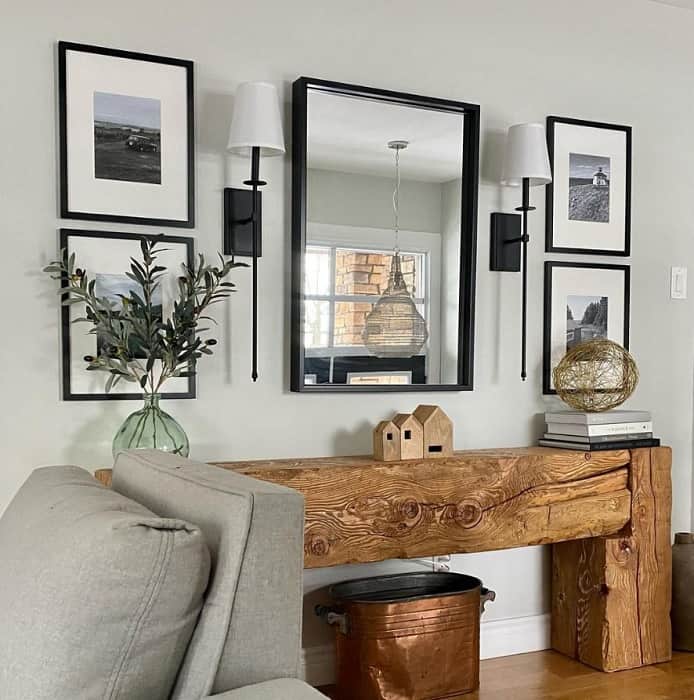
Clauzier @clauzier on Instagram used it on her walls, and let us just say the proof is in the photo. Everything about this photo makes me happy. The gorgeous tones of the wood table against Moonshine; it’s a match made in heaven.
BEDROOM
I think the bedroom is another fantastic place to use Moonshine. Again, it’s a neutral gray paint color so it allows you to play with color elsewhere. It’s also a cool-toned paint color, and cool tones are known for promoting a more relaxing, peaceful atmosphere. The bedroom is exactly where you need a restful, chill vibe, right?
READ MORE: HOW TO PAINT INTERIOR DOORS
BASEMENT
Basements can be tricky when it comes to finding the right paint color. For the most part, they’re darker with little to no natural light, and they may have lower ceilings. Two quite challenging factors to work around. However, I am here to tell you it works beautifully on the basement walls.
I used it as my basement wall color. For reference, there are two small windows with a porch deck covering them. So, there is basically no natural light. However, high hats provide artificial light.
The color reads cooler. I tend to see more of a green/blue in the gray. But it is not too dark for the space. I find it to be the perfect fit for my basement.
Grab these amazing painting tools! They will only make your life easier!
IS MOONSHINE A GOOD EXTERIOR COLOR?
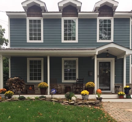
Light, near neutrals like Moonshine may not be your best choice for exterior paint. Because the color will be in direct sunlight, it may look very washed out. You’ll lose all sense of the color, and it will end up looking white.
The exterior of a home will work better with paint colors like Sherwin Williams Riverway, SW Lazy Gray, or Coventry Gray, which carry a bit more depth or weightiness to hold up against the sunlight.
READ MORE: THE BEST EXTERIOR PAINT COLORS FROM BENJAMIN MOORE
LOOKING FOR MORE EXTERIOR PAINT COLORS? CHECK THESE OUT:
- Benjamin Moore Exterior Paint Colors
- Popular Sherwin Williams Exterior Colors
- Exterior Colors that go with Brick
- Awesome Front Door Colors
- Exterior Paint Color Combos
- Blue Exterior Paint Colors
- SW Tricorn Black
- Sherwin Williams Snowbound
WHAT’S THE BEST WAY TO SAMPLE MOONSHINE?
Let’s talk about testing paint samples.
Before committing to a paint color, I highly recommend testing it in your own home first. Lighting can completely change how a color looks. I love using Samplize peel-and-stick samples because they’re mess-free and so much easier than buying sample pots.
WHAT IS THE SHERWIN WILLIAMS EQUIVALENT TO MOONSHINE?
There isn’t an SW color that is quite comparable to Benjamin Moore Moonshine. The closest Sherwin-Williams paint color that I found, going solely off of spectral data, is:
- SW 9628 WINTER WALK – Sherwin-Williams Emerald Designer Edition
- LRV 66
Now, side by side, they don’t look very similar. SW Winter Walk is in the yellow-green hue family and is a bit warmer in tone.
The one color I found to be comparable is:
If you’re color-matching between paint brands, I highly recommend buying a sample beforehand. Sometimes, when you color-match between paint manufacturers, the colors don’t come out accurately. This is because each brand uses different formulas to create its paint colors.
The best option is to choose within the brand’s paint color lines. This way you know what you are getting.
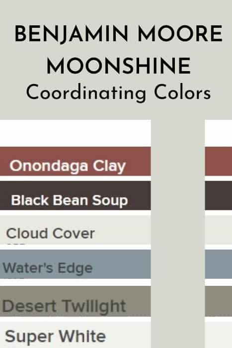
COORDINATING COLORS
Neutral paint colors tend to be the most effortless to find complementary colors for, especially grays. However, it’s important to be aware of the color’s undertones. When talking about Benjamin Moore Moonshine, blue/green undertones can show up. Knowing this information, you can do one of two things,
- work with colors to enhance those tones
- work with colors to dilute those tones
For fun, I’ll give you some colors that do both.
- Cloud Cover 855
- WATER’S EDGE 1635
- ARCTIC SHADOWS 1559
- SUPER WHITE PM-1
- Desert Twilight 2137-40
- Onondaga Clay 1204
- Black Bean Soup 2130-10
- Beach Glass
COLOR COMPARISONS
As I mentioned before, comparing colors is a helpful way to see if a color is warm or cool, etc. I collected a few popular paint colors to compare Moonshine against. Let’s see how they stack up.
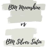
MOONSHINE VS SILVER SATIN
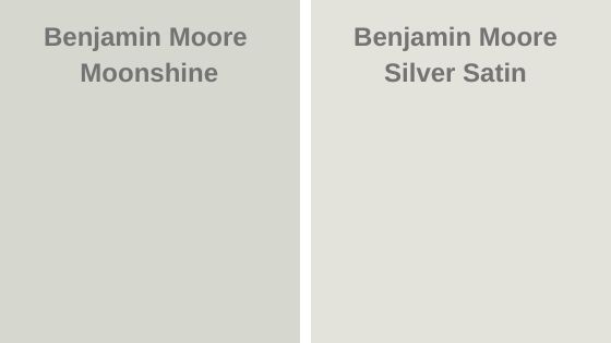
- Silver Satin has an LRV of 76.35
- Both colors are a part of Benjamin Moore’s Off-White Collection.
- Silver Satin is the lighter color of the two.
- Both are gray paint colors.
- Silver Satin has more purple-ish undertones
I wouldn’t say these two colors are close in color. There are both beautiful in their own ways.
READ MORE: FULL REVIEW ON SILVER SATIN
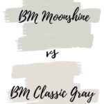
MOONSHINE VS CLASSIC GRAY
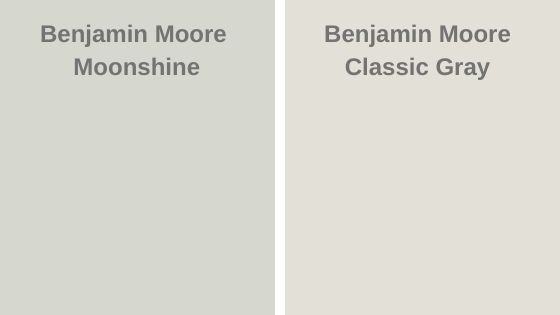
- Classic Gray has an LRV of 74.78.
- Both colors are a part of Benjamin Moore’s Off-White Collection.
- Classic Gray is a warm-toned gray.
- As for undertones, Classic Gray has purple undertones.
- Moonshine is darker than Classic Gray
- Classic Gray will pull quite cool in North-facing rooms
READ MORE: CLASSIC GRAY PAINT COLOR REVIEW
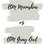
MOONSHINE VS GRAY OWL
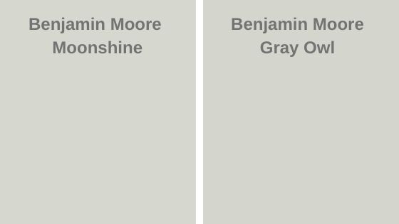
- Moony has an LRV of 68.28 which is a hair higher than Gray Owl’s 65.77.
- These are very similar.
- Gray Owl is a darker paint color.
- Both are cooler-toned grays.
- Both Gray Owl and Moonshine have blue/green undertones.
- I find Moonshine to pull a bit more green/blue.
- Gray Owl can look a bit more of a neutral gray in the right situation.
READ MORE: GRAY OWL COLOR REVIEW
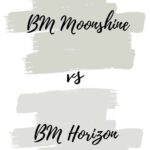
MOONSHINE VS HORIZON
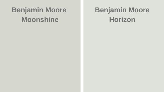
- Horizon has an LRV of 73.96
- Both are a part of Benjamin Moore’s Off-White Collection.
- Horizon has blue and green undertones, leaning more towards green.
- Horizon is the lighter of the two colors.
- Both are cool-toned.
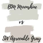
MOONSHINE VS AGREEABLE GRAY
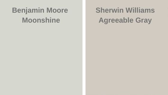
- Sherwin-Williams Agreeable Gray has an LRV of 60
- Of the two colors, Agreeable Gray is the warmer gray.
- Agreeable Gray is a versatile warm gray/greige paint color.
- Agreeable Gray also has a green undertone that can show in certain lighting.
READ MORE: AGREEABLE GRAY- IS IT THE BEST GREIGE OUT THERE?
MOONSHINE VS REVERE PEWTER
- Benjamin Moore Revere Pewter has an LRV of 55.51
- Revere Pewter is the warmer gray / greige.
- Moonshine has more of a clean, crisp feel to it.
- Revere Pewter green undertone that can show up. And can be considered a “muddy” color.
- Revere Pewter works well as a transitional color.
READ MORE: BM REVERE PEWTER – STILL A FAVORITE?
RECAP
Here’s a quick review of what we learned about Benjamin Moore Moonshine OC-56.
- it’s a soft gray paint color
- it is cool-toned- but not icy
- has an LRV of 68.28
- looks great in a West-facing room as its cool tones balance out the warm light
- can be used in just about any room of your home
- may not be the best option for the exterior since it has the potential to washout in direct sunlight
- looks amazing with a bright white trim
- coordinates well with man colors.
️ Want to Make Your Paint Planning Even Easier?
Choosing the right paint color is just one piece of the puzzle. That’s why I created a collection of printable guides to help you pull it all together—without the stress (or the paint regrets).
✔️ Room-by-room paint planners
✔️ Finish and sheen cheat sheets
✔️ Budget-friendly decorating tips
✔️ Coordinating color palette templatesThey’re designed to take the guesswork out of decorating—and look cute on your clipboard, too.
Browse my printable shop here and start planning your dream home with confidence.
FINAL THOUGHTS
If I had to describe this color, I’d say refined, timeless, and classic. It has a certain elegance, which is why it is a favorite hue among designers and DIYers alike.
The appeal of this cool-toned gray is its versatility, which makes it a great wall color for just about any room.
What more is there to say?
This is one of those paint colors that (in my eyes) will never go out of style. It is truly timeless. It’s so soft and beautiful and will make any space feel elegant.
The subtle blue/green undertone is not overbearing at all. It adds to the color’s sophistication. If youare okay with a lovely cool undertone, you will absolutely fall for Moonshine.
However, if you aren’t a fan of any cool blue-green undertones, you may want to explore a paint color that is slightly warmer, like Edgecomb Gray, Repose Gray. or SW Agreeable Gray.
Finally, keep in mind that the colors you see on a computer screen aren’t a true representation of the paint colors spoken about. Swatch and test the paint colors to see the true color.
RECENT ARTICLES:
- The Best Black Paint Colors
- SW Greek Villa Review
- Caldwell Green Paint Color Review
- SW Natural Choice Paint Color Review
- Dovetail by Sherwin Williams
- The Best Pro Paint Tools
- Sherwin Williams Dorian Gray
- SW Peppercorn
- Divine White SW
- BM Pale Oak
- Hale Navy Review
- Cream Paint Colors
