We may earn money or products from the companies mentioned in this post.



Last Updated on September 2, 2026 by Cate
Benjamin Moore Collingwood OC-28 is a light greige paint color with soft gray undertones and just enough warmth to keep it from feeling cold. This versatile neutral adapts beautifully to changing light, making it a popular choice for living rooms, bedrooms, kitchens, hallways, and whole-house color palettes. Collingwood pairs effortlessly with crisp white trim, warm wood tones, black accents, and natural stone, creating a timeless look that complements both modern and traditional homes.
WHAT COLOR IS COLLINGWOOD?

Collingwood is a neutral, warm gray paint color. It’s more along the lines of a light to mid-toned gray. It’s neither the darkest nor the lightest gray you will find. It’s a good in-between.
Neutral grays like Collingwood are sort of like chameleons. For instance, it can look different depending on what’s happening in the room you are painting. Lighting, furnishings, and fixed elements can all affect how a color looks on the walls.
Let me just get right into the good stuff.
STATS
- AKA Collingwood 859
- 82.389 5.411 89.289°
- Part of the Off-White Color Collection as well as the Classic Color Collection.
- One of Benjamin Moore’s Best-Selling Neutral Paint Colors
WHAT IS THE LRV OF COLLINGWOOD?
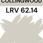
Collingwood’s LRV is 62.14. I know you are thinking, “What in the world does LRV stand for?”
LRV, or Light Reflectance Value, is a measurement commonly used by design professionals to measure how much light a surface reflects or absorbs. LRVs range from 0-100, with 100 being pure white and 0 being pure black.
But why is LRV important, though?
Identifying the LRV of a paint color helps when deciding whether a color is too dark for a space.
Essentially, the higher the LRV of a paint color, the more reflective it will be. The lower the LRV, the more light the color will absorb.
Want a More Professional Paint Finish?
Want your paint project to look less DIY and more designer-finished? The secret is often in the prep work and the tools you use. Here are my go-to painting supplies that make the process easier and the results so much better.
Check out the must-have painting tools our painting crew uses.
IS COLLINGWOOD BEIGE OR GRAY?
Collingwood is a neutral, but it’s a warm gray and can sometimes even be considered a greige. Sometimes it looks more neutral gray, and other times it looks more greige.
The color will look different in different settings. Rooms with a ton of sun flooding in through the windows will look different from rooms with no windows.
Overall, this color is a soft, light, and airy gray.
WHAT UNDERTONES DOES COLLINGWOOD HAVE?
All grays have blue, green, and violet undertones. The undertone that tends to present itself most often in Collingwood is violet.
So, depending on the lighting in the space, the colors of your furniture, and the colors of the fixed elements in the room, Collingwood’s undertones can show up.
Undertones are subjective. Keep this in mind with all paint colors.
If you are having a tough time with the undertone, the best way to see it is by using a product like Samplize- Peel & Stick Paint Samples or, painting a poster board and bringing it into your home. The color you see on a computer screen usually isn’t true to color. This is why sampling is so important.
If you want, compare Edgecomb Gray’s green-gray undertones to Collingwood’s violet-gray undertones. This makes it easier to see the different undertones of the 2 colors.
IS IT A WARM OR COOL COLOR?
Collingwood is a warm-toned paint color.
It isn’t the warmest Benjamin Moore gray. However, it is still considered to be warm. You can expect it to look a bit more gray in cooler north-facing light and a bit more greige in warmer southern-facing light.

An excellent way to tell whether a paint color is warm- or cool-toned is to compare it to another paint color.
For example, let’s place Collingwood side by side with Moonshine. When compared, you can see that Collingwood is the warmer of the two paint colors.
INTERESTED IN WARM PAINT COLORS? CHECK THESE OUT!
- Sherwin William Kilim Beige
- SW Natural Choice
- SW Greek Villa
- BM Swiss Coffee
- SW Shoji White
- 10 Great Mushroom Paint Colors
- Benjamin Moore Classic Gray
- BM Manchester Tan
COLLINGWOOD AND LIGHTING
Lighting is unquestionably a contributing factor in how paint colors will look in your home.
It plays a large role in how you will perceive a color. For this reason, it’s a good idea to understand the lighting situation in the room you are choosing the right paint color for.
For reference, here is how light appears in different directions.
NORTH-FACING ROOMS – Light in North-facing rooms comes off cooler and somewhat bluish. Lighter colors will appear more muted, while bolder colors will show up or appear more solid.
SOUTH-FACING ROOMS – South-facing rooms tend to have consistently bright light throughout the day. Warm and cool tones work with south-facing light. This light intensifies colors, so darker colors will seem a bit brighter, while softer colors will appear to gleam.
EAST-FACING ROOMS – East-facing rooms have the brightest light in the mornings, with a yellow-orange tone. If you’ll use an east-facing room mostly in the evenings, a warm palette can help balance the lack of natural light.
WEST-FACING ROOMS – West-facing rooms have the most favorable light in the early evening. Warmer tones might feel overwhelming because of the red-orange light they cast. However, if the room is used mainly in the mornings, the colors won’t appear as strong as they would in the evening.
Warm light will give Collingwood a beautiful warmth. While cooler light will make it feel a bit grayer.
Don’t forget: while lighting plays a major part in how a paint color will look at times, other factors matter too. For instance, decor, furniture, fixtures, cabinetry, and floors. These elements can affect and/or influence how a paint color looks in your room.
WHAT IS THE BEST TRIM COLOR FOR COLLINGWOOD?
Like many other colors similar to Collingwood, it looks fantastic with a bright white trim like BM Chantilly Lace. But don’t think you are limited to white trim colors. If you want to make a bold statement, try using a black paint color.
Or, for a more seamless, monochromatic look, use a shade lighter or darker than Collingwood. You can also use Collingwood for both the walls and trim. To distinguish them, consider using different sheens to add visual interest.
USE IT IN DIFFERENT SHEENS
Another way to use BM Collingwood is to use it in different sheens. Here’s an example.
Let’s say you decided to paint your kitchen cabinets with a gloss finish. You can then use a flat finish on the walls.
Changing the finish or sheen changes how the color looks. A higher sheen, like gloss, reflects more light and makes the color appear lighter, while a lower sheen, like flat, does the opposite.

WHERE TO USE COLLINGWOOD?
You can use Collingwood just about anywhere. It’s neutral, and we all know neutrals are great jumping-off points to decorating around.
Some of the places you can use this amazing neutral paint are:
- bedroom
- bathroom
- kitchen
- kitchen cabinets
- living room
- entryway
- nursery
- dining room
- shiplap
- board and batten
- ceilings

Alana @lana_mack on Instagram went with Collingwood OC-28 on her kitchen walls.
Valerie of @cottageandblossom on Instagram painted her beautiful accent wall in her bedroom with BM Collingwood. She also used it on her ceilings.

WILL BENJAMIN MOORE COLLINGWOOD WORK ON THE EXTERIOR?

Sure, Collingwood will work on the exterior of your home. However, it may not be the best option if you want a noticeable color. Paint colors with this depth tend to wash out in direct sunlight. So you can expect that to possibly happen.
TAKE A LOOK AT THESE EXTERIOR PAINT COLOR OPTIONS:
Let’s talk about testing paint samples.
Before committing to a paint color, I highly recommend testing it in your own home first. Lighting can completely change how a color looks. I love using Samplize peel-and-stick samples because they’re mess-free and so much easier than buying sample pots.
READ MORE: How to Test Paint Sample
WHAT IS THE SHERWIN WILLIAMS EQUIVALENT TO BENJAMIN MOORE COLLINGWOOD?
There isn’t an exact match to BM Collingwood. However, one very popular paint color is surprisingly close, according to the scientific color data.

They are similar but not a dupe of each other.
If you are thinking about color-matching between brands, I highly suggest not doing so. Every paint brand is different, so there is no guarantee that the paint color you are trying to match will be the same.
It’s best to choose a color within the same brand so you know what you are getting.
However, if you do decide to color match, please please please do yourself a favor and get a sample of the matched color beforehand.
COORDINATING COLORS
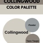
Neutral paint colors are the easiest to coordinate with. There’s no doubt about that. But creating color combinations and color palettes can sometimes throw you for a loop. I’m here to help. Below are colors that work well with Collingwood.
COLLINGWOOD COLOR COMBINATIONS
- Pewter 2121-30
- Night Shade 2116-10
- Taos Taupe 2111-40
- Mars Red 2172-20
- Simply White
- Balboa Mist
- Providence Blue 2135-40
- Hale Navy

BENJAMIN MOORE COLLINGWOOD VS REVERE PEWTER

- Revere Pewter has an LRV of 55.51
- Revere Pewter is the darker paint color of the two
- Collingwood is the cooler-toned paint color
- Revere has a green-gray undertone.
- Revere has more of an earthy and natural feel to it
READ MORE: REVERE PEWTER FULL REVIEW
BENJAMIN MOORE COLLINGWOOD VS EDGECOMB GRAY

- Edgecomb Gray has an LRV of 66.88.
- Edgecomb has green-gray undertones
- Collingwood is more gray, and Edgecomb has a bit of beige.
- Edgecomb Gray is the warmer-toned color.
READ MORE: BENJAMIN MOORE EDGECOMB GRAY
BENJAMIN MOORE COLLINGWOOD VS BALBOA MIST

- Balboa Mist has an LRV of 67.37
- Balboa Mist is lighter than Collingwood
- Collingwood is a smidge cooler than Balboa Mist
- Both colors can flash violet
READ MORE: AN AMAZING GRAY – BALBOA MIST
BENJAMIN MOORE COLLINGWOOD VS PALE OAK

- Collingwood is a bit grayer than Pale Oak
- Pale Oak has an LRV of 69.89
- Pale Oak is the lighter of the two colors
- Both have a chance of shifting or flashing lavender in certain lighting
- Pale Oak may also shift or flash to a peachy color
READ MORE: BENJAMIN MOORE PALE OAK
FINAL THOUGHTS
I have to say, Collingwood is an awesome paint color. It’s sophisticated and refined, versatile, and makes a beautiful backdrop for a space.
Of course, it won’t be the perfect gray paint color for everyone. However, if you like it and want to see how it will perform in your room, I say go for it and purchase a sample.
You must sample this (and every) paint color to see if it will work in your home. I know you are probably 100% over me saying this, but it’s the honest truth.
Never take someone’s word for how a color will look on your walls. They don’t live in your home with your lighting and decor. You need to see it with your own eyes, and sampling is the only way.
Overall, I really like Collingwood. It’s a tremendous gray paint color option, and it’s worth checking out.
Are you planning on tackling a painting project on your own?
Use these tips and avoid these mistakes to help you paint your room like a pro.
Don’t forget your tools and accessories!
Drop cloths are a must for any painting project. Paint is messy! Use drop cloths to avoid unnecessary cleanup. You’ll be happy you did.
A high-quality paint brush will go a long way. The same goes for paint rollers. You want to use tools that will work with you, making your painting job easier
[show_shopthepost_widget id=”4661783″]
RECENT ARTICLES:
- The Best Blush Paint Colors
- Caldwell Green by Benjamin Moore
- Sherwin Williams Natural Choice
- BM Beach Glass
- BM Chantilly Lace
- SW Divine White Review
- 14 Best Green Paint Colors
- Sea Salt SW
- Spring Inspired Paint Colors
- Drift of Mist Review
- Yellow Paint Colors By SW
