We may earn money or products from the companies mentioned in this post.





Last Updated on August 21, 2026 by Cate
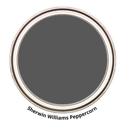
Sherwin-Williams Peppercorn SW 7674 is a deep charcoal gray paint color with balanced warm and cool undertones, giving it a rich, sophisticated look without reading as true black. Its versatility makes it a favorite for accent walls, cabinetry, front doors, exteriors, and even entire rooms when paired with ample natural light. Peppercorn complements crisp white trim, warm wood tones, brass hardware, and natural stone, making it an excellent choice for modern, industrial, farmhouse, and transitional homes.
STATS
- Color Collections: Purely Refined, Reasoned, Cool Neutrals, Top 50 Colors
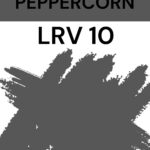
- LRV: 10
- HUE FAMILY: Purple
PEPPERCORN LRV
Peppercorn has an LRV of 10. If you’re wondering what LRV is, here’s a brief explanation.
LRV, or Light Reflectance Value, is a measurement commonly used by design professionals that measures how much light a surface reflects and absorbs. LRVs range from 0 -100, with 100 being pure white and 0 being absolute black. A great article to read to learn more about LRV is Light Reflectance Value: What Do Those Numbers Mean?
Peppercorn, with an LRV of 10, won’t be the most light-reflecting paint color. It won’t reflect much light at all.
WHAT COLOR IS PEPPERCORN FROM SHERWIN WILLIAMS?
Peppercorn is a dark gray paint color. It is one step above black. So it is dark but not the darkest. You could say it has a slight charcoal feel.
While Peppercorn is a dark gray paint color, it is actually quite soft and not harsh at all. It has a lot of depth to it, which ultimately gives it a good foot on which to stand.
Some designers even go so far as to call it a “true gray.” I say take that with a grain of salt and don’t rely on it alone when deciding whether Peppercorn is the gray paint color for you. You have to sample the color in your room to know for sure if it will look like a “true gray’ in your space.
Remember to swatch your paint colors. Pick up your Samplize Peel & Stick paint samples today!
DOES PEPPERCORN LOOK BLUE?
No, I wouldn’t say SW Peppercorn looks fully blue, nor would I say it looks like a blue paint color. As I mentioned earlier, it’s a dark gray paint color.
For the most part, it stays neutral. Keep in mind that it comes from the purple hue family, so chances are, in unbalanced lighting, you may see a hint of purple or even a purple-blue.
Overall, it is not a blue paint color. It is gray.
Now, before you run out and grab a gallon, you need to sample it first. I know I just said it looks like a neutral gray, but it may look different than you expected.
WHAT’S ITS COLOR FAMILY?
Peppercorn is from the purple hue family.
Don’t let that scare you. I know many people are very fearful of having any type of purple show up in their gray.
Yes, Peppercorn is from the purple hue family, but it is not a purple paint color. I will be 100% with you, though. There is a chance a moment or flash of purple could show up in unbalanced lighting, but I promise it won’t look like you have purple walls.
WHAT UNDERTONES DOES PEPPERCORN SW 7674 HAVE?
Undertones are merely subjective. What you say may not be what someone else sees. These undertones, or colors, appear because of the lighting and elements around them.
In regard to the undertones, or rather the colors that may be seen in unbalanced lighting, Peppercorn has times when it can flash purple or even slightly blue.
IS IT A COOL PAINT COLOR?
Yes, Peppercorn is considered to be a cool-toned paint color.
A great way to tell whether a paint color is warm- or cool-toned is to compare it to another paint color.
For instance, let’s place Peppercorn side by side with Gauntlet Gray. You can indeed see how Gauntlet Gray is more of a warm-toned gray, and Peppercorn is a cool-toned gray.

MORE INTO WARM TONES? CHECK THESE PAINT COLORS OUT:
SHERWIN WILLIAMS PEPPERCORN AND LIGHTING
Light plays an influential role in the way a color looks and can change the appearance of essentially any color. For this reason, it’s a good idea to be familiar with the lighting condition of the room you are choosing the right paint color for.
North-facing rooms – Light in North-facing rooms comes off cooler and sometimes somewhat bluish. Lighter colors appear more muted, while bolder colors show up better.
South-facing rooms– South-facing rooms tend to have consistently bright light throughout the day. Warm and cool tones work with south-facing light. This light intensifies colors, so darker colors will seem more vivid, while softer colors will almost look like they are radiating.
East-facing rooms– East-facing rooms have the brightest light in the mornings, with a yellow-orange tone. If you use an east-facing room regularly in the evenings, a warm palette can help offset the lack of natural light.
West-facing rooms- Early evening is when West-facing rooms have the most favorable light. Warmer tones might seem a bit strong because of the red-orange tones the light gives off. However, if you use the room mainly in the mornings, the colors won’t seem as intense.
As much as lighting plays a significant part in how a paint color can look at times, there are other elements you simply cannot forget about.
For example, the color of your decor, furniture, fixtures, cabinetry, and floors. These elements can affect how a paint color looks in your room.
Don’t forget to pick up these amazing painting tools! They will only make your life easier!
WHAT’S THE BEST WAY TO SAMPLE?
You know how I feel about testing paint samples. It is a must! Believe it or not, the biggest painting mistake you can make is not sampling paint colors.
Sampling your paint colors is so important because it is the only way to truly see how a color will look in your home.
Now that you know you need to sample your paint colors, what is the best way to sample them?
Samplize Peel & Stick Paint samples, of course!
Remember to swatch your paint colors. Pick up your Samplize Peel & Stick paint samples today!
WHAT IS THE BEST TRIM COLOR TO USE WITH SW PEPPERCORN?
Personally, I feel like SW Peppercorn looks absolutely fantastic with a bright white trim like BM Chantilly Lace or SW Extra White. Since Peppercorn is dark and Chantilly Lace is bright white, it creates a beautiful contrast.
SW Pure White is another great white option that is not as crisp as Extra White or Chantilly Lace.
READ MORE: THE BEST WHITE PAINT COLORS FOR TRIM
Don’t think white is your only trim option. You can also go with a dark monochromatic look and use Peppercorn on both walls and trim. You can slightly change the trim’s look by choosing a different sheen or finish. This will create a slight variation between the two.
If that seems too dark, try using a lighter gray on your trim. This will give you a similar look but not as dark.
Grab these amazing painting tools! They will only make your life easier!
WHERE TO USE SW PEPPERCORN
KITCHEN ISLAND
Kitchen cabinets or kitchen islands are a great place to use Peppercorn.
Tri-Son Painting Plus, trisoncabinetdivision on Instagram, uses it on this kitchen island, and it is a showstopper. It’s the perfect dark gray paint color.

BUILT-INS

Beth @houseonyough on Instagram used Peppercorn on her built-ins. The dark paint color contrasts beautifully with her wood trim. The color looks like it was meant to be, simply gorgeous.
READ MORE: PAINT COLORS TO GO WITH HONEY OAK
ACCENT WALL / SHIPLAP
@Mcclaryranch. on Instagram opted to paint their accent wall with Peppercorn. I am pretty much obsessed with it.
The dark wall, contrasted with the light walls, pulls the room together. It makes such a stunning statement.

BEDROOM WALLS

Laurie @salalitten and @comeonindesigns on Instagram used Peppercorn in her bedroom. Is this not the perfect room for this color?
The room has enough lighting that the color isn’t overbearing. Also, being paired with the lighter-colored furnishings and decor, this room is the perfect example of how to use a dark paint color on the walls.
IS SHERWIN WILLIAMS PEPPERCORN A GOOD EXTERIOR COLOR?
Yes! Peppercorn is an amazing exterior paint color. I don’t know about you, but lately I have been seeing a trend of darker exterior paint colors on homes, and I am here for it.
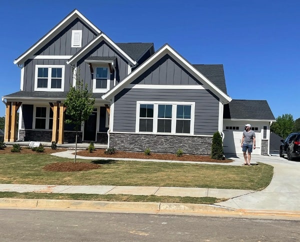
It works on the exterior because it has enough depth to hold up to bright, direct sunlight.
You can also see in this picture that the house is in the shade, which brings out a bit of the cooler blue tone that can show up in the color.


Exterior paint colors will always look lighter. This is because of the direct sunlight.
LOOKING FOR MORE EXTERIOR PAINT COLORS? CHECK THESE OUT:
COLORS THAT GO WITH SHERWIN WILLIAMS PEPPERCORN
Since it’s a dark gray, Peppercorn is easy to build color palettes around. Neutral colors are always easier to pair.
Some of the colors that look great with it are:
- Unique Gray
- Mysterious Mauve
- Starry Night
- Repose Gray
- Passive
- Extra White
- Drift of Mist
- Reflection
- SW Caviar
WHAT IS THE BENJAMIN MOORE EQUIVALENT?
If you are looking for an exact Benjamin Moore dupe, I hate to break it to you, but you aren’t going to find one.
There is one Benjamin Moore color that is similar to Peppercorn according to the spectral data,
- CW-685 AMBLER SLATE – Benjamin Moore Williamsburg Color Collection
- Hue Family: Purple Blue
- LRV: 11.78

You can see that these two colors are very similar. AMBLER Slate has a touch more blue to it.
Honestly, they are both gorgeous colors, and if you like one, you will most likely like the other.
SHERWIN WILLIAMS PEPPERCORN VS CYBERSPACE

- SW Cyberspace has an LRV of 6, a bit lower than Peppercorn’s LRV of 10
- Cyberspace is from the Purple Blue hue family
- Peppercorn is lighter than Cyberspace
- Cyberspace is a bit more of a blue; it is more saturated
- Peppercorn is a near-neutral
SHERWIN WILLIAMS PEPPERCORN VS IRON ORE

- Iron Ore has an LRV of 6, lower than Peppercorn at 10
- SW Iron Ore is from the Green Yellow hue family
- Peppercorn is the lighter of the two colors
- Iron Ore is more saturated
SHERWIN WILLIAMS PEPPERCORN VS GAUNTLET GRAY
- Gauntlet Gray has an LRV of 17, higher than Peppercorn’s LRV of 10
- SW Gauntlet Gray comes from the Yellow hue family
- Peppercorn is the darker and less saturated color
- Gauntlet Gray is a warmer gray
SHERWIN WILLIAMS PEPPERCORN VS URBANE BRONZE

- SW Urbane Bronze has an LRV of 8, only a bit lower than Peppercorn
- Urbane Bronze is from the Yellow hue family
- Peppercorn is darker and more of a gray
- Urbane Bronze is more saturated and is warmer-toned
SHERWIN WILLIAMS PEPPERCORN VS BENJAMIN MOORE KENDALL CHARCOAL

- Kendall Charcoal has an LRV of 14.61, a tad bit higher than Peppercorn
- Benjamin Moore Kendall Charcoal comes from the Yellow hue family
- Peppercorn is the darker and less saturated gray
- Kendall Charcoal is warmer in tone
SHERWIN WILLIAMS PEPPERCORN VS BEHR CRACKED PEPPER

- Behr Cracked Pepper has an LRV of 8
- Peppercorn is lighter
- Cracked Pepper comes from the Purple Blue hue family
- Cracked Pepper is slightly more saturated
SHERWIN WILLIAMS PEPPERCORN VS BM WROUGHT IRON

- Benjamin Moore Wrought Iron has an LRV of 8.17
- Wrought Iron comes from the Purple Blue hue family
- Peppercorn is a lighter gray and less saturated.
- Wrought Iron is actually very similar to Behr Cracked Pepper
YOU MIGHT ALSO LIKE: BM WROUGHT IRON vs SW IRON ORE
RECAP
I know you were just given a crap load of information, so to give you a quick refresher on what we learned about Sherwin Williams Peppercorn:
- has an LRV of 10
- comes from the Purple hue family
- Color Collections: Purely Refined, Reasoned, Cool Neutrals, Top 50 Colors
- it’s considered a dark gray, not blue paint color
- it is a cooler-toned color
- looks fantastic on the exterior of the home
- can potentially show blue or purple in certain unbalanced lighting
- it’s a great dark gray color for kitchen cabinets
- can be a softer color alternative to a black paint color
- pairing it with a bright white trim will give the room and clean and crisp feel
- the best way to sample is by using SAMPLIZE Peel & Stick Paint Samples
DON’T PAINT WITHOUT THE BEST TOOLS
The Tools That Make Painting Easier
A beautiful paint color can only do so much if you’re using cheap brushes and flimsy rollers. These are the painting tools I personally recommend for cleaner lines, better coverage, and less frustration during your project.
FINAL THOUGHTS – IS PEPPERCORN THE PAINT COLOR FOR YOU?
I’m a fan of Sherwin-Williams Peppercorn. It’s honestly a fabulous dark gray paint color.
It is everything a dark gray paint color should be. The fact that many designers label it a “true gray” speaks for itself.
It works wonderfully with many other paint colors and can be used just about anywhere. It’s also on Sherwin-Williams’s top 50 paint colors list, so we know it’s a favorite.
If you are looking for a dark paint color that isn’t quite black, this may be the color for you.
Want to see for yourself? Grab a SAMPLIZE PEEL & STICK PAINT SAMPLE.
LEARN HOW TO TEST YOUR PAINT SAMPLE THE RIGHT WAY.
GRAB A SAMPLING PAINT COLORS WORKSHEET TO LEARN HOW TO GET THE MOST OUT OF YOUR SAMPLES
RECENT ARTICLES:
- Silver Satin- A BM Favorite
- Chantilly Lace- The Best White?
- Benjamin Moore Pale Oak Review
- 14 Trending Green Paint Colors
- Paint Color Review- SW Tricorn Black
- SW Seat Salt Paint Color Review
- Beautiful Spring Paint Colors
- Coventry Gray BM
- Sherwin Williams Paint Color Review – Gale Force