
We may earn money or products from the companies mentioned in this post.








Last Updated on August 24, 2026 by Cate
Benjamin Moore Chantilly Lace OC-65 is a crisp, clean white paint color with very subtle cool undertones, making it one of Benjamin Moore’s brightest and most versatile whites. It delivers a fresh, modern look without feeling overly stark in most spaces, making it a popular choice for walls, trim, ceilings, cabinets, and whole-house color palettes. Chantilly Lace pairs beautifully with virtually any paint color, natural wood, black accents, and contemporary or traditional décor styles.
WHAT COLOR IS CHANTILLY LACE?
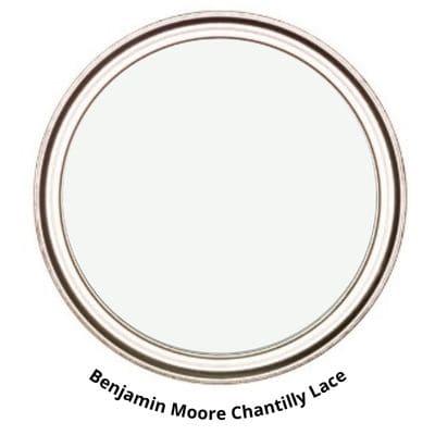
Benjamin Moore Chantilly Lace is a white paint color. To give you a bit more detail, it’s a clean, crisp white. Benjamin Moore describes it as follows:
A classic go-to white that elicits images of fresh cotton and pure silk.
Benjamin Moore
I don’t think I can find a better way to describe it. It truly is a classic go-to white that works with everything.
There is a reason it’s arguably one of the most popular paint colors available. It’s basically the perfect white. Not too warm, not too cool, just perfect.
STATS
- HUE FAMILY: GREEN-YELLOW
- LRV: 90.04
- COLOR COLLECTION: Most Popular Paint Colors.
- ALSO KNOWN AS: Chantilly Lace 2121-70
Chantilly Lace LRV
Chantilly Lace has an LRV of 90.04. What does LRV mean? Light Reflectance Value is OK, but what is it?
LRV, or Light Reflectance Value, is a scale used by design professionals to measure the amount of light reflected from and/or absorbed by a surface. The scale range is 0 to 100, with 0 being absolute black and 100 being pure white.
A great article to read to learn more about LRV is Light Reflectance Value: What Do Those Numbers Mean?
With an LRV of 90.04, Chantilly Lace is pretty close to pure white, but not quite there. Overall, we can expect it to reflect a ton of light.
*DID YOU KNOW?
Chantilly lace is a handmade bobbin lace named after the city of Chantilly, France, The best Chantilly laces were made of silk, and were generally black
Wikipedia
IS BENJAMIN MOORE CHANTILLY LACE A COOL COLOR?
I wouldn’t say BM Chantilly Lace is a cool paint color. But I also wouldn’t say it’s a warm paint color.
When it comes to the tone of a paint color, I find that with some colors, it is much more obvious than others. For instance, Sherwin Williams Kilim Beige is a warm paint color. We can see this by looking at it. But with a color like Chantilly Lace, it’s hard to tell just looking at it.
When you get stuck trying to decipher tones, all you need to do is compare the paint color to another.
For example, let’s compare Chantilly Lace to Benjamin Moore White Dove.
Side by side, White Dove has more warmth and looks a bit creamier. Chantilly Lace looks like a neutral white.

If you ever feel overwhelmed and unsure whether a paint color is warm or cool, try the comparison method. It’s bound to help. But remember, nothing is more foolproof than testing your paint colors.
LEARN HOW TO TEST YOUR PAINT SAMPLE THE RIGHT WAY.
GRAB A SAMPLING PAINT COLORS WORKSHEET TO LEARN HOW TO GET THE MOST OUT OF YOUR SAMPLES

IS CHANTILLY LACE TOO WHITE?
Absolutely not. I don’t think Chantilly Lace is too white. This question doesn’t tell you much, since it’s more opinion-based. To me, Chantilly may not be too white, but to someone looking for a warmer white, it may be too white for their preference. Again, this is a very opinion-based question.
Overall, in balanced lighting, it doesn’t look too white or stark; it is simply a fantastic white. However, in a room that is north-facing and has unbalanced light, it may come off a bit cooler or somewhat icy.
If you are still wondering whether it’s too white for what you are looking for, the best way to get a 100% clear answer is to sample the color in your space. Only then will you know for sure how the color will look.
Grab these amazing painting tools! They will only make your life easier!
WHAT UNDERTONES DOES CHANTILLY LACE HAVE?
OK, let’s talk about Chantilly Lace and undertones—or rather, the lack thereof. Honestly, Chantilly Lace is very white. That’s because it has a chroma (how saturated a color is) of less than 0.55 and a value (how light or dark a color is) between 9.12 and 10.00.
First, it’s important to understand that undertones are subjective. Not everyone will see a paint color the same way. So, if you are trying to select a paint color based on its undertones, stop right there.
A paint color, especially white paint colors like Chantilly Lace, will look different based on the elements around it. For example, in a room with many windows and bright, lush greenery on the outside, your white walls may look a bit green.
If you want to know exactly how a paint color will look in your room, factor in every element in the space, including floors, cabinets, furniture color, etc. Then, get a paint sample and see how it looks in your room.
Remember to swatch your paint colors. Pick up your Samplize Peel & Stick paint samples today!
LIGHTING
In perfect lighting around noon, you can expect to see a paint color as it should be. However, in unbalanced light, you will see a shift in the paint color.
Lighting plays a major role in how a paint color looks. It’s not the only factor, but it’s a big one. That said, it’s important to understand how natural light looks in certain directions throughout the day.
The four cardinal directions, north, south, east, and west, play into how lighting will look.
North-facing rooms – Light in North-facing rooms comes off cooler and sometimes somewhat bluish. Lighter colors appear more muted, while bolder colors show up better. North-facing light can cool down warmer colors.
South-facing rooms– In South-facing rooms, there tends to be a consistently bright light throughout the day. Warm and cool tones work with south-facing light. This light intensifies colors, so darker colors will seem more vivid while softer colors will almost look like they are radiating.
East-facing rooms– East-facing rooms have the brightest light in the mornings, with a yellow-orange tone. If an east-facing room is used regularly in the evenings, going with a warm palette will help to offset the lack of natural light.
West-facing rooms– Early evening is when West-facing rooms have the most favorable light. Warmer tones might seem a bit strong because of the red-orange tones the light gives off. However, if the main use of the room is in the mornings, the colors won’t seem as intense.
Remember to always consider lighting when choosing a paint color. But don’t forget the other elements that influence how a paint color may look. This includes fixed elements like cabinetry, flooring, tiles, etc., as well as the decor colors you choose for your home.
Let’s talk about testing paint samples.
Before committing to a paint color, I highly recommend testing it in your own home first. Lighting can completely change how a color looks. I love using Samplize peel-and-stick samples because they’re mess-free and so much easier than buying sample pots.
Don’t skip testing and sampling your paint colors! It’s one of the biggest painting mistakes you can avoid.
WHERE TO USE
KITCHEN CABINETS
White is a super popular kitchen cabinet paint color. Everyone loves a white kitchen, especially one that looks like Ana’s asprinkleofana on Instagram.
Her kitchen cabinets are clean, crisp, and absolutely stunning. They don’t look stark or cold; instead, they look quite inviting.

BEDROOM

Painting bedroom walls is another place you can use this fantastic white.
Jess of jkmacrame_ on Instagram used Chantilly Lace on her bedroom walls. It looks absolutely amazing. She added some color to her room using throw pillows and their perfection. That is the thing about white walls: you can use color in other aspects of the room to give it character.
Jess also has an Etsy Shop where she sells handcrafted modern macramé. I highly suggest checking it out.
How do you paint like a pro? By using the right tools and supplies! Check out the Ultimate Painting Tools List for everything you need to paint a room.
IS CHANTILLY LACE A GOOD EXTERIOR PAINT COLOR?
Exterior paint colors will always look different from interior paint colors. Why? Direct sunlight brightens or lightens colors. So the question here is: Is Chantilly Lace good for the exterior?

If you want a bright white house, this is an amazing white exterior paint color. It will look very bright and crisp.
Theazbeachhouse on Instagram used it on the exterior of her home. It looks gorgeous paired with the dark trim and windows. I also love that it gives the house a bit of a modern look. Flat out stunning.
So, if you are after a softer white, I suggest steering clear.
Another thing to keep in mind: since Chantilly Lace is basically a neutral white, it works well as a trim color. It tends to go nicely with the color of the windows.
LOOKING FOR MORE EXTERIOR PAINT COLORS? CHECK THESE OUT:
COORDINATING COLORS
Basically, every color will work with Chantilly Lace. Why? It’s a neutral white paint color with no surprises. This is a “what you see is what you get” type of white.
It’s also a great paint color to pair with dark wood and honey oak wood.
Furthermore, because it’s a clean, crisp white, it pairs with green-gray paint colors, blue-gray paint colors, blush paint colors, basically all paint colors.
When it comes to some of my favorite colors to coordinate with Chantilly Lace, they are as follows:
- REVERE PEWTER
- SAYBROOK SAGE
- SIMPLY WHITE
- BEACON GRAY
- STONINGTON GRAY
- EDGECOMB GRAY
- KENDALL CHARCOAL
- BEACH GLASS
- LAZY GRAY
- CLASSIC GRAY
- COVENTRY GRAY


Does Chantilly Lace go with Pale Oak?
Absolutely! It looks wonderful when paired with Pale Oak. Even though Pale Oak is a light paint color, the two colors still create a beautiful contrast.
READ MORE: PALE OAK PAINT COLOR REVIEW
WHAT IS THE SHERWIN WILLIAMS EQUIVALENT TO BM CHANTILLY LACE?
There is no Sherwin Williams paint color that exactly duplicates BM Chantilly Lace, and I have yet to come across a paint color that is a dupe between the two brands.
That is a good thing, though. It gives us a lot of variety in the paint colors we have to choose from.
I understand not everyone has access to every paint brand, which is why people want to know whether there is a dupe for a certain color.
I found two colors that are similar according to the spectral data.
SW WHITE SNOW SW 9541 – Sherwin-Williams Emerald Designer Edition

SW EXTRA WHITE SW 7006

Between White Snow and Extra White, White Snow is a bit closer to Chantilly Lace. I wanted to mention both because SW White Snow is a newer addition to the Sherwin Williams Color Collection.
I know what the next question is: Can’t I just color match with Sherwin Williams paint? Yes, you can, but proceed with caution.
Paint manufacturers use different formulas to create their paint colors, so if you try to color match, the colors won’t exactly match. If you are feeling brave enough to try it, I HIGHLY suggest starting with a small sample can.
BEHR EQUIVALENT
Unfortunately, again, there is no exact Behr Paint dupe for BM Chantilly Lace. However, I found a very similar color that works well as an alternative.
BEHR – BIT OF SUGAR PR-W14

Behr Bit Of Sugar is very similar. It’s not quite an equivalent, but it’s close enough and a beautiful white paint color.
Doing the painting yourself? Grab this essential painting tool to help you along the way.
CHANTILLY LACE VS ALABASTER

- SW Alabaster has an LRV of 82, slightly lower than CL
- Chantilly Lace is the lighter paint color
- Alabaster has a bit more saturation to it
- Alabaster has a warmth to it, giving it a slightly more of a creamy look compared to CL
- Chantilly Lace is more of a crisp white
READ MORE: ALABASTER PAINT COLOR REVIEW
CHANTILLY LACE VS HIGH REFLECTIVE WHITE

- Sherwin Williams High Reflective White has an LRV of 93, higher than CL’s 90
- Both colors have a very similar saturation value
- High Reflective White is a bit lighter
- Both colors are from the same hue family
- both are clean white paint colors
CHANTILLY LACE VS SNOWBOUND

- Sherwin Williams Snowbound has an LRV of 83
- Snowbound has a bit more saturation to it
- Chantilly Lace is a smidge lighter
- Snowbound comes from the Yellow hue family
- Snowbound is less of a clean white than Chantilly Lace
CHANTILLY LACE VS SWISS COFFEE

- Benjamin Moore Swiss Coffee has an LRV of 81.91
- Swiss Coffee is an Off-white paint color
- Chantilly Lace is the lighter of the two
- both are from the same hue family
- Swiss Coffee has more warmth and saturation
READ MORE: BENJAMIN MOORE SWISS COFFEE REVIEW
CHANTILLY LACE VS GREEK VILLA

- Sherwin Williams Greek Villa has an LRV of 84
- It has more saturation than Chantilly Lace
- Greek Villa comes from the yellow hue family
- Greek Villa has more warmth and is an off-white paint color
- Chantilly Lace is just a hint lighter.
READ MORE: GREEK VILLA PAINT COLOR REVIEW
CHANTILLY LACE VS PURE WHITE SW

- Sherwin Williams Pure White has an LRV of 84
- Pure White has a bit more saturation to it
- Chantilly Lace is a tiny bit lighter and is more of a clean white
- Pure White is less of a clean, bright white
- SW Pure White comes from the yellow hue family
READ MORE: SW PURE WHITE COLOR REVIEW
CHANTILLY LACE VS WHITE OC-151

- Benjamin Moore White OC-151 has an LRV of 83.56
- White OC-151 is also known as White PM-2
- White OC-151 has very low saturation
- Both colors are from the same hue family
- Chantilly Lace is a tiny bit lighter
FINAL THOUGHTS
I really don’t have much to say other than Chantilly Lace is an amazing white paint color. I really cannot think of anything bad to say about this color.
I will say that if you are not looking for a clean and crisp white with an airy feel, you may not like Chantilly Lace. But I’m telling you, it is such a fabulous, no-nonsense white paint color.
I understand the cult following for this color. It’s basically perfect.
Remember, even though I say it’s the perfect white, you need to sample the paint color in your home. That’s the only way to see what it looks like.
Want to see for yourself? Get a SAMPLIZE PEEL & STICK PAINTS SAMPLE.
️ Want to Make Your Paint Planning Even Easier?
Choosing the right paint color is just one piece of the puzzle. That’s why I created a collection of printable guides to help you pull it all together—without the stress (or the paint regrets).
✔️ Room-by-room paint planners
✔️ Finish and sheen cheat sheets
✔️ Budget-friendly decorating tips
✔️ Coordinating color palette templatesThey’re designed to take the guesswork out of decorating—and look cute on your clipboard, too.
Browse my printable shop here and start planning your dream home with confidence.
RECENT ARTICLES:
- BM Silver Satin Review
- Repose Gray- A SW Favorite
- SW Peppercorn
- Sherwin Williams Divine White Review
- 14 Best Green Paint Colors
- SW City Loft- An Amazing Neutral
- Shoji White- Sherwin Williams
- The Best Color for a Coastal Home
- BM Soft Chamois Review
- Fun Yellow Paint Colors
