We may earn money or products from the companies mentioned in this post.





Last Updated on August 24, 2026 by Cate
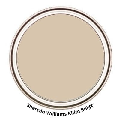
Sherwin-Williams Kilim Beige SW 6106 is a warm beige paint color with soft golden and taupe undertones that creates a cozy, inviting atmosphere. Richer than many modern greiges, it adds warmth without feeling overly yellow, making it a timeless choice for living rooms, bedrooms, hallways, and whole-house color palettes. Kilim Beige pairs beautifully with creamy whites, natural wood, earthy accents, and warm stone finishes, making it an excellent option for traditional, transitional, and updated classic homes.
STATS
- LRV: 57
- Hue Family: Yellow, leaning towards yellow-red
- Color Collections: Living Well, Top 50 Colors
LRV
LRV or Light Reflectance Value is a measurement commonly used by design professionals that measures the amount of light reflected from and absorbed by a surface. LRVs range from 0 -100, with 100 being pure white and 0 being absolute black. A great article to read to learn more about LRV is Light Reflectance Value: What Do Those Numbers Mean?
To sum it up, Kilim Beige has an LRV of 57. It’s almost right in the middle of the scale. You can expect it to reflect a decent amount of light.
WHAT COLOR IS KILIM BEIGE?
Kilim Beige is a soft warm neutral beige paint color. On the Sherwin Williams website, it is categorized as an orange paint color. This makes sense since its hue family leans towards yellow-red, which is orange.
That being said, Kilim Beige is not going to look like the color of a pumpkin on your walls. In certain lighting, it may come off almost like a peach color. Don’t let that scare you; it depends heavily on the lighting and time of day.
Overall, it is a comfortable warm neutral beige color. It’s light enough to feel airy, yet it has enough depth to create a warm atmosphere.
The best way to see what Kilim Beige will look like in your home is by getting a paint sample. Why is this an important step in the painting process? Because the paint color will look different depending on the lighting, fixed elements, and decor colors in your home.
DOES KILIM BEIGE LOOK YELLOW?
Kilim Beige is definitely not yellow. Sometimes we hear “beige” and automatically think that the color will look some shade of yellow. Of course, there are beiges that lean more on the yellow side, but that is not the case with Kilim Beige.
Kilim does come from the yellow hue family, but it’s right on the edge, leaning toward the yellow-red side. Yellow-red is ultimately orange, so Kilim Beige has more of an orange base rather than yellow.
IS KILIM BEIGE TOO DARK?
I wouldn’t say Kilim Beige is too dark. Its LRV is 57, which is a little over halfway on the scale. It’s not the most light-reflective, but that doesn’t mean it’s too dark of a paint color.
Whether Kilim Beige is too dark really depends on who is looking at it. You may think it’s too dark for your preferences, whereas I may think it’s too light.
It also depends on the elements and lighting in a room whether it will appear darker or lighter.
These types of questions are quite subjective. But in my opinion, I don’t believe Kilim Beige is too dark of a paint color.
WHAT UNDERTONES DOES KILIM BEIGE HAVE?
Oh undertones, how you love to scare everyone. Kilim Beige tends to stay neutral, for the most part. However, in certain unbalanced lighting, you can have a brief moment of peachiness. Remember Kilim Beige has a red-yellow (orange) base.
Speaking of unbalanced lighting, it may flash or shift to show a bit of green. But again, this has a lot to do with the lighting in the room.
Don’t let that send you running for the hills. Kilim is a fantastic beige that deserves a shot. The only way to know what undertones or colors Kilim Beige will show is by testing a paint sample in your home. It is honestly the easiest way to see how a color will perform for you. It will also take all the guesswork out of the paint color selection process.
GRAB A SAMPLING PAINT COLORS WORKSHEET TO LEARN HOW TO GET THE MOST OUT OF YOUR SAMPLES

KILIM BEIGE AND LIGHTING
Lighting plays a definitive role in the way a paint color looks. It’s not the only factor, but it’s a big part of it. that being said I think it’s important to understand how natural light looks in certain directions throughout the day.
Having this bit of knowledge will help you decide whether or not Sherwin Williams Kilim Beige will be a good paint color for your home.
North-facing rooms – Light in North-facing rooms comes off cooler and sometimes somewhat bluish. Lighter colors appear more muted, while bolder colors will show up or appear better. North-facing light can cool down warmer colors.

South-facing rooms– In South-facing rooms, there tends to be a consistently bright light throughout the day. Warm and cool tones work with south-facing light. This light intensifies colors, so darker colors will seem more vivid while softer colors will almost look like they are radiating.
East-facing rooms– East-facing rooms have the brightest light in the mornings, with a yellow-orange tone. If an east-facing room will be used regularly in the evenings, going with a warm palette will help to offset the lack of natural light.
West-facing rooms– Early evening is when West-facing rooms have the most favorable light. Warmer tones might seem a bit strong because of the red-orange tones the light gives off. However, if the main use of the room is in the mornings, the colors won’t seem as intense.
Remember to always consider lighting when choosing a paint color. But don’t forget the other elements that influence how a paint color may look. This includes fixed elements like cabinetry, flooring, tiles, etc., as well as the decor colors you choose for your home.
If you’re planning a painting project soon, these are the supplies worth adding to your cart first. A few good tools can seriously improve your results.
WHERE TO USE?
LIVING ROOM

Erin @e.lynndesign on Instagram painted her living room built-ins using SW Kilim Beige.
Her room looks elegant and quite welcoming. It is absolutely stunning.
READ MORE: PAINT COLORS FOR LIGHT WOOD FLOORS
Dennisse Styles via Houzz painted the living room walls with Kilim Beige. The color is the perfect neutral backdrop.

BEDROOM

Dennisse Styles via Houzz also has SW Kilim Beige on the bedroom walls. You can see in the photo that it looks like a beautiful neutral beige.
READ MORE: HOW TO PAINT DOORS LIKE A PRO
IS KILIM BEIGE A GOOD EXTERIOR PAINT COLOR?
I think Kilim Beige will work on the exterior of the home. But you should keep in mind that colors tend to look brighter in direct sunlight.
Lifeonwaterstreet on Instagram painted the exterior of her home with SW Kilim Beige. The home looks gorgeous, but the key takeaway is how it looks quite a bit lighter on the exterior.

INTERESTED IN MORE EXTERIOR PAINT COLORS? CHECK THESE OUT:
- Paint Colors to go with Brick Exteriors
- The Best Sherwin Williams Exterior Colors
- BM Exterior Colors
- Exterior Color Combos
- Front Door Paint Colors
- Blue Exterior Paint Colors
- BM Manchester Tan For the Exterior
- Boothbay Gray- A Great Exterior Color
WHAT IS THE BEST WAY TO SAMPLE?
One of the biggest paint mistakes I see people make is not testing their paint colors. If you want to be positively sure a paint color is going to look great in your house, you must test your paint samples. I promise this is a step you do not want to skip.
The best and easiest way to test paint samples is by using SAMPLIZE.
LEARN HOW TO TEST YOUR PAINT SAMPLE THE RIGHT WAY.
GRAB A SAMPLING PAINT COLORS WORKSHEET TO LEARN HOW TO GET THE MOST OUT OF YOUR SAMPLES
Remember to swatch your paint colors. Pick up your Samplize Peel & Stick paint samples today!
WHAT IS THE BEST TRIM COLOR FOR KILIM BEIGE?
Finding a trim color that coordinates with a wall color can leave you scratching your head. It can be tricky and quite frustrating.
White is the most popular trim color, but what white goes with Kilim Beige?
A great white trim color option is SW Alabaster. Alabaster is a slightly off-white color with a hint of warmth. It complements Kilim perfectly.
Divine White is another amazing warmer-toned white paint color that works.
You don’t have to limit yourself to just white paint colors for trim. You can try the color drenching trend and use the same color on both trim and walls. Use different sheens for slight contrast.
You can also opt for a dark trim color like Black Bean; this will really amp up the contrast.
READ MORE: THE BEST WHITE PAINT COLORS FOR TRIM
BENJAMIN MOORE EQUIVALENT TO KILIM BEIGE
So, for the curious, I found a Benjamin Moore paint color similar to SW Kilim Beige. Not a dupe, but similar.
THOUSAND ISLANDS CC-308 – Benjamin Moore Designer Classics
If you glance at these two paint colors quickly, you may think they are the same color. They are quite similar; however, they have a few differences.
- Benjamin Moore Thousand Island has an LRV of 60.66, slightly higher than Kilim’s 57
- Thousand Island is a hair lighter
- Both colors are very similar in saturation, though Thousand Island is a tiny bit more saturated.

I know what you are thinking: can’t I just color match between brands? Yes, you can, but I must warn you to proceed with caution. Every brand formulates its paint colors differently. This means that if they make up a paint color that isn’t theirs, it could be slightly off.
If you still want to go for it, I highly suggest getting a sample of it to start. This way you can see if the color works for you.
WHAT COMPLIMENTS KILIM BEIGE?
- BRACING BLUE SW 6242
- CREAMY SW 7012
- GRANITE PEAK SW 6250
- GAUNTLET GRAY SW 7019
- TRICORN BLACK SW 6258
- MALABAR SW 9110
- OAKMOSS SW 6180
- COLONNADE GRAY SW 7641
- PEPPERCORN SW 7674
- DOVER WHITE SW 6385
- LATTE
- COCONUT HUSK
- SEA SALT

COLOR /PAINT STRIP
The color strip is the page that displays a paint color in the paint deck.

- KILIM BEIGE SW 6106
- NOMADIC DESERT SW 6107
- LATTE SW 6108
- DOUBLE LATTE SW 9108
- HOPSACK SW 6109
- STEADY BROWN SW 6110
- COCONUT HUST SW 6111
KILIM BEIGE VS ACCESSIBLE BEIGE

- Accessible Beige has an LRV of 58, a hair higher than KB at 57
- Both paint colors are basically the same lightness value, but Accessible Beige is technically the darker one.
- Kilim has more saturation.
- Accessible is a bit more grayed down
READ MORE: ACCESSIBLE BEIGE PAINT COLOR REVIEW
KILIM BEIGE VS CANVAS TAN
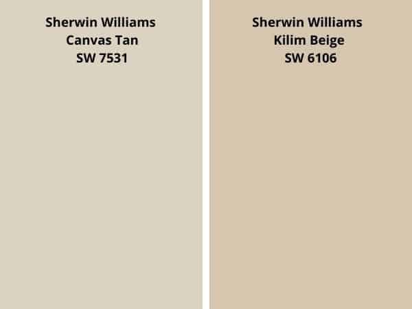
- Canvas Tan has an LRV of 64, higher than KB’s 57
- Canvas Tan is the lighter paint color of the two
- Kilim Beige is a bit more saturated
- Both are from the yellow-red hue family
- Canvas Tan has the potential to show so subtle pink tones.
KILIM BEIGE VS NATURAL LINEN

- Natural Linen has an LRV of 66, a bit higher than KB’s 57
- Natural Linen is the lighter paint color
- Kilim Beige has a bit more color to it or saturation
- Natural Linen is a tad more yellow
KILIM BEIGE VS AGREEABLE GRAY

- Agreeable Gray has an LRV of 60, a few notches higher than Kilim at 57
- Agreeable Gray is the lighter paint color.
- Kilim is a beige paint color, and Agreeable is a greige
- Agreeable Gray is more grayed down and less saturated.
- Kilim Beige is a warmer paint color
READ MORE: AGREEABLE GRAY PAINT COLOR REVIEW
KILIM BEIGE VS BALANCED BEIGE

- Balanced Beige has an LRV of 46, that’s lower than Kilim Beige’s 57
- Balanced Beige is the darker paint color
- Both colors are from the same hue family.
- Balanced Beige is darker in shade and is a bit less saturated
KILIM BEIGE VS SOFTER TAN

- Softer Tan has an LRV 60, a little higher than Kilim Beige
- Softer Tan leans a tiny bit more to the yellow hue side.
- Kilim Beige is a smidge darker
- Softer Tan has more saturation.
DON’T PAINT WITHOUT THE BEST TOOLS
The Tools That Make Painting Easier
A beautiful paint color can only do so much if you’re using cheap brushes and flimsy rollers. These are the painting tools I personally recommend for cleaner lines, better coverage, and less frustration during your project.
FINAL THOUGHTS
I have to be honest, I personally lean towards neutral paint colors that are on the gray side. But there is something about Kilim Beige that I am drawn to.
It’s such a unique beige color, not the typical yellow beige. It leans more toward an orange beige, and I believe that’s what makes it so special to me. Along with being a warm, comforting paint color, it also has an elegance to it. It’s truly a paint color that has it all.
Would I recommend it? Absolutely!

Are you looking for a way to keep track of all the paint colors in your home? Have you ever had to touch up some paint in your home and forgotten what the paint color was? It’s like you are playing the guessing game, what color, paint, finish, and brand? It’s completely frustrating! I have the perfect solution to keep your paint colors all in one place. My simple paint color tracker can keep you and your paint colors organized!
RECENT ARTICLES:
- Paint Colors That Work with Honey Oak
- BM Beach Glass Review
- Benjamin Moore Chantilly Lace
- BM Silver Satin Review
- Full Paint Color Review – BM Pale Oak
- Fabulous Green Paint Shades
- SW Shoji White Review
- BM Swiss Coffee
- Hale Navy Review
- Springtime Paint Colors
- SW Drift of Mist Review
- SW Snowbound
