We may earn money or products from the companies mentioned in this post.




Last Updated on July 28, 2026 by Cate
Sherwin-Williams Snowbound SW 7004 is a soft white paint color with subtle gray undertones that keep it from looking stark or overly creamy. It’s an excellent choice if you want a crisp yet inviting white that works well in modern, transitional, and farmhouse-style homes. Snowbound performs best in spaces with good natural light, though it can reveal a slight pink or taupe undertone depending on the room’s lighting and surrounding finishes.
WHAT COLOR IS SHERWIN WILLIAMS SNOWBOUND SW 7004?
Sherwin Williams Snowbound is a white paint color.
Of course, that is the simple answer. Sherwin Williams says,
With its slight gray undertone, this versatile cool white pairs well with other gray-influenced colors. Like stepping into a snowy glade.
Sherwin Williams

The thing about Snowbound is that it is pretty neutral. It doesn’t lean too warm or too cool. Of course, in the perfect lighting conditions, it appears as a gorgeous neutral white paint color.
Keep in mind that lighting influences the way paint colors appear, so it’s important to know the space’s lighting situation.

LRV, HUE FAMILY & COLOR COLLECTIONS
First things first. Let me share a few stats on SW Snowbound.
- LRV – 83
- HUE FAMILY – Yellow
- COLOR COLLECTIONS – Color ID (Minimalist), Living Well (Reflect), Top 50 Colors, Pottery Barn (Fall/Winter), Finest Whites & Neutrals (Finest Whites), Colormix Forecast 2024 (a Study in Delicate Tints)
What is LRV?
LRV, or Light Reflectance Value, is a measurement commonly used by design professionals that measures the amount of light reflected from or absorbed into a surface. LRVs range from 0-100, with 100 being pure white and 0 being pure black.
A great article to read to learn more about LRV is Light Reflectance Value: What Do Those Numbers Mean?
With an LRV of 83, Snowbound is certainly going to reflect a good amount of light.
Snowbound is from the yellow hue family. Having knowledge about paint colors can be very helpful, as it allows you to understand them better. This understanding can help you anticipate how a color may appear or shift in different lighting conditions.
As for the color collections, Snowbound is part of a few different Sherwin Williams Collections. This doesn’t provide much information about the color itself. Nonetheless, it is intriguing and helps you identify other colors that accompany it.
BEFORE YOU PAINT
My Must-Have Painting Supplies
You don’t need expensive contractor equipment for a beautiful paint job — but a few quality tools can absolutely help. These are the products I recommend over and over again.
DOES SNOWBOUND LOOK YELLOW?
No, Snowbound doesn’t look yellow.
Again, I have to mention that lighting, fixed elements, and decor all affect how a paint color will present itself.
For example, if you have all yellow decor, fixed elements with yellow-based finishes, and warm artificial lighting, chances are you will see your Snowbound walls appear a bit yellow.
If you are unsure about how a paint color will look in your home, grab a paint sample of the color. This is how you can see a true representation of how the color will look.
READ MORE: HOW TO TEST PAINT SAMPLES IN YOUR HOME
WHAT UNDERTONES DOES SNOWBOUND HAVE?
OK, let’s talk about undertones or colors that can possibly be seen. Snowbound is a neutral white with some gray to it. That’s because it has a chroma (how saturated a color is) that is less than 0.55 and a value (how light or dark a color is) between 9.12 and 10.00.
It’s crucial to keep in mind that undertones are subjective. Different people may perceive a paint color differently. Therefore, if you’re choosing a paint color based on its undertones, it’s best to stop and reconsider.
That being said, Snowbound can appear to show a bit of tapuish / pink tones. Of course, the color you see is all dependent on lighting as well as other factors in the room.
The appearance of a paint color can vary depending on its surroundings, particularly for white shades such as Snowbound. For instance, if the room has numerous windows with lush greenery outside, Snowbound may sometimes appear to have a green moment.
To accurately preview how a paint color will appear in your room, it is essential to consider all elements in the space, such as flooring, cabinets, and furniture color. Once these factors are taken into account, obtaining a paint sample and observing it in the room is the best way to determine its appearance.
IS SNOWBOUND A WARM OR COOL WHITE?
Sherwin Williams Snowbound is a cool-toned white paint color. However, in certain lighting conditions, it can look a bit warm-toned.
When it comes to the tone of a paint color, I find that some colors are much more obvious than others. White paint colors can be a bit more tricky.
If you’re having trouble interpreting tones, simply compare the paint color to one you are familiar with.
For example, when you compare Snowbound to Greek Villa, Greek Villa stands out as the warmer tone paint color.

If you’re feeling unsure about a paint color’s warmth or coolness, use the comparison method to help you decide. However, it’s important to remember that testing the paint colors is the most foolproof method.
INTERESTED IN WARM PAINT COLORS? CHECK THESE OUT:
- Kilim Beige- Sherwin Williams
- Benjamin Moore Edgecomb Gray
- SW Worldly Gray
- Sherwin Williams City Loft
- Sherwin Williams Shoji White
- The Best Mushroom Paint Colors
- SW Drift of Mist
- BM Classic Gray
LIGHTING, & CARDINAL DIRECTIONS
I’d love to now discuss lighting with you! When the lighting is ideal around midday, you can observe a paint color as it truly is. Yet, in uneven lighting, that’s when you’ll notice a change in the paint color.
The way a paint color appears is greatly influenced by the lighting in a room. Although not the only factor, it plays a significant role. Therefore, it’s crucial to have an understanding of how natural light changes throughout the day in different directions.
The four cardinal directions, north, south, east, and west, play into how lighting will look.
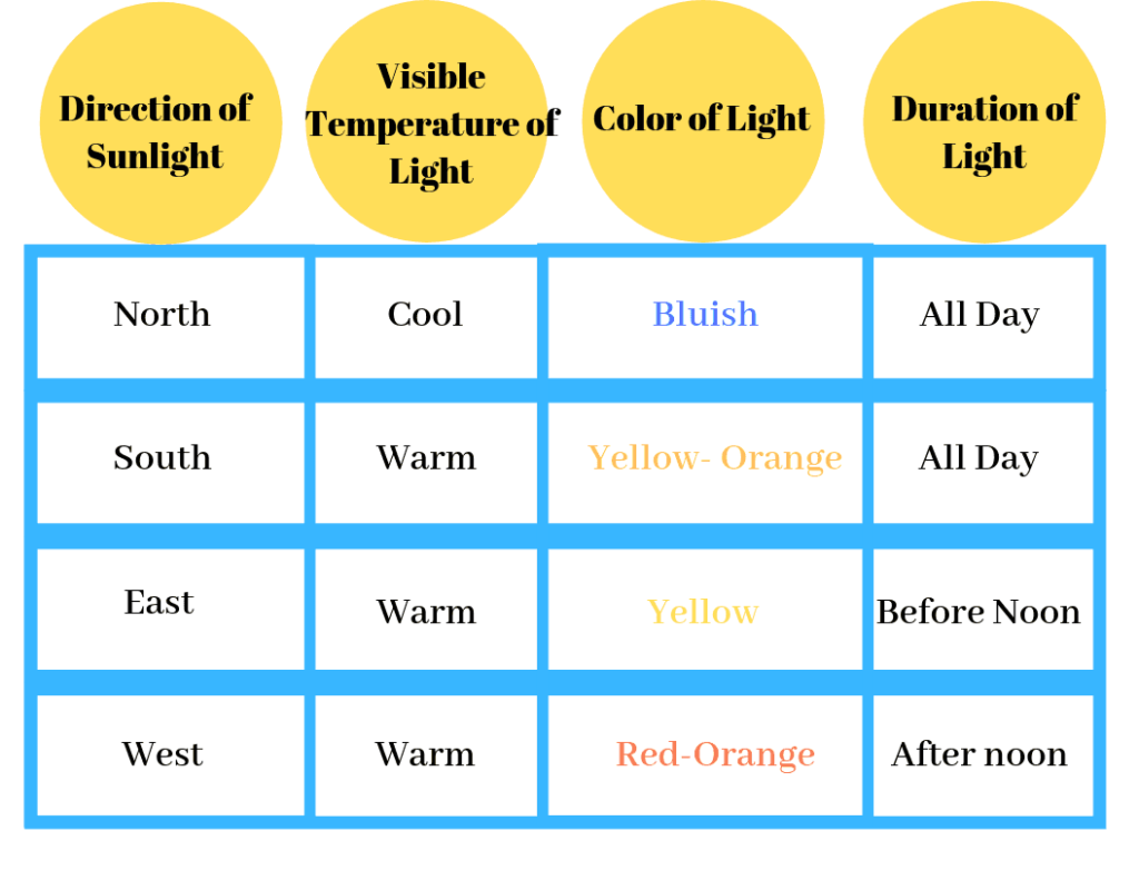
Knowing this information can assist you in deciding if Sherwin Williams Snowbound would make a suitable paint color for your home.
North-facing rooms – Light in North-facing rooms comes off cooler and sometimes somewhat bluish. Lighter colors appear more muted, while bolder colors will show up or appear better. North-facing light can cool down warmer colors.
South-facing rooms– In South-facing rooms, there tends to be a consistently bright light throughout the day. Warm and cool tones work with south-facing light. This light intensifies colors, so darker colors will seem more vivid, while softer colors will almost look like they are radiating.
East-facing rooms– East-facing rooms have the brightest light in the mornings, with a yellow-orange tone. If an east-facing room is used regularly in the evenings, going with a warm palette will help to offset the lack of natural light.
West-facing rooms– Early evening is when West-facing rooms have the most favorable light. Warmer tones might seem a bit strong because of the red-orange tones the light gives off. However, if the main use of the room is in the mornings, the colors won’t seem as intense.
When selecting a paint color, it’s crucial to keep lighting in mind. However, it’s also essential not to overlook other factors that can impact how the color appears. These factors include fixed elements such as cabinetry, flooring, and tiles, as well as the colors of your home decor.
THE IMPORTANCE OF LIGHT BULBS
All lighting affects your paint color, whether natural or artificial. But with artificial lighting, it can be somewhat doctored, and that’s with the color of the light bulb you use.
The color of the light bulbs you use will influence how a paint color will look in a room. And unfortunately, it’s an important detail that is often overlooked.
With the variety of light bulbs available, it can be overwhelming. I mean, what’s really soft white and what’s bright white?
Thankfully, it becomes easier once you know a little bit about light bulbs.
For reference, light color or light appearance is measured on the Kelvin (K)temperature scale. Lower Kelvin numbers mean more yellow light; the higher the Kelvin number, the whiter or bluer the light.
Remember, lower Kelvin (K) numbers = yellow light, Higher Kelvin (K) numbers = white/blueish light
I always recommend using this type of light bulb.
[show_shopthepost_widget id=”5043956″]
Be cautious of the light bulb names such as “daylight” or warm light.” I’d advise against picking a light bulb by its name.
Instead, always check the package for actual facts. This allows you to choose the best bulb for you.
It’s important to keep in mind that while lighting is a key factor in how a paint color appears, there are other factors to consider. Elements such as decor, furniture, fixtures, cabinetry, and flooring can all affect how a paint color looks in a room. It’s important to be aware of these influences when choosing a color for your space.
WHERE TO USE

LIVING ROOM

Cynthia Jin used Snowbound on her living room walls.
Here the color looks like a beautiful neutral white.

DOORS /TRIM

lizzierobin painted her interior doors using SW Snowbound.
I think this was a fantastic idea. Overall, Snowbound looks like the lovely neutral white it is.
Let’s talk about testing paint samples.
Before committing to a paint color, I highly recommend testing it in your own home first. Lighting can completely change how a color looks. I love using Samplize peel-and-stick samples because they’re mess-free and so much easier than buying sample pots.
IS SNOWBOUND A GOOD EXTERIOR PAINT COLOR?
Yes, Snowbound SW 7004 is a great white paint color for the exterior of a home.

Paint colors used on the exterior will always appear lighter in the sun. Some near-neutral paint colors may even wash out.
Snowbound is a good exterior white paint color. It will look bright, clean, and crisp. If you are looking for a white with a little more warmth, you may want to go with a color like SW Natural Choice. It holds more warmth as well as depth.
If you are still unsure, do yourself a favor and sample the color on the exterior of your home to make sure you love it.
Find More Exterior Paint Color Inspiration:
- The Best Benjamin Moore Exterior Paint Colors
- Great Sherwin Williams Paint Colors for the Exterior
- Exterior Colors Combinations
- Inviting Exterior Paint Colors
- Paint Colors that go with Brick Exteriors
- SW Dovetail – A Great Exterior Paint Color
- 12 Great Blue Exterior Paint Colors
IS SW SNOWBOUND A GOOD TRIM COLOR?
Yes, Sherwin Williams Snowbound can be a fantastic trim paint color.
The thing to keep in mind is that you’ll want to make sure it complements your wall paint color.
WHAT’S THE BEST TRIM COLOR FOR SW SNOWBOUND SW 7004?
Many people tend to choose white as their preferred paint trim color. However, it’s important to note that not all white paint colors are the same.
It can be difficult to find white paint colors that complement each other. Picking two whites that don’t blend well can make them appear dirty and dingy.
This is yet another excellent example of why sampling paint colors is a crucial step to take.
My go-to time paint color for Snowbound is Sherwin Williams Extra White or High Reflective White.
READ MORE: THE BEST WHITE PAINT COLORS FOR TRIM.
To make it easier to work with Snowbound, consider painting your trim in the same color but with a different sheen. This will help eliminate any difficulties in finding a matching white.
One helpful tip is to apply a flat finish to your walls and a semi-gloss finish to your trim. This will create a subtle difference in how the color reflects light, resulting in a slightly different appearance on the walls and trim.
How do you paint like a pro? By using the right tools and supplies! Check out the Ultimate Painting Tools List for everything you need to paint a room.
COORDINATING COLORS
Creating a paint color palette can send some into a tizzy. And I get it, though. It’s frustrating. But the good news here is that Snowbound is easy to coordinate with.
I have found a few colors that work well.
- Colonnade Gray SW 7641
- Ellie Gray SW 7650
- Gauntlet Gray SW 7019
- Soulmate SW 6270
- Repose Gray
- Canvas Tan SW
SW SNOWBOUND VS ALABASTER

Snowbound

- LRV – 83
- Hue Family – Yellow
- cool toned
- white paint color
- is the lighter paint color
Alabaster

- LRV – 82
- Hue Family – Yellow
- warm toned
- creamy off-white paint color
- is more saturated or colorful
- FULL ALABASTER REVIEW
AGREEABLE GRAY VS SNOWBOUND

Snowbound
- LRV – 83
- Hue Family – Yellow
- cool toned
- white paint color
- is the lighter paint color
Agreeable Gray

- LRV – 60
- Hue Family – Yellow
- warm toned
- warm gray/ greige paint color
- is more saturated or colorful
- FULL AGREEABLE GRAY REVIEW
SNOWBOUND VS PURE WHITE

Snowbound
- LRV – 83
- Hue Family – Yellow
- cool toned
- white paint color
- is the darker paint color
Pure White

- LRV – 60
- Hue Family – Yellow
- warm toned
- neutral white paint color
- is more saturated or colorful
- FULL PURE WHITE REVIEW
SNOWBOUND VS WHITE DOVE

Snowbound
- LRV – 83
- Hue Family – Yellow
- cool toned
- white paint color
- is the lighter paint color
White Dove

- LRV – 85.38
- Hue Family – Yellow
- warm toned
- warm white paint color
- is more saturated or colorful
- FULL WHITE DOVE REVIEW
SNOWBOUND VS EXTRA WHITE

Snowbound
- LRV – 83
- Hue Family – Yellow
- cool toned
- white paint color
- is the darker paint color
Extra White

- LRV – 86
- Hue Family – Yellow
- cool toned
- cool white paint color
- is less saturated or colorful
If you’re planning a painting project soon, these are the supplies worth adding to your cart first. A few good tools can seriously improve your results.
WHAT IS THE BENJAMIN MOORE EQUIVALENT TO SW SNOWBOUND?
I understand why people are curious about finding an equivalent.
At times, you may find it difficult to get hold of a particular brand of paint. This could be for various reasons, such as your loyalty to a particular brand, your painter’s preference for a specific type, or simply because you live far from a particular store.
The closest Benjamin Moore equivalent to Snowbound is AF-10 GARDENIA.
Based on the specifications, these two colors are very similar. However, upon closer inspection, they do not appear to be visually alike.
In my opinion, it would be ideal to select a color from the brand you are considering that appeals to you.

RECAP
- LRV – 83
- HUE FAMILY – Yellow
- COLOR COLLECTIONS – Color ID (Minimalist), Living Well (Reflect), Top 50 Colors, Pottery Barn (Fall/Winter), Finest Whites & Neutrals (Finest Whites), Colormix Forecast 2024 (a Study in Delicate Tints)
- cool-tone but in certain situations, can lean towards warm
- can flash undertones or tones of pink or taupe in unbalanced lighting
- the best way to Sample is with SAMPLIZE PEEL & STICK PAINT SAMPLES
- it works as an exterior paint color
- looks good with an array of colors
FINAL THOUGHTS
OK, so what do I really think of Sherwin-Williams Snowbound SW 7004?
I like it. I think It’s a stunning white paint color. Honestly, there aren’t many colors I dislike.
I guess the thing here is that if you are looking for a white that is bare bones, with no surprises, you may not like Snowbound.
Why? Because if you have unbalanced light, it may appear to show some taupe or pick colors. And if that’s not what you are looking for, you’ll be disappointed.
I said it before, and I’ll say it again and again. You need to get a sample of the paint color and test it in your home. It’s truly the most accurate way to see how a paint color will look in your home.
Sampling will save you time, money, and frustration.

Are you looking for a way to keep track of all the paint colors in your home? Have you ever had to touch up some paint in your home and forgotten what the paint color was? It’s like you are playing the guessing game, what color, paint, finish, and brand? It’s completely frustrating! I have the perfect solution to keep your paint colors all in one place. My simple paint color tracker can keep you and your paint colors organized!
