
We may earn money or products from the companies mentioned in this post.





Last Updated on July 21, 2026 by Cate
As a seasoned color consultant and passionate advocate for creating inviting living spaces, I find myself often gravitating towards the soft elegance of cream paint colors.
These hues, especially from trusted names like Sherwin-Williams and Benjamin Moore, possess an inherent warmth that transforms houses into homes. Cream, a nuanced neutral, holds the power to provide a cozy and welcoming atmosphere, a canvas on which life’s memories are painted.
Its versatility allows it to stand alone or complement bolder accent colors, effortlessly contributing to a tranquil and harmonious interior design.
Whether it envelops a room in a glow of understated sophistication or acts as the gentle backdrop for your home decor, cream paint colors prove time and again to be a homeowner’s ally in creating soul-soothing spaces.
MY MOST RECOMMENDED CREAM PAINT COLORS
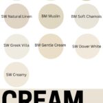
I dove into my Benjamin Moore and Sherwin Williams paint decks and pulled on the best cream paint colors. These are all my most recommended cream colors- my tried-and-true, ride-or-die, OK, OK. You get the picture.

- Natural Linen
- Alabaster
- Creamy
- Dover White
- Greek Villa
- Navajo White
- Butter Cream
- Muslin
- Soft Chamois
- Gentle Cream
MY Top Cream PAINT COLOR Picks by Sherwin-Williams
I can’t help but get excited about sharing my favorite Sherwin-Williams cream paint colors. These shades are like a cozy blanket for your walls, offering warmth and an inviting ambiance.
Sherwin-Williams Natural Linen

Sherwin-Williams Natural Linen, a soft, buttery color that’s reminiscent of sandy beaches. This one’s perfect for spaces where you want a touch of warmth without overpowering the room.
Sherwin-Williams Alabaster
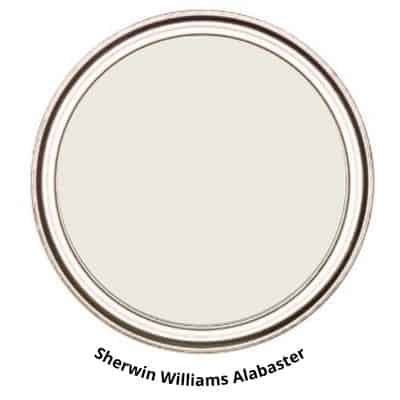
Sherwin-Williams Alabaster, a creamy tone without the starkness of pure white. It strikes just the right balance, making it versatile for both traditional and modern interiors. It’s also been celebrated as a color of the year, so you know it’s got timeless appeal.
Sherwin-Williams Creamy
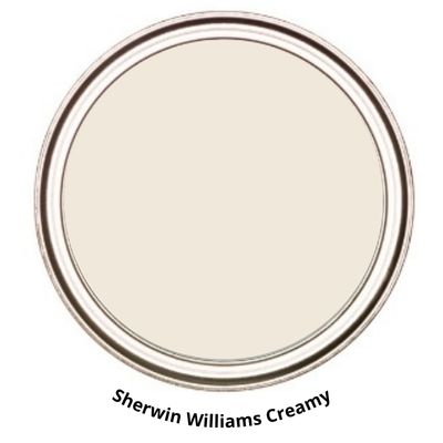
Sherwin-Williams Creamy, which lives up to its name, creating a smooth and rich backdrop. This shade works wonders in spaces that crave a soft touch, enhancing the room’s aesthetics substantially.
Sherwin-Williams Dover White

Sherwin-Williams Dover White is another gem, a neutral with a whisper of cream. It’s especially great in rooms with plenty of natural light, as it casts a warm and radiant glow throughout the space. Each of these selections comes with a promise: to elevate the coziness of your home.
Sherwin-Williams Greek Villa

Sherwin Williams Greek Villa is an ideal example of a cream paint color. Coming from the yellow hue family gives it that warmth that makes it the perfect cream paint color. It is a great color to use in a room to provide a warm and cozy feel.
My Top Cream pAINT COLOR Picks by Benjamin Moore
I can’t tell you enough about the comfort that spills from Benjamin Moore’s cream paint colors. The fantastic thing about their creams is the subtle undercurrents each one holds, providing an unmatched coziness for any space.
Benjamin Moore Navajo White

Navajo White is a classic, with a soft and understated air that brings light to rooms without overwhelming them. It partners beautifully with natural wood and textiles.
Benjamin Moore Butter cream

Butter Cream is your go-to for those of you craving a bit of a darker, more buttery feel. It has a hint of olive in it, which keeps it from being too creamy. This is one of the less traditional cream paint colors you’ll find on this list, but that’s what makes it special.
Benjamin Moore Muslin

And then there’s the famous Muslin, which stands out with its touch of gray, dialing up the sophistication a notch. It’s phenomenal in spaces that call for a neutral yet chic backdrop, like your home office or a modern living room.
Benjamin Moore Soft Chamois

Soft Chamois is one of the most versatile paint colors I’ve used to date. It’s a great fit for many spaces and is so soft. This cream color is more on the neutral side, but in certain lighting, it can certainly look warm and creamy.
Benjamin Moore Gentle Cream

BM Gentle Cream is what its name implies: a gentle cream beige paint color. It has an earthy feel to it with hints of yellow and orange in it. It tends to pull to the yellow side more. But that all depends on the lighting. This is another fantastic paint color in the cream family.
Each of these shades from Benjamin Moore has its special way of capturing warmth and transforming a house into a home. They work phenomenally in different lighting situations, proving versatile through mornings and evenings alike.
My tip is to consider where you want that dash of cream and let that guide you to the right tone—be it the cozy hug of Buttercream in a bedroom or the crisp cleanness of Muslin for your foyer

Let’s talk about testing paint samples.
Before committing to a paint color, I highly recommend testing it in your own home first. Lighting can completely change how a color looks. I love using Samplize peel-and-stick samples because they’re mess-free and so much easier than buying sample pots.

Cream PAINT Color Pairings and Combinations
Picking the right companions for cream paint can transform a room into a harmonious haven. Start by considering the color’s undertone; warm creams go beautifully with rich, earthy hues like terracotta or muted greens, creating a cozy, inviting space.
On the other hand, creams with cool undertones pair elegantly with blues and purples, offering a classic look that’s both soothing and sophisticated.
I recommend layering various neutrals together for a subtle, textured effect. Imagine a room with Sherwin-Williams or Benjamin Moore cream on the walls, accented with crisp white trim and soft beige furnishings. The result? A design that whispers understated luxury and comfort.
If you want a pop of color, consider adding muted yellows or soft pinks. These shades complement cream walls without overpowering them, and they bring a cheerful energy to the space.

For a bolder statement, try a navy blue or charcoal grey. They create a stunning contrast against a cream backdrop, allowing for a more dynamic aesthetic.
Wood tones are also natural allies of cream hues. Light woods add brightness and can make small spaces appear larger. Dark woods, in contrast, offer depth and richness that ground the airy lightness of cream.
For a truly cohesive look, keep an eye on a color’s saturation. Pair creams with colors of similar intensity to maintain balance.
By mixing these colors thoughtfully, you create a seamless flow that makes your interiors feel like a carefully curated collection rather than a random assortment.
Want a More Professional Paint Finish?
Want your paint project to look less DIY and more designer-finished? The secret is often in the prep work and the tools you use. Here are my go-to painting supplies that make the process easier and the results so much better.
Check out the must-have painting tools our painting crew uses.
Textures and Finishes in Cream Paint COLORS
Choosing the right finish for cream paint is like selecting the perfect accessory for an outfit—it can completely transform the look. I always recommend considering the specific room and the durability needs when deciding on the finish.
Think about how light interacts with these hues. A matte finish absorbs light, giving walls a velvety appearance that masks surface irregularities, ideal for low-traffic areas where a soft, subtle ambiance is desired.
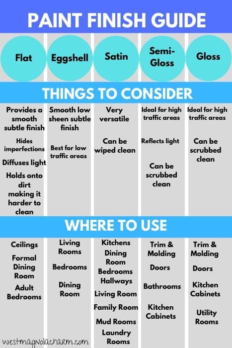
On the flip side, eggshell and satin finishes have a slight sheen, making them more washable and durable—perfect for kitchens or bathrooms where moisture and frequent cleaning are factors.
These finishes can also bring a gentle warmth and depth to cream colors, enhancing the cozy feel of a space.
And if you want some drama, go for a semi-gloss or gloss finish. They reflect light beautifully, which can add vibrancy to the color and create a more refined look.
However, remember they also tend to highlight imperfections, so your walls will need to be well-prepared before painting. Trust me, the extra effort is worth the stunning result.
In addition to finish, think about texture. A smooth cream finish creates a sleek, modern feel, whereas adding a textured technique can give a room a more rustic charm.
Play around with different painting methods to see how texture can add dimension and character to your walls with the warm, inviting nature of cream shades.
Snag My Paint Planning Printables
Want to plan your color palette like a pro? I’ve got you covered. Grab my printables designed to help you sample, compare, and choose your perfect paint colors—all without losing your mind.
Click here to download the printables ➝
Decor and Style Tips for Cream Paint colors
Let me share some of my favorite decor recommendations and style tips for making the most of cream paint in your interior design. Cream hues offer a perfect canvas for a variety of textures and accents, setting the scene for a truly cozy atmosphere. You’ll want to consider the natural light in your space, as this can influence the way cream paint interacts with your decor.

- Highlight with Accents: Use vibrant accents to complement the neutrality of cream walls. Throw pillows, art pieces, and area rugs in bold colors can create focal points and add character.
- Mix Textures: Incorporate different materials such as wood, metal, and textiles. Rustic wood furniture or woven baskets add earthy elements that contrast beautifully with the smooth cream backdrop.
- Layer Lighting: Soft, layered lighting can enhance the warmth of cream colors. Combine overhead lights with floor lamps and candles for a welcoming glow that accentuates the creamy tones.
- Natural Elements: Bring in plants or florals to breathe life into cream-themed rooms. Greenery against cream walls establishes a fresh, serene setting.
- Classic Contrast: Pair cream with classic black or deep brown for a timeless look. Dark picture frames, lampshades, or bookshelves provide contrast and depth.
- Balance with Blues: Cooler tones like blues or greys balance out the warmth of cream. Consider soft blue curtains or grey throw blankets for a harmonious blend.
- Soft Fabrics: Layering various fabrics creates a tactile experience. Think velvet cushions, silk curtains, or fluffy rugs against the softness of cream walls for a luxe feel.
Remember, cream paint is like the base note in a harmonious chord; it’s the starting point of your design symphony. Play around with these elements, and you’ll see how wonderfully versatile cream paints can be in crafting an inviting, stylish home.
Transitional Shades Near Cream
Exploring the spectrum of cream shades leads us down a path to some lovely adjacent colors that blend seamlessly from space to space or serve as harmonious accents.
Ivory is a close cousin to cream, just slightly lighter, and it can create a subtle differentiation without creating a stark contrast. I find it’s perfect for trim work or ceilings to give a room a continuous but layered look.
Another great transition shade is beige. It carries a bit more brown than cream, grounding a space with a bit of earthiness while still keeping the overall palette light and airy.
For those spots in your home that crave a hint of color, consider taupe. It’s a beautiful blend of brown and gray that’s a step away from cream but remains in the warm neutral family. Taupe works wonders as an accent wall or even in fabrics and textiles throughout the interior.
Lastly, don’t overlook soft peach tones. These colors can serve as a delightful, gentle companion to the creams, adding a touch of playfulness and warmth without deviating too much from the neutral territory.
My tip is to employ these shades in areas where you wish to evoke feelings of comfort and serenity – think bedrooms, reading nooks, or a quaint breakfast nook.
Don’t forget to pick up these amazing painting tools! They will only make your life easier!
The Final Brushstroke
We’ve journeyed through the inviting world of cream paint colors, exploring the cozy ambiance they can create in any space. From the nuanced shades offered by Sherwin-Williams to the inviting tones by Benjamin Moore, we’ve uncovered a spectrum of options that can bring warmth and sophistication to your interiors. I’ve shared insights into how cream hues affect mood, offered tips on pairings and applications, and provided a peek into the role of textures and finishes.

In your quest for that perfect paint selection, remember the versatility of these warm neutrals that pair effortlessly with a variety of decor styles. Whether you’re taking on a full home renovation or simply refreshing a single room, the right cream shade can transform your space. As a color expert, I encourage you to embrace these hues for their ability to make a home feel both elegant and inviting.
Feel empowered to experiment with the creams we’ve discussed. Trust in the quality of Sherwin-Williams and Benjamin Moore to deliver the hue that speaks to you. With brush in hand and the right cream paint on your walls, you’re ready to create interiors that not only reflect your style but also envelop you in comfort. Remember, a touch of cream can make a house truly feel like home.
