We may earn money or products from the companies mentioned in this post.


In this post, you will find amazing Sherwin Williams color combinations and tips for creating your own paint color palette for your home.
I have been dedicated to mastering the art of creating perfect paint color combinations, helping transform countless homes into visually stunning spaces.
With Sherwin Williams’ extensive palette, choices feel limitless, yet selecting the ideal blend can seem daunting. I assure my clients that, together, we will navigate this vibrant spectrum to discover the colors that reflect their personality and style. As a paint color consultant, my role transcends mere selection.
I delve into the science and psychology of colors, ensuring that every hue harmonizes with both the interior design and the inhabitants’ moods. The outcome always promises a home renovation that feels both personal and rejuvenating.
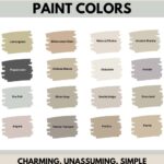
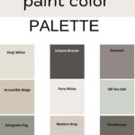
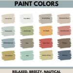
9 SHERWIN WILLIAMS COLOR PALETTE COMBINATIONS
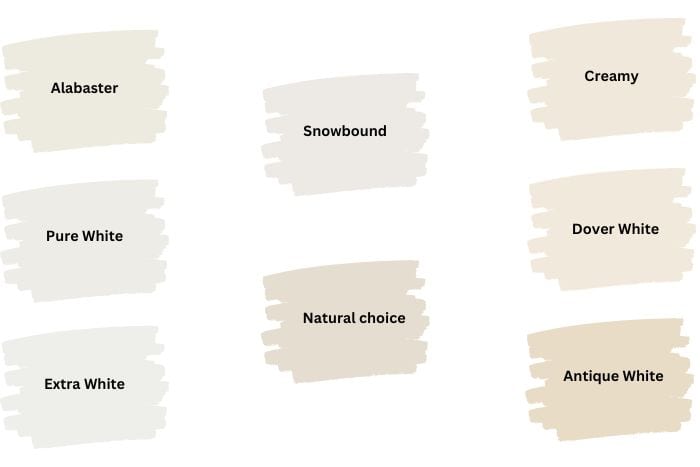
WHITES
- Extra White SW 7006
- Pure White SW 7005
- Alabaster SW 7008
- Snowbound SW 7004
- Natural Choice SW 7001
- Creamy SW 7012
- Dover White SW 6385
- Antique White SW 6119
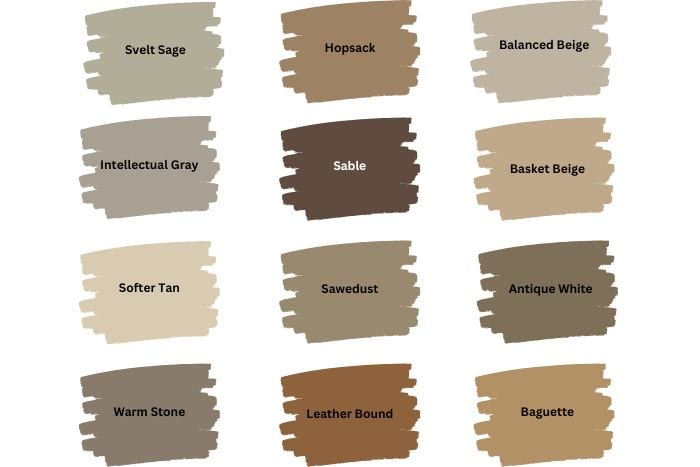
NATURALLY NEUTRAL
- Neutral Ground SW 7568
- Intellectual Gray SW 7045
- Artisan Tan SW7540
- Favorite Tan SW 6157
- Balanced Beige SW 7037
- Sawdust SW 6158
- Hopsack SW 6109
- High Tea SW 6159
- Softer Tan SW 6141
- Warm Stone SW 7032
- Svelte Sage SW 6164
- Leather Bound 6118
- Creamy SW 7012
- Baguette SW 6123
- Basket Beige SW 6143
- Sable SW 6083
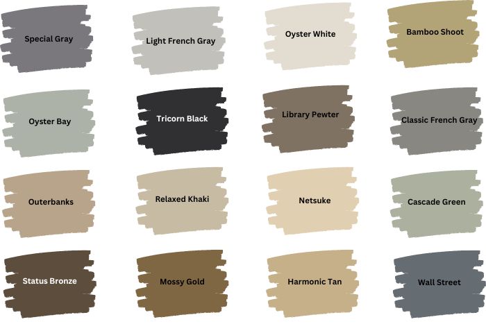
SIMPLY SOPHISTICATED
- Oyster White SW 7637
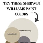
- Relaxed Khaki SW 6149
- Wall Street SW 7665
- Status Bronze SW 7034
- Light French Gray SW 0055
- Classic French Gray SW 0077
- Cascade Green SW 0066
- Bamboo Shoot SW 7733
- Tricorn Black SW 6258
- Oyster Bay SW 6206
- Library Pewter SW 0038
- Outerbanks SW 7534
- Netsuke SW 6134
- Harmonic Tan SW 6136
- Special Gray SW 6277
- Mossy Gold SW 6139
WANT TO TRY A SAMPLE? TRY SAMPLIZE PEEL & STICK PAINT SAMPLES
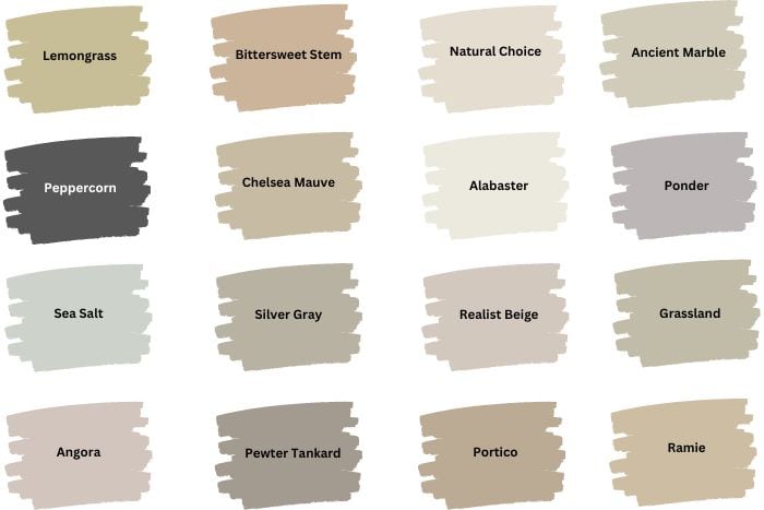
VINTAGE CHIC
- Ramie SW 6156
- Grassland SW 6163
- Ponder SW 7079
- Ancient Marble SW 6162
- Natural Choice SW 7011
- Alabaster SW 7008
- Realist Beige SW 6078
- Portico SW 7548
- Pewter Tankard SW 0023
- Silver Gray SW 0049
- Chelsea Mauve SW 0002
- Bittersweet Stem SW 7536
- Angora SW 6036
- Sea Salt SW 6204
- Lemongrass SW 7732
- Peppercorn SW 7674
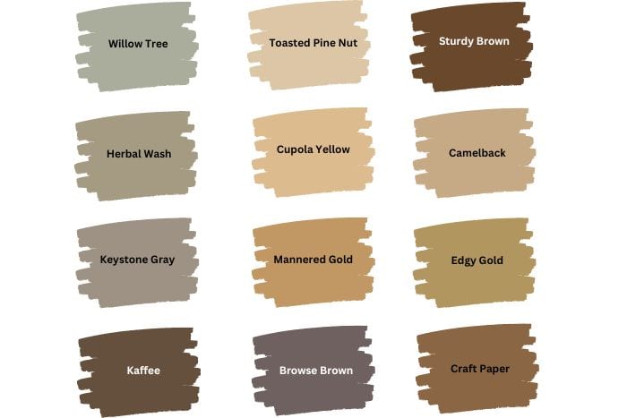
TUSCAN WARM
- Summer White SW 7557
- Pavillion Beige SW 7512
- Wheat Penny SW 7705
- Palm Leaf SW 7735
- Cupola Yellow SW 7692
- Herbal Wash SW 7739
- Willow Tree SW 7741
- Kaffee SW 6104
- Toasted Pine Nut SW 7696
- Sturdy Brown SW 6097
- Camelback SW 6122
- Browse Brown SW 6012
- Keystone Gray SW 7504
- Edgy Gold SW 6409
- Craft Paper SW 6125
- Mannered Gold SW 6130
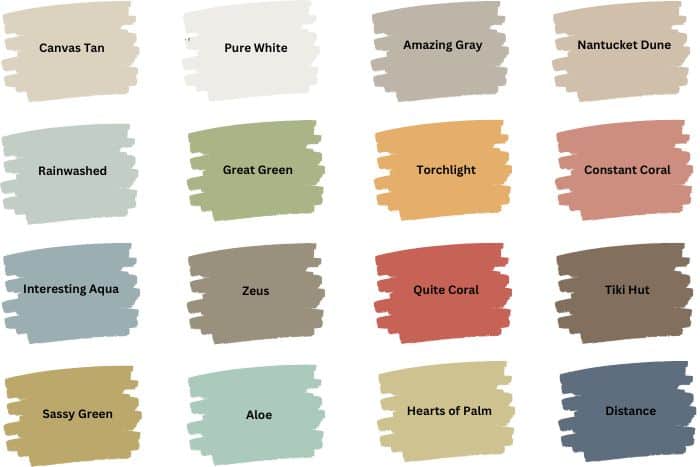
SEASIDE RETREAT
- Canvas Tan SW 7531
- Rainwashed SW 6211
- Interesting Aqua SW 6220
- Sassy Green SW 6416
- Pure White SW 7005
- Great Green SW 6430
- Zeus SW 7744
- Aloe SW 6464
- Nantucket Dune SW 7527
- Constant Coral SW 6325
- Tiki Hut SW 7509
- Hearts of Palm SW 6415
- Amazing Gray SW 7044
- Torchlight SW 6374
- Quite Coral SW 6614
- Distance SW 6243
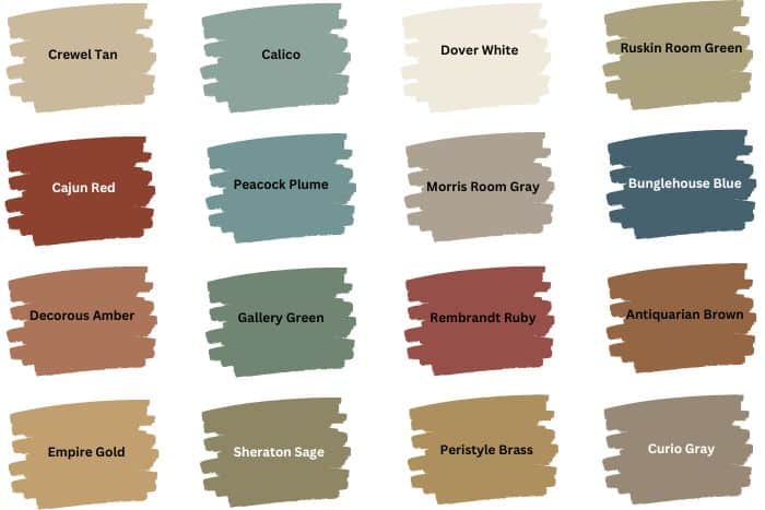
HISTORIC HUES
- Crewel Tan SW 0011
- Cajun Red SW 0008
- Decorous Amber SW 0007
- Empire Gold SW 0012
- Calico SW 0017
- Peacock Plume SW 0020
- Gallery Green SW 0015
- Sheraton Sage SW 0014
- Dover White SW 6385
- Morris Room Gray SW 0037
- Rembrandt Ruby SW 0033
- Peristyle Brass SW 0043
- Ruskin Room Green SW 0042
- Bunglehouse Blue SW 0048
- Antiquarian Brown SW 0045
- Curio Gray SW 0024
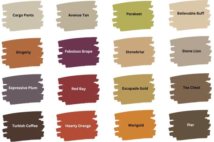
SPICE IT UP
- Cargo Pants SW 7738
- Gingery SW 6363
- Expressive Plum SW 6271
- Turkish Coffee SW 6076
- Avenue Tan SW 7543
- Fabulous Grap Sw 6293
- Red Bay SW 6321
- Hearty Orange SW 6622
- Aesthetic White SW 7035
- Stonebriar SW 7693
- Escapade Gold Sw 6403
- Marigold SW 6664
- Believable Buff SW 6120
- Stone Lion SW 7507
- Tea Chest Sw 6103
- Pier SW 7545
WANT TO TRY A SAMPLE? TRY SAMPLIZE PEEL & STICK PAINT SAMPLES
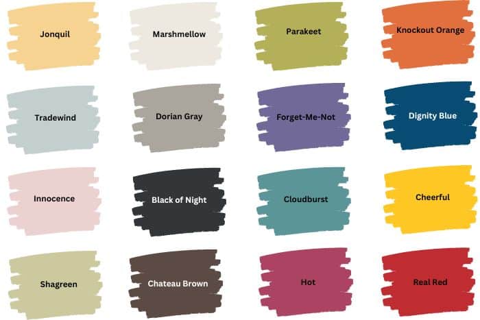
KID’S PLAY
- Jonquil Sw 6674
- Tradewind SW 6218
- Innocence SW 6203
- Shagreen SW 6422
- Marshmellow SW 7001
- Dorian Gray SW 7017
- Black of Night SW 6993
- Chateau Brown SW 7510
- Parakeet SW 6711
- Forget-Me-Not SW 6824
- Cloudburst SW 6487
- Hot SW 6843
- Knockout Orange SW 6885
- Dignity Blue SW 6804
- Cherry Tomato SW 6864
- Cheerful SW 6903
WANT TO TRY A SAMPLE? TRY SAMPLIZE PEEL & STICK PAINT SAMPLES
The Role of Color in Home Design
Colors have the power to transform not just walls but also the emotions and perceptions within a space. They can soothe or energize us, shrinking or expanding the perception of a room’s size without a single structural alteration.
In my journey as a color consultant, especially when considering Sherwin Williams’ vast palette for home renovation or DIY home projects, understanding this impact is crucial. Colors influence mood intricately, with neutral colors often bringing a sense of calm and bold colors, injecting vibrancy and dynamism into home decor.
This fundamental understanding guides my paint selection, whether working towards a serene retreat using Sherwin Williams popular neutral shades or a stimulating home office through more vivid hues. Thus, choosing paint colors goes beyond aesthetic appeal, enveloping psychological dimensions that shape how we experience our homes.
using the Color Wheel to create wall color combinations

The color wheel serves as a basic guide for selecting paint colors that harmonize within your home. Understanding this tool is vital for anyone embarking on interior design or home renovation projects, especially when weaving together a color scheme that elevates the space. Primary colors, red, blue, and yellow, sit at the wheel’s core. They are the origin from which all other colors emerge. Combining these hues leads to the creation of secondary colors – green, orange, and purple. It’s an exciting process, witnessing how mixing in varied proportions can yield a broad spectrum of shades.
When primary and secondary colors meet in harmony, we get tertiary colors. These are the intricate shades that fill the spaces between, such as the soothing blues and energetic oranges I often recommend during my paint consultations. For those envisioning a wall painting project or a full-scale home improvement, these colors provide a rich palette to draw from. They allow for an exploration of both neutral colors and bold colors, ensuring your DIY home projects reflect the latest color trends. Matching these with Sherwin Williams popular colors can transform any living space, making it uniquely yours.
How to Choose Your Paint Color Combinations
Choosing the right Sherwin Williams paint colors for your home renovation or interior design project can seem daunting. I recommend beginning with an inspiration piece. This could be anything from a cherished piece of art to a vibrant textile that captures your heart. It serves as a cornerstone for your color scheme, simplifying your paint selection process. Consider the size of the room next. Hues that are lighter tend to make spaces feel more expansive, a boon for smaller rooms. Conversely, bold colors can add depth and character to larger areas.
Don’t overlook the impact of natural and artificial lighting; colors will vary throughout the day and under different light sources. Testing colors in your specific environment is crucial. Samples allow you to observe these variations, ensuring your chosen paint colors truly match your vision for the space. Finally, integrating existing decor into your color palette helps maintain a cohesive look. Whether you lean towards neutral colors for a subtle background or prefer vibrant accent walls, ensuring harmony between your selections and existing elements is key.
Common Mistakes to Avoid when creating wall color combinations
Many dive into paint selection with Sherwin Williams, drawn to the plethora of vibrant colors, neutral palettes, and trending shades. They often overlook the delicate art of matching these hues to their home’s interior design, resulting in a mismatched color scheme. One common mistake is disregarding the importance of lighting. Both natural and artificial light can dramatically alter how a color looks on walls. I have seen cases where homeowners chose bold colors for small rooms, hoping to make them appear cozy, only for the space to feel cramped instead.
Ignoring the color wheel and its principles can lead to clashing combinations rather than the desired harmonious balance between bold and neutral colors. Another pitfall is getting swayed by color trends without considering if these shades complement the existing decor or the overall style of the home. I recommend starting with color swatches and observing them under different lighting conditions. Consulting a color consultant for a professional paint consultation can bring an expert perspective on color matching, ensuring the chosen paint colors enhance your home renovation or DIY home projects effectively.
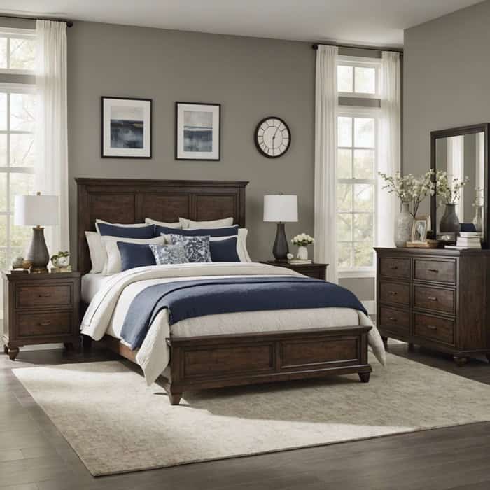
Creating a Cohesive Look Throughout Your Home
Through years of experience, I have learned that creating a unified look throughout your home can be deeply satisfying. It starts with selecting a base color, often a neutral or soft hue from the expansive Sherwin Williams palette. This foundational color will flow from room to room, providing a sense of continuity and harmony. I then recommend incorporating thematically linked accent colors. These can be bolder shades or complementary hues that add depth and interest to each space.
For instance, if the primary color is a soft gray, consider navy or teal for a splash of boldness in living areas, while maintaining the flow with lighter accents in bedrooms. DIY home projects like wall painting become more cohesive with this approach. It’s not just about choosing paint colors; it’s about weaving a color story throughout your space. Always remember, the aim is to reflect your personality and style, making your home a true representation of you.
Last Touch of Color
I have walked through the transformative journey of selecting Sherwin Williams paint colors, from the soothing neutrals to the dynamic bold hues. Every color choice, whether for a DIY home project or a significant home renovation, tells a story. It’s a narrative of personal style, the pursuit of beauty, and the endless possibilities that Sherwin Williams provides. This experience, enriched by the expertise of a seasoned color consultant, emphasizes how critical it is to choose colors thoughtfully.
In my role, I have seen countless homes turn from ordinary spaces into spectacular showcases of personality and visual harmony. Often, it’s not just about following the latest color trends or adhering rigidly to the color wheel. It’s about daring to let your distinctive preferences lead the way. Whether you’re considering a complete home makeover or just pondering a refresh of your living room with the latest Sherwin Williams popular colors, remember this: every palette is a canvas, and every room is a masterpiece waiting to happen.
Inspire yourselves to trust your vision and to make bold decisions where they feel right. Rely on Sherwin Williams for an unparalleled selection of paint colors, finishes, and textures, designed to breathe life into every corner of your home. I encourage you to pick up that paintbrush, to consult with professionals when needed, and to dive into your color selection journey with enthusiasm and confidence. After all, the final touch of color is not just about the paint—it’s about crafting a space that truly feels like home.