We may earn money or products from the companies mentioned in this post.



Last Updated on June 17, 2026 by Cate
Let’s talk about something near and dear to my heart: the ever-glamorous, sometimes overwhelming, “what-the-heck-do-I-paint-my-house” decision. Yep. It’s 2026, and exterior house colors have taken a sharp turn from safe and subtle to bold, moody, and—dare I say—delightfully rebellious.
I’ve spent the last few months swatching, stalking color launches, and side-eyeing houses around my neighborhood (don’t worry, I was polite about it). So if you’re about to paint your house or just love a good color trend deep dive, grab your coffee (or wine, depending on the hour), because we’re diving into the most exciting exterior color trends for 2026.

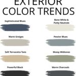
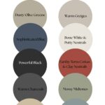
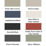
1. Dusty Olive Greens
Top picks: Sherwin Williams Svelte Sage SW 6164 & Benjamin Moore Gloucester Sage HC-100
Green is still going strong, but this year we’re waving goodbye to those bright gardeny greens and ushering in the age of dusty, earthy olives. These colors feel organic, grounded, and a bit like your house just did a yoga retreat in the forest.
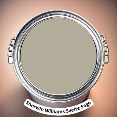
Svelte Sage (Sample it) is that quiet neighbor who reads poetry but could also build you a bookshelf. It’s a chameleon in the best way—looks serene in sunlight and cozy in overcast weather.
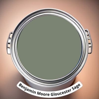
Gloucester Sage, (Sample It) on the other hand, leans richer and deeper. If your home has character (think stonework, chunky trim, or dramatic landscaping), this one makes everything look intentional. Add black shutters, and it’s giving historic charm meets modern farmhouse.
2. Warm Greige is Back (But Cooler)
Top pick: Sherwin Williams Skyline Steel SW 1015
Okay, okay—greige isn’t new. But this year’s version? It’s got sass. It’s warmer than gray, cooler than beige, and it plays nicely with all the things: brick, stone, cedar, you name it.

Skyline Steel (Sample It) is my go-to recommendation for anyone who doesn’t want to repaint again for 15 years. It’s timeless without being boring. Pair it with white trim and a natural wood door, and you’ll have the prettiest house on the block (and I say that with full bias).
3. Sophisticated Blues
Top picks: Benjamin Moore Newburyport Blue HC-155 & Sherwin Williams Cyberspace SW 7076
Hear me out: blue isn’t just for beach cottages anymore. In 2025, we’re seeing navy and charcoal blues steal the show—especially with crisp white trim and copper or bronze accents.

Newburyport Blue (Sample It)is an absolute gem. It has just enough green undertone to keep it from feeling nautical. It’s smart, elegant, and makes vinyl siding look expensive. (No offense to vinyl, we love a low-maintenance queen.)

Cyberspace, (Sample It) meanwhile, is dramatic. It’s moody, modern, and looks insane with natural wood garage doors. Just make sure your house gets decent light—this baby can go very dark, very fast.
4. Bone Whites & Putty Neutrals
Top picks: Benjamin Moore Seapearl OC-19 & Sherwin Williams Shoji White SW 7042
We’ve officially moved past stark white exteriors, thank goodness. This year, it’s all about soft whites that feel lived-in and luxe. Think “old money” meets “coastal grandma.”

Seapearl (Sample It) is one of my all-time favorites. It’s a warm white that doesn’t go yellow, and it looks divine with black windows. It also won’t blind your neighbors in direct sun, which—let’s be honest—is a community service.

Shoji White (Sample it) has a hint of greige that makes it feel cozy even on modern builds. It’s subtle but not snoozy. If your vibe is “I grow hydrangeas and wear linen on purpose,” this is your color.
MAKE SURE YOU ARE SAMPLING YOUR PAINT COLORS
Let’s talk about testing paint samples.
Before committing to a paint color, I highly recommend testing it in your own home first. Lighting can completely change how a color looks. I love using Samplize peel-and-stick samples because they’re mess-free and so much easier than buying sample pots.
5. Black is Still a Power Move
Top pick: Sherwin Williams Caviar SW 6990
Ah yes, the black house trend isn’t going anywhere—and honestly, I’m not mad about it. A black exterior is bold, dramatic, and just a little bit rebellious. (I mean, we’ve all thought about it.)

Caviar (Sample It) is my favorite true black because it has just enough warmth to avoid looking harsh. If you’re scared your house might look like a haunted mansion, fear not. Add some warm wood accents and you’ve got yourself a modern cabin that belongs on a magazine cover.
6. Earthy Terra Cottas & Clay Neutrals
Benjamin Moore Terra Cotta Tile (2090-30)
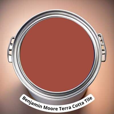
Terra Cotta Tile (Sample It) is like the lovechild of spicy paprika and a well-traveled clay pot in Tuscany. It has all the warmth and rustic charm with a touch more vibrancy and a modern Mediterranean flair. It’s bold without being loud, and it pairs beautifully with soft creams, deep charcoals, and even muted greens for contrast.
7. Warm Charcoals
Top pick: Behr Cracked Pepper PPU18-01

Black-adjacent, but with a little softness around the edges. Cracked Pepper is one of those colors that walks into a room (or, you know, lands on your siding) and immediately commands respect. It’s less stark than a true black but still bold enough to feel modern and fresh.
This color shines on contemporary homes with sharp angles and looks ridiculously good with cedar accents. Just don’t pair it with high-gloss white trim—it wants friends, not enemies.
If you’re planning a painting project soon, these are the supplies worth adding to your cart first. A few good tools can seriously improve your results.
8. Mossy Midtones
Top pick: Farrow & Ball Lichen No.19

Let’s hear it for the plants. Greens are still everywhere, but 2025 is leaning into those richer, softer, mossy tones—and Lichen (Sample It) is the moody fairy tale of them all.
This one is ideal for cottage-style homes or bungalows tucked under trees. It feels like a color you’d find on a home that smells faintly of baked bread and old books. Pair it with a muted white trim and a natural wood door, and your house basically is a vibe.
9. Soft Terracotta Tans
Top pick: Dunn-Edwards Bungalow Taupe DE6172

If your dream exterior vibe is “modern Craftsman met a Pinterest board and never looked back,” Bungalow Taupe is calling your name. This warm, grounded taupe has just enough greige to feel updated but still gives off serious “inviting front porch with rocking chairs and maybe a lemonade stand” energy.
It plays beautifully with dark trim (think deep espresso or charcoal) and looks especially stunning against green landscaping. It’s neutral, yes, but far from boring. It’s the kind of shade that makes your house look like it always knew it was going to be the best one on the block.
10. Pewter Blues
Top pick: Valspar Blue Twilight 4004-2B

Last but not least, say hello to a cool-toned stunner that plays well with everyone. Blue Twilight is a pewter-y blue-gray that looks tailored, clean, and just a little bit mysterious.
It’s perfect for coastal homes, yes—but also modern farmhouses, mid-century ranchers, or even split-levels begging for a facelift. Try it with white trim and a pop of brass or copper on the light fixtures. Elegant and effortless.
Final Thoughts from Your Friendly Color Nerd
The biggest theme I’m seeing in 2026 is character. People are moving away from safe, cookie-cutter colors and choosing shades that reflect their personality—and honestly, I love that for us.
Whether you go bold with navy or soft with putty, the trick is to test those samples. Get them up on your exterior, check them morning, noon, and night. And if you’re still stuck? That’s literally what I’m here for.
Paint is magic, and I fully believe that the right color can make you fall in love with your home all over again. So go bold, go beautiful, and go you.
P.S. Want me to tell you exactly which colors will look best on your home? I offer virtual color consults, and I would love to help. Find all the details right here.
RECENT ARTICLES:
- Hould you lighten Honey Oak?
- Sherwin Williams Warm Neutral Paint Colors
- Countertop Colors for Honey Oak Cabinets
- Benjamin Moore Wrought Iron Vs. Sherwin Williams Iron Ore
- Shaker Beige Paint Color Review
- Warm Neutrals from Benjamin Moore
- Sherwin Williams Review – Skyline Steel
- Neutral Paint Colors for a Nursery
- BM Pashmina Review
️ Want to Make Your Paint Planning Even Easier?
Choosing the right paint color is just one piece of the puzzle. That’s why I created a collection of printable guides to help you pull it all together—without the stress (or the paint regrets).
✔️ Room-by-room paint planners
✔️ Finish and sheen cheat sheets
✔️ Budget-friendly decorating tips
✔️ Coordinating color palette templatesThey’re designed to take the guesswork out of decorating—and look cute on your clipboard, too.
Browse my printable shop here and start planning your dream home with confidence.
