We may earn money or products from the companies mentioned in this post.


Dark rooms can be frustrating.
No matter what you do, they feel a little… off. A little flat. Sometimes even gloomy.
And if you’ve ever tried to fix that by painting the walls bright white?
You already know how that ends.
Spoiler: it usually makes things worse.
The truth is, dark rooms don’t need brighter colors—they need smarter ones.
Let’s break down exactly what works (and what doesn’t) so you can finally get a color that feels right
The Best Paint Colors for Dark Rooms (Quick Answer)
If you’re short on time, here’s the deal:
The best paint colors for dark rooms are:
- Soft warm whites
- Light greige tones
- Creamy off-whites
- Muted, warm pastels
- Balanced warm neutrals
And what should you avoid?
- Stark white
- Cool gray
- Blue-based neutrals
These tend to look flat, cold, or muddy in low light.
Why White Paint Fails in Dark Rooms
This is where most people go wrong.
White paint seems like the obvious fix for a dark room—but without enough natural light, it doesn’t reflect brightness the way you expect.
Instead, it can:
- Look gray or dingy
- Pull cool or blue undertones
- Feel flat and lifeless
Bottom line: white needs light to work.
And dark rooms don’t have enough of it.
What Actually Works in Dark Rooms

If you want a room to feel brighter (without adding windows), you need to work with the lighting—not against it.
Here’s what to look for:
1. Warm Undertones
Warmth is everything in a dark room.
It helps:
- Counteract shadows
- Prevent the space from feeling cold
- Add a subtle glow to the walls
2. Mid-Light Depth
Super light colors can fall flat.
Super dark colors can feel heavy.
The sweet spot?
Soft, mid-light tones with a bit of depth
3. Soft, Balanced Pigment
Avoid anything too stark or icy.
You want colors that feel:
- Blended
- Slightly muted
- Easy on the eyes
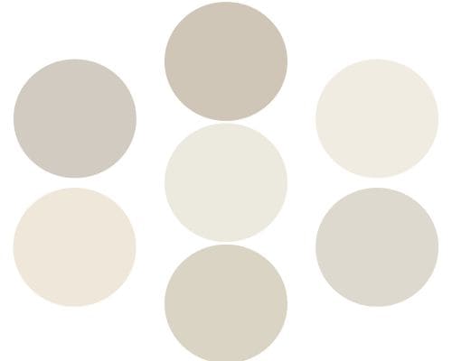
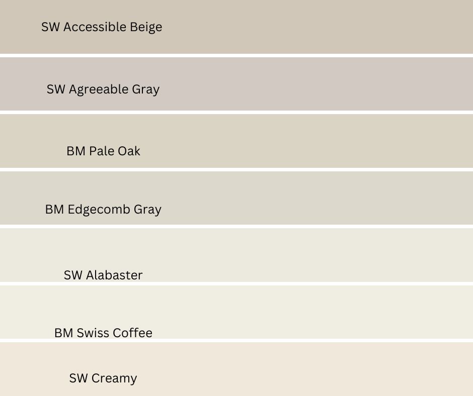
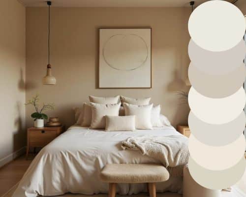
The Best Paint Colors for Dark Rooms
These are tried-and-true colors that hold up in low-light spaces without turning weird.
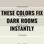
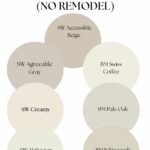
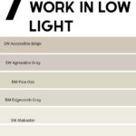
Sherwin Williams Agreeable Gray
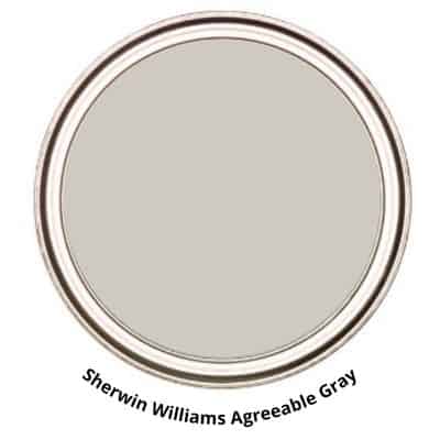
- Warm greige with subtle beige undertones
- One of the most versatile neutrals out there
- Doesn’t go muddy easily in darker rooms
- See it in your home!
Best for: Living rooms, open spaces, whole-home color
Benjamin Moore Edgecomb Gray
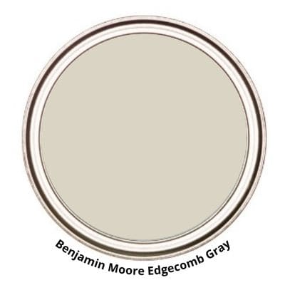
- Light greige with a soft warmth
- Feels airy without looking washed out
- A great “safe” neutral
- Test it in your space!
Best for: Hallways, bedrooms, transitional spaces
Sherwin Williams Alabaster

- Creamy, warm white
- Much softer than stark white
- Adds brightness without feeling cold
- Grab a sample to test it out!
Best for: Walls, trim, cabinets
Benjamin Moore Swiss Coffee
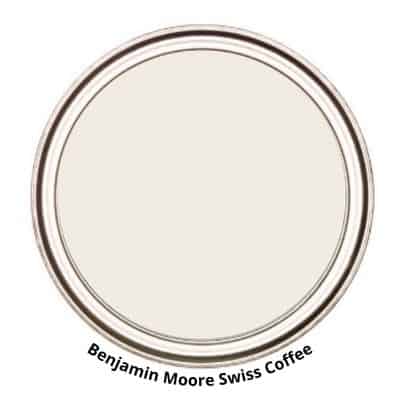
- Warm, inviting off-white
- Slight depth keeps it from looking flat
- Perfect for cozy, low-light rooms
- See it in your home!
Best for: Living rooms, bedrooms
Sherwin Williams Accessible Beige
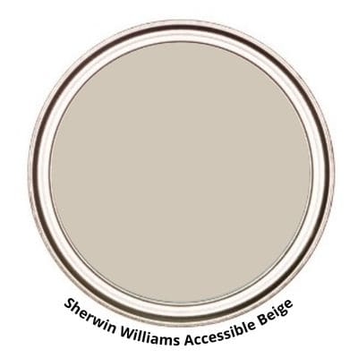
- Warm neutral with a bit more body
- Adds richness without darkening the space
- Great alternative to gray
- Try it in your home!
Best for: Traditional homes, warmer palettes
Benjamin Moore Pale Oak
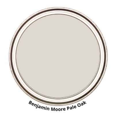
- Soft greige with a hint of warmth
- Light and calming without feeling cold
- Subtle enough for almost any space
- Grab a sample to test it out!
Best for: Bedrooms, soft neutral backdrops
Sherwin Williams Creamy
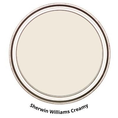
- rue warm cream (no harsh undertones)
- Brightens a space without feeling stark
- Works especially well in darker rooms
- See it in your home!
Best for: Rooms that need warmth and light
BEFORE YOU PAINT
My Must-Have Painting Supplies
You don’t need expensive contractor equipment for a beautiful paint job — but a few quality tools can absolutely help. These are the products I recommend over and over again.
Pro Tips for Painting Dark Rooms
These small tweaks make a big difference:
Test colors on multiple walls
Light shifts throughout the day—don’t rely on one spot. Use Samplize Peel & Stick Paint Samples.
Choose the right finish
Eggshell or satin will reflect more light than flat paint.
Add contrast
Trim, decor, and furniture help the color feel intentional and balanced.
What to Avoid in Dark Rooms
Some colors just don’t hold up well in low light:
- Stark white (too harsh)
- Cool gray (can feel cold and flat)
- Blue-based neutrals (often look dull)
- Super dark colors (unless you want a moody look)
How to Choose the Right Color for Your Space
Still stuck? Start here:
- Want a safe, versatile option → Agreeable Gray
- Want something light and airy → Edgecomb Gray
- Want a warm white → Alabaster or Swiss Coffee
- Want cozy warmth → Accessible Beige or Creamy
KEEP TRACK OF YOUR PAINT COLORS

Before You Commit (Don’t Skip This)
Paint will look completely different in your home than it does online.
Before you choose:
- Test samples in your space. I use and recommend using Samplize Peel & Stick Paint Samples.
- Look at them morning, afternoon, and night
This is the easiest way to avoid repainting later.
Final Thoughts
Dark rooms aren’t the problem—the wrong paint color is.
Once you shift from “brightest” to “most balanced,” everything changes.
The right color won’t just lighten your walls—it will make the entire room feel more inviting, warm, and pulled together.
Want to Dive Deeper? Check out These Articles:
- Alabaster vs Swiss Coffee vs White Dove
- Agreeable Gray vs Repose Gray
- Best White Paint Colors for Trim vs Walls
- City Loft vs Alabaster
- The Best Paint Colors for a North-Facing Room